This content is outdated. I'll be making updates to non-current work soon. Check back later!
Hired
Product & Visual Design
Overview
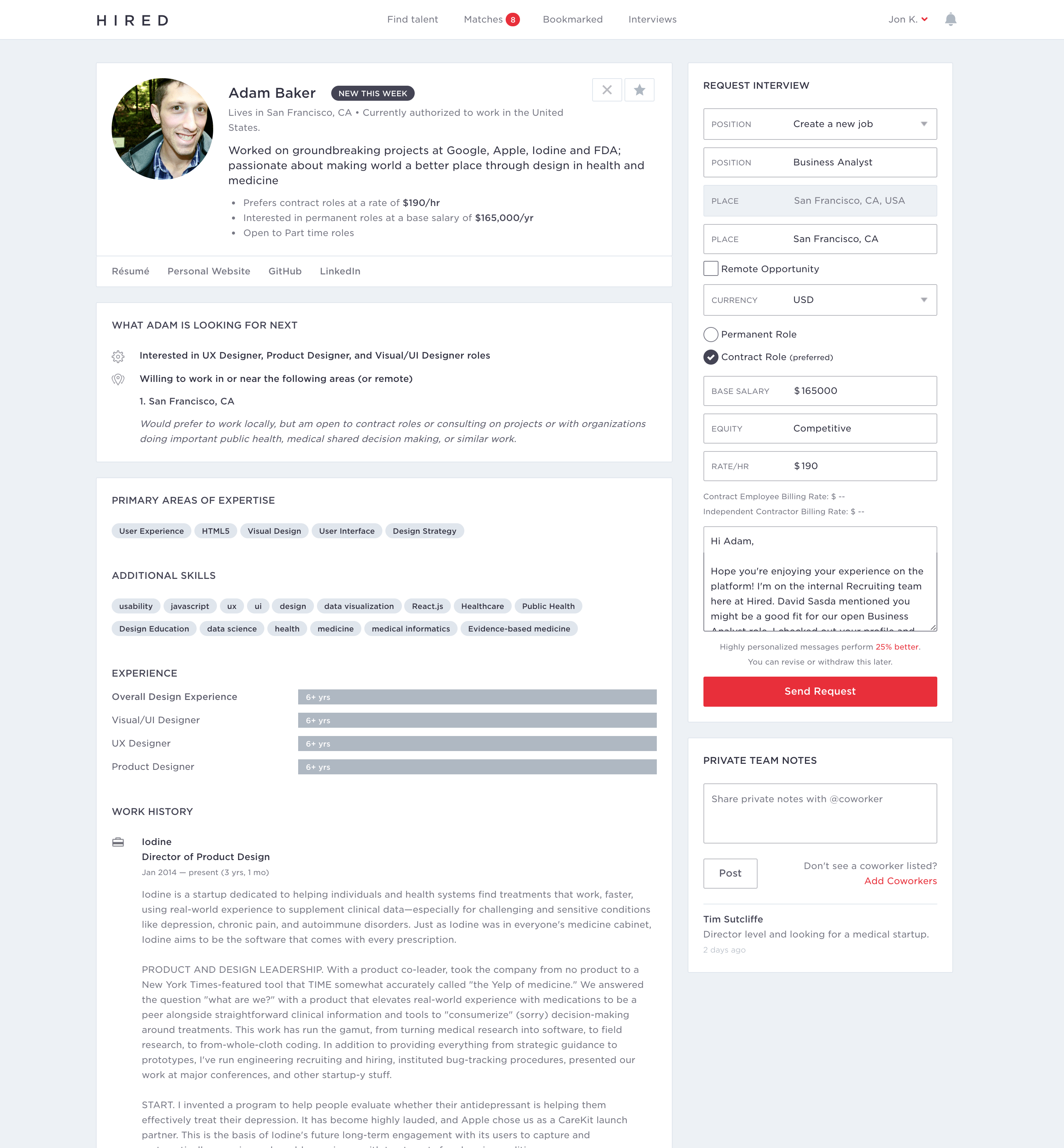
Hired is an opportunity marketplace that serves knowledge-workers in cities across the globe. Hired prides itself on its transparent interview process and simplicity of interactions. By letting the clients approach the candidates with offers upfront, it allows for a smoother and easier way to find a great job inside the wonderful world of tech.
I found my job at Hired through Hired, which allowed me to directly influence a product that I loved and trusted.
Candidate-Side Work
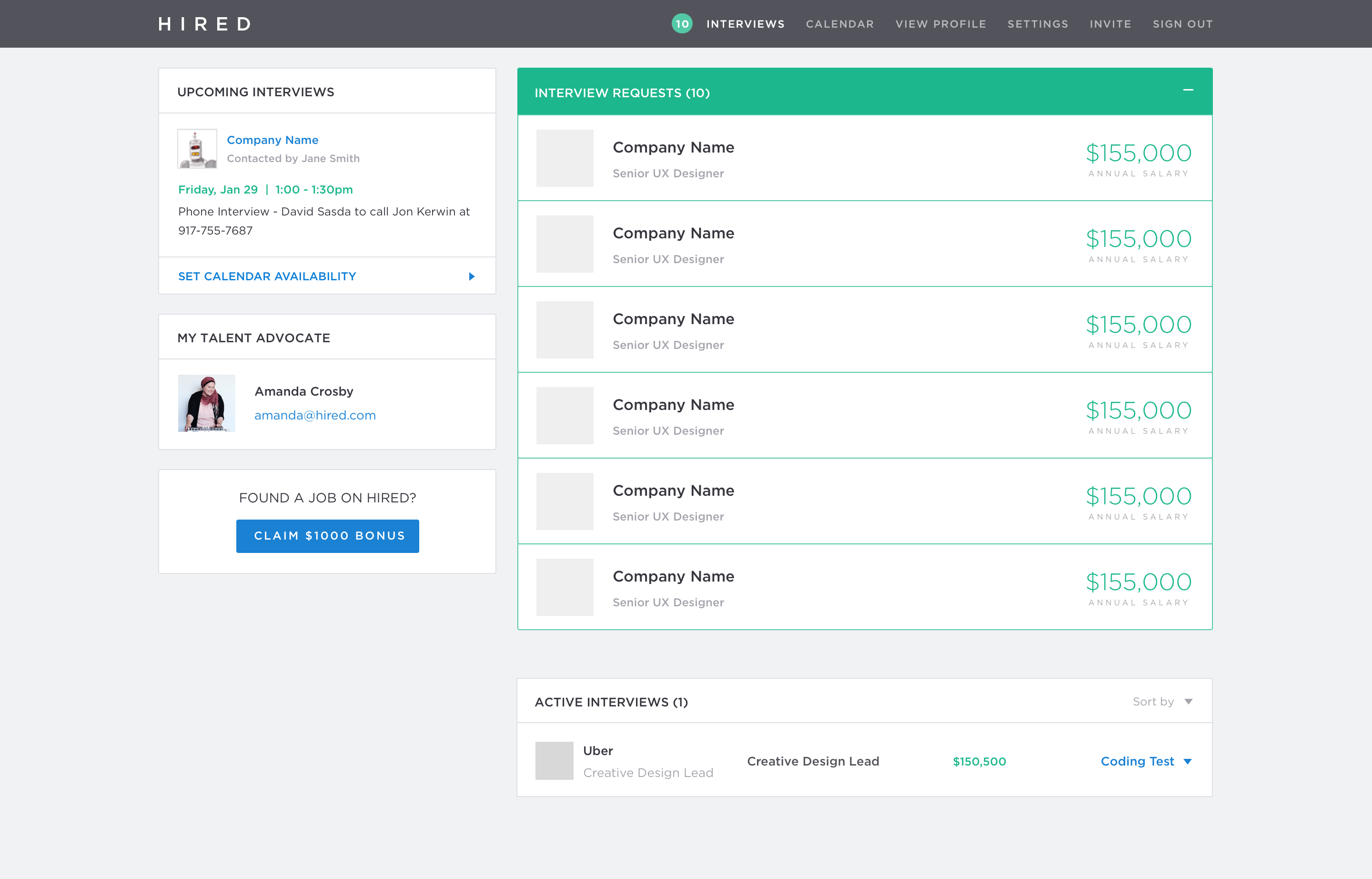
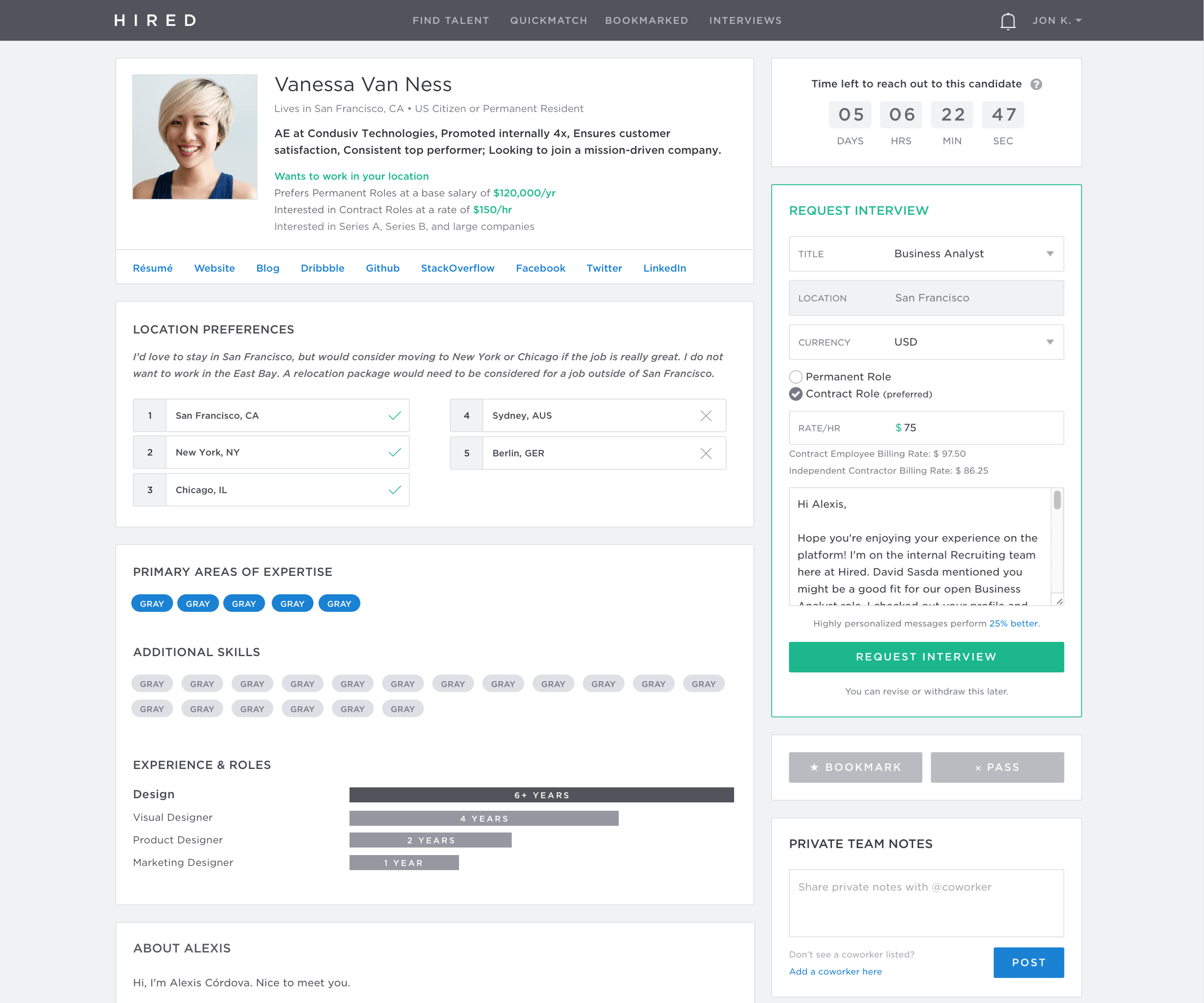
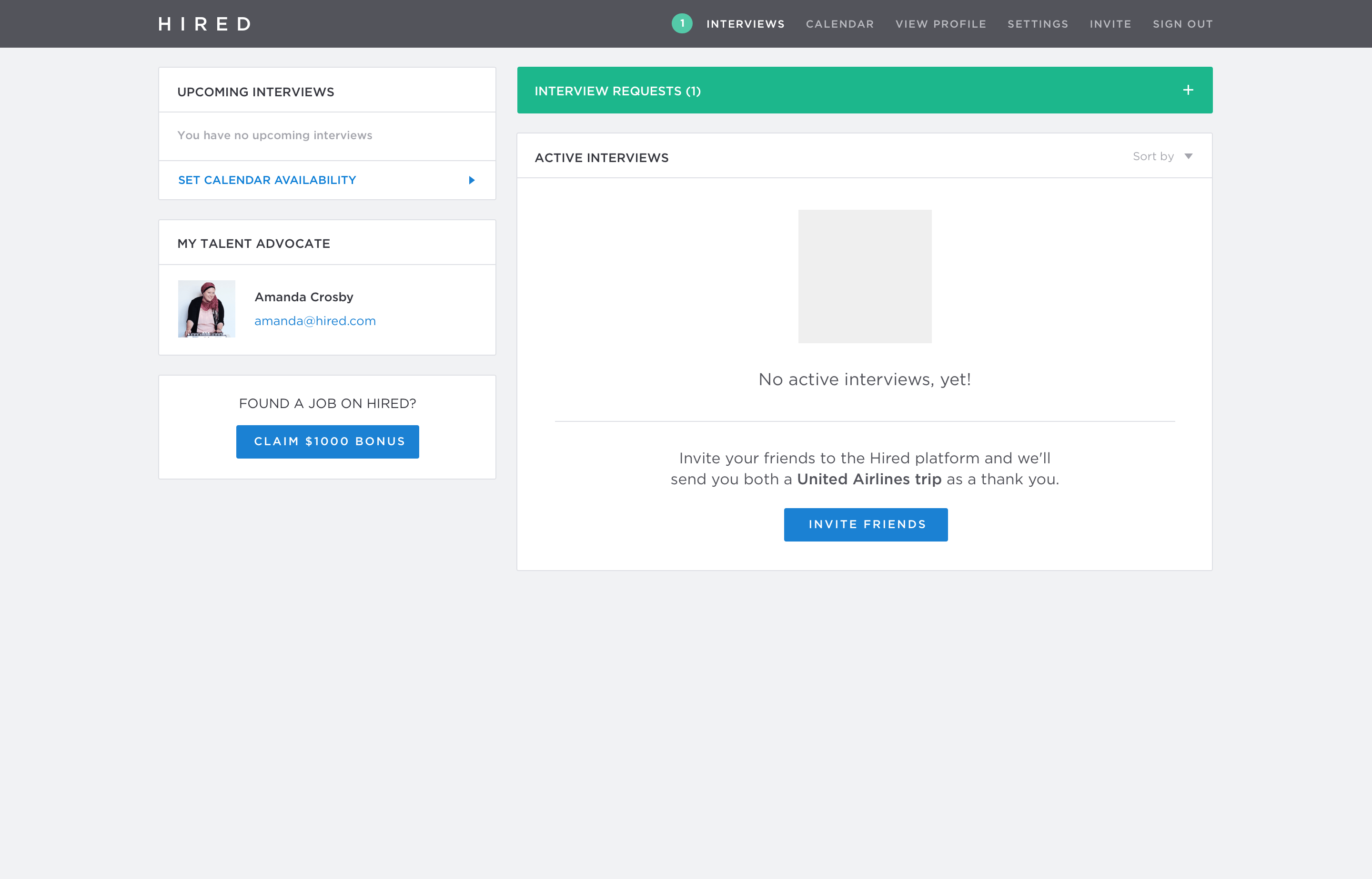
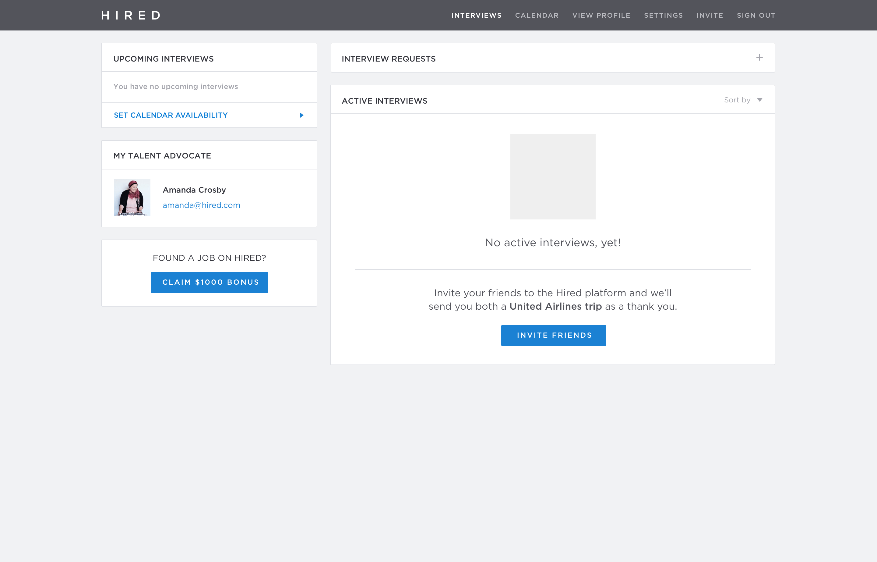
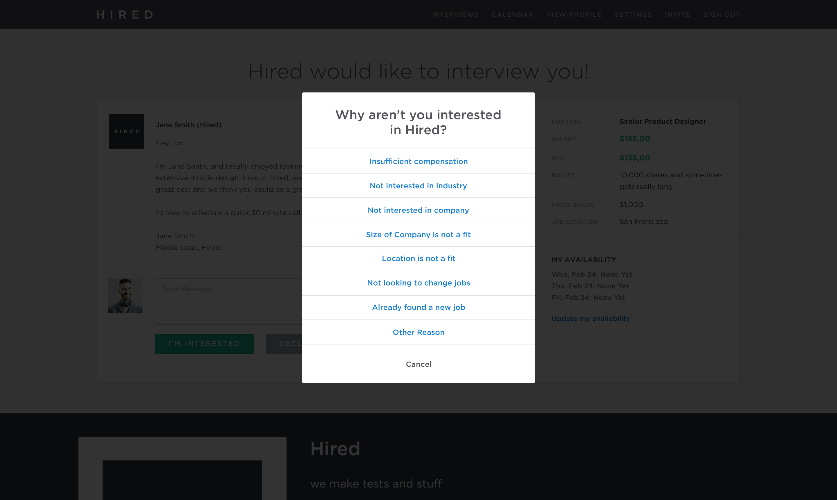
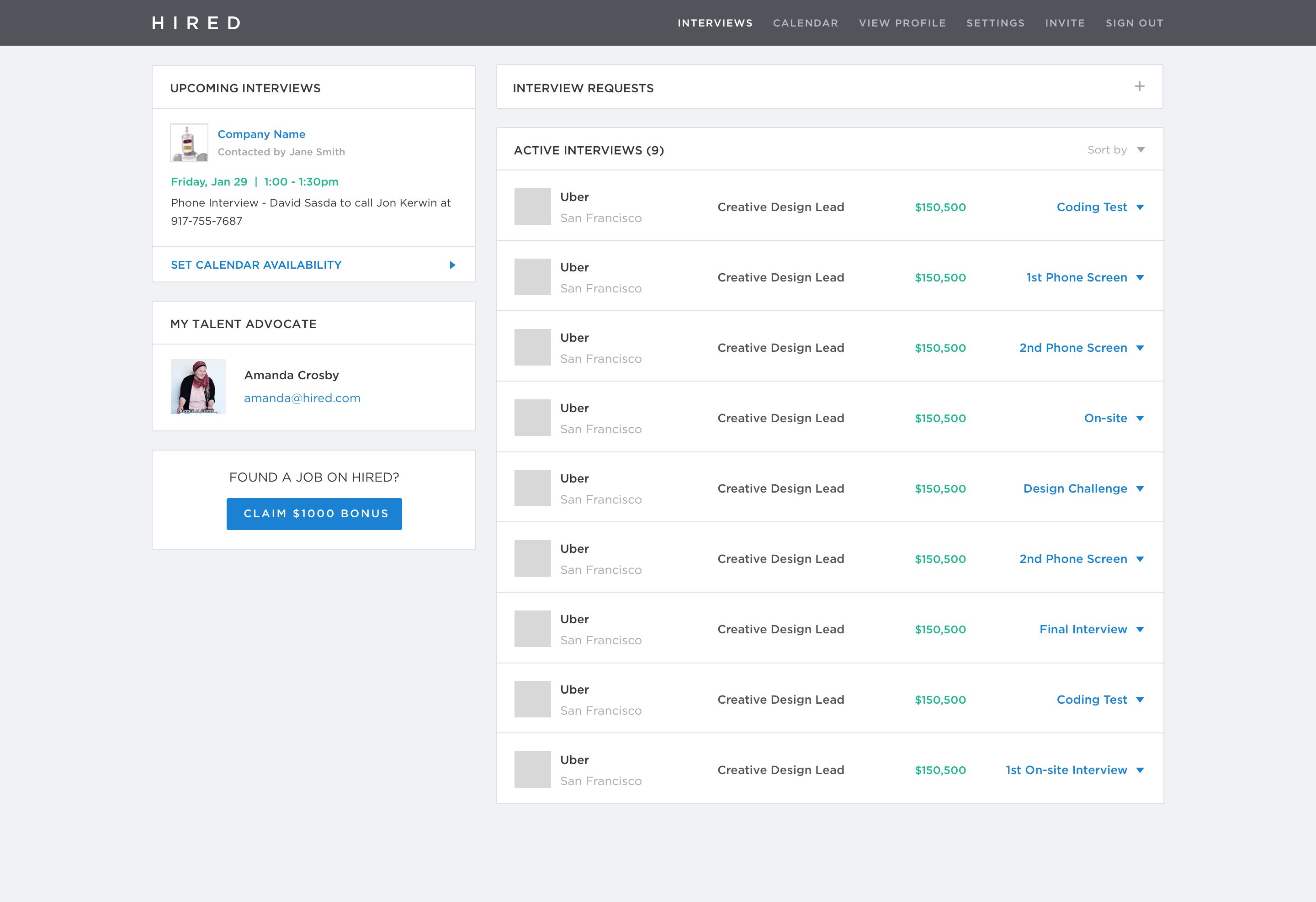
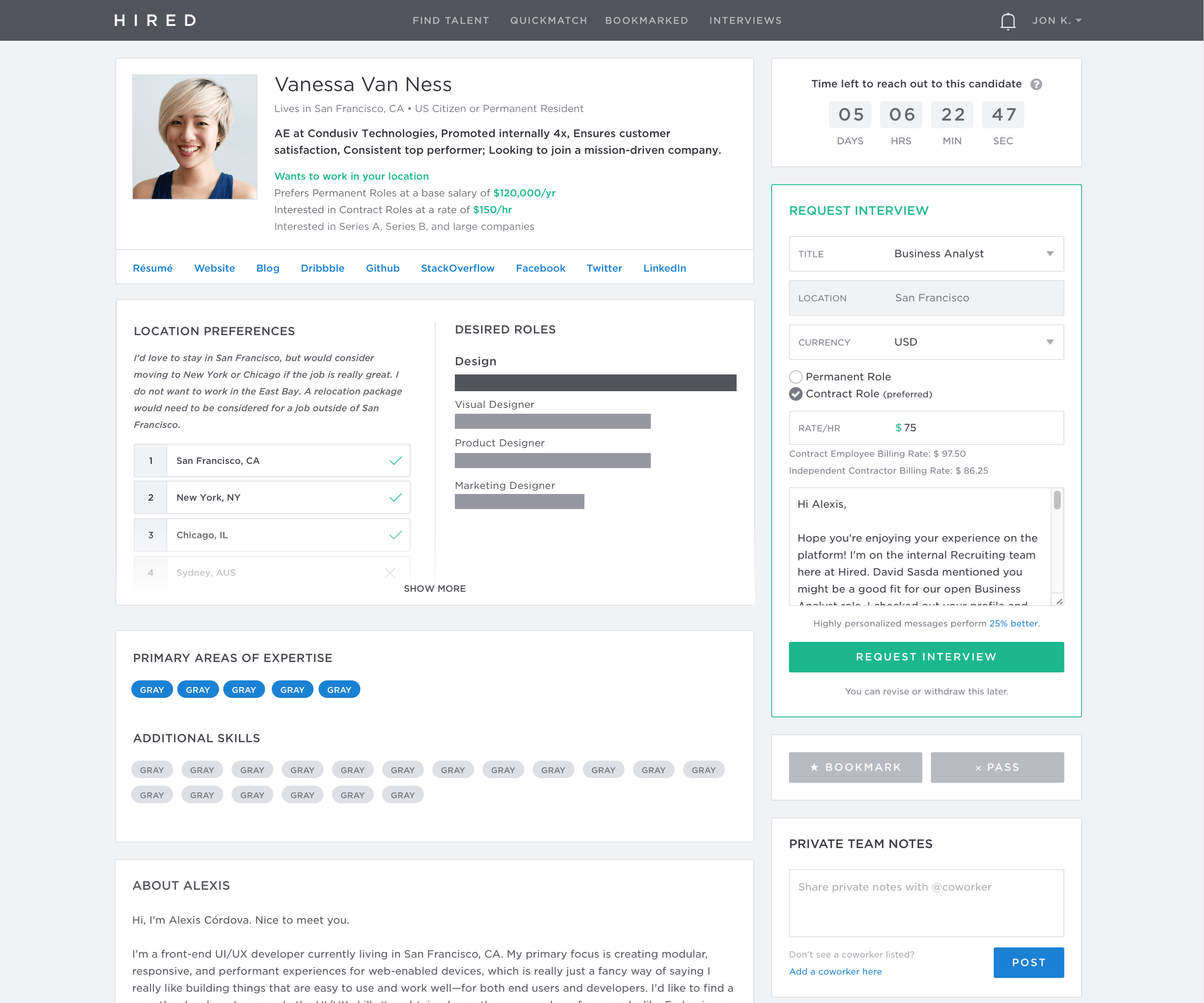
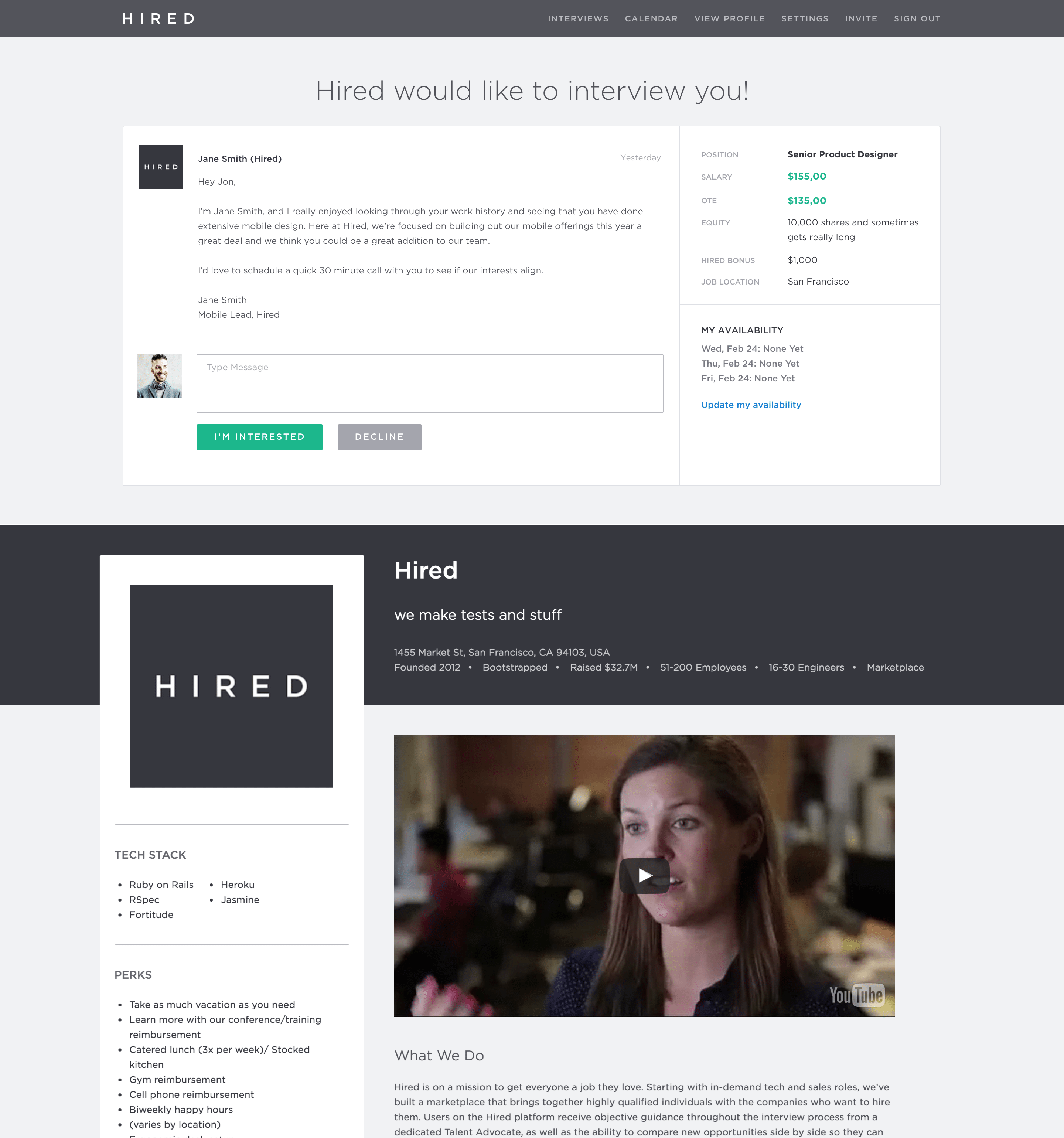
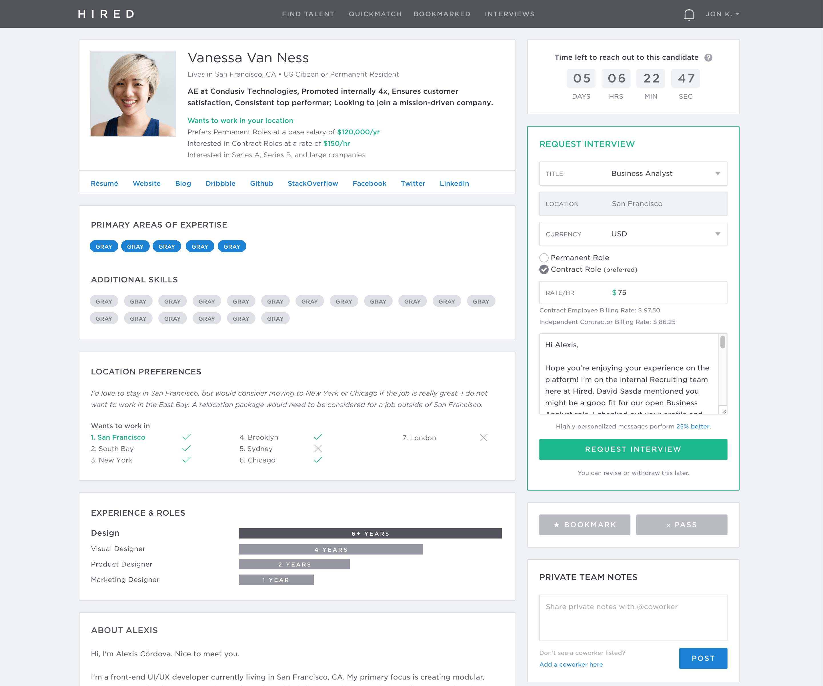
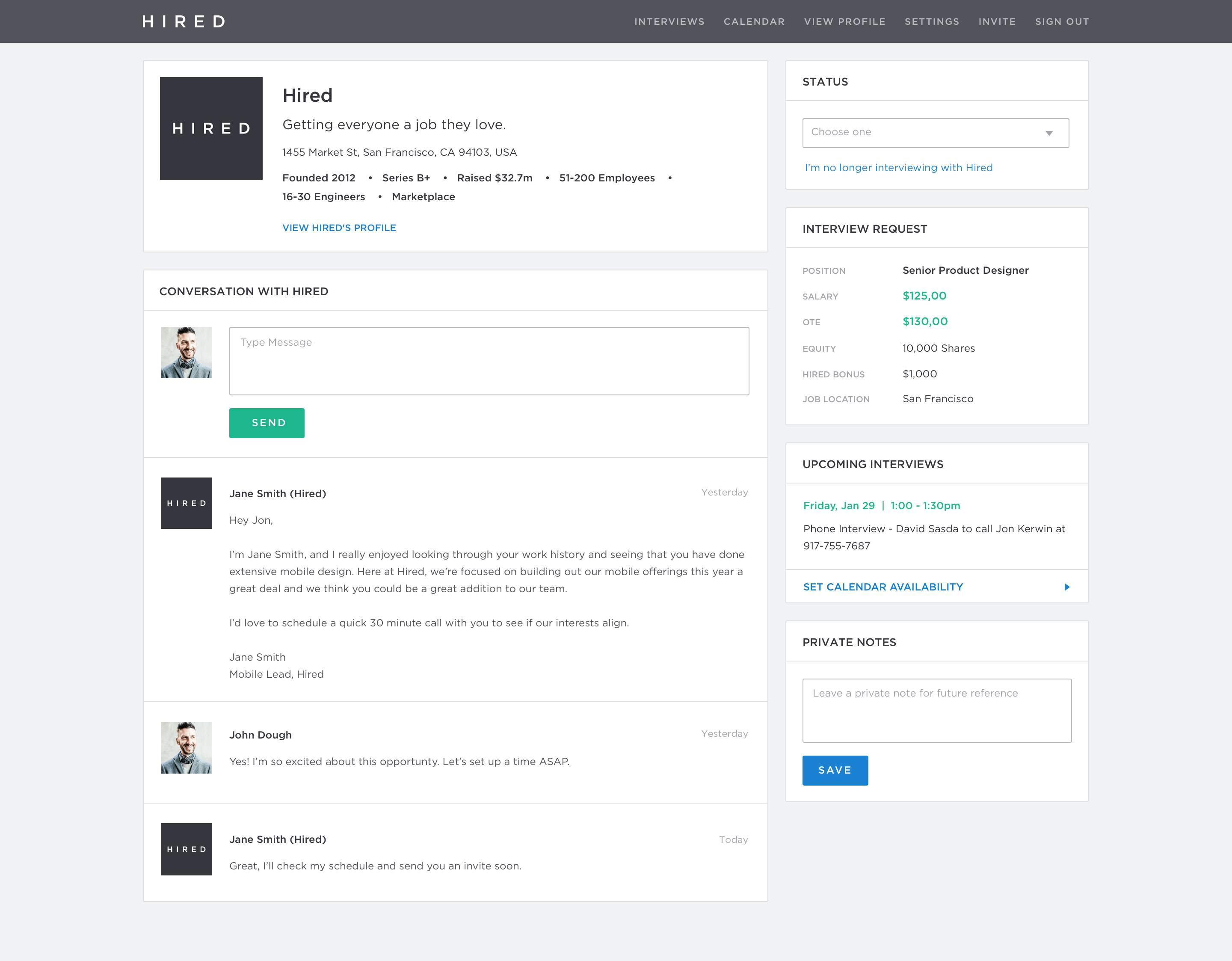
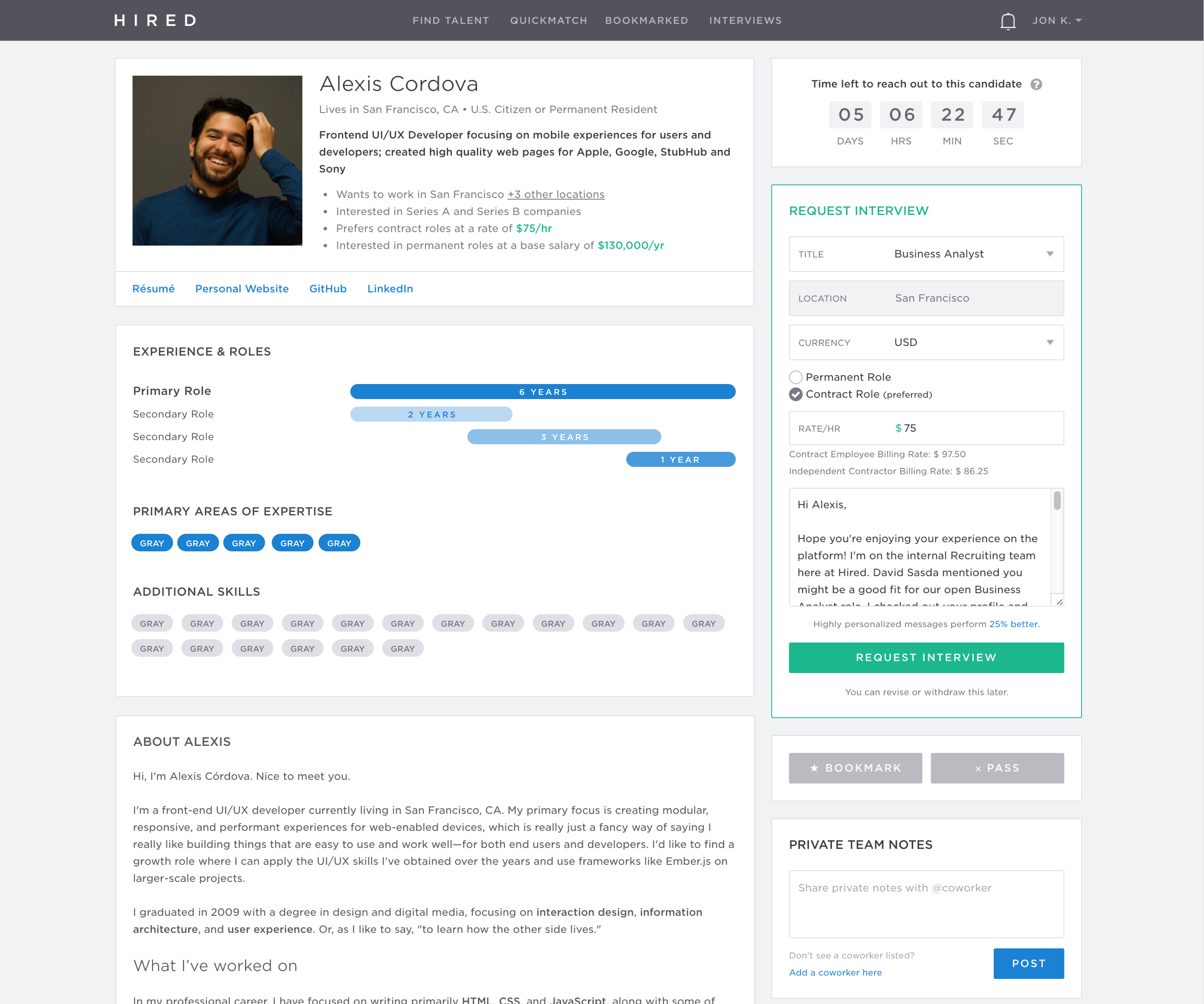
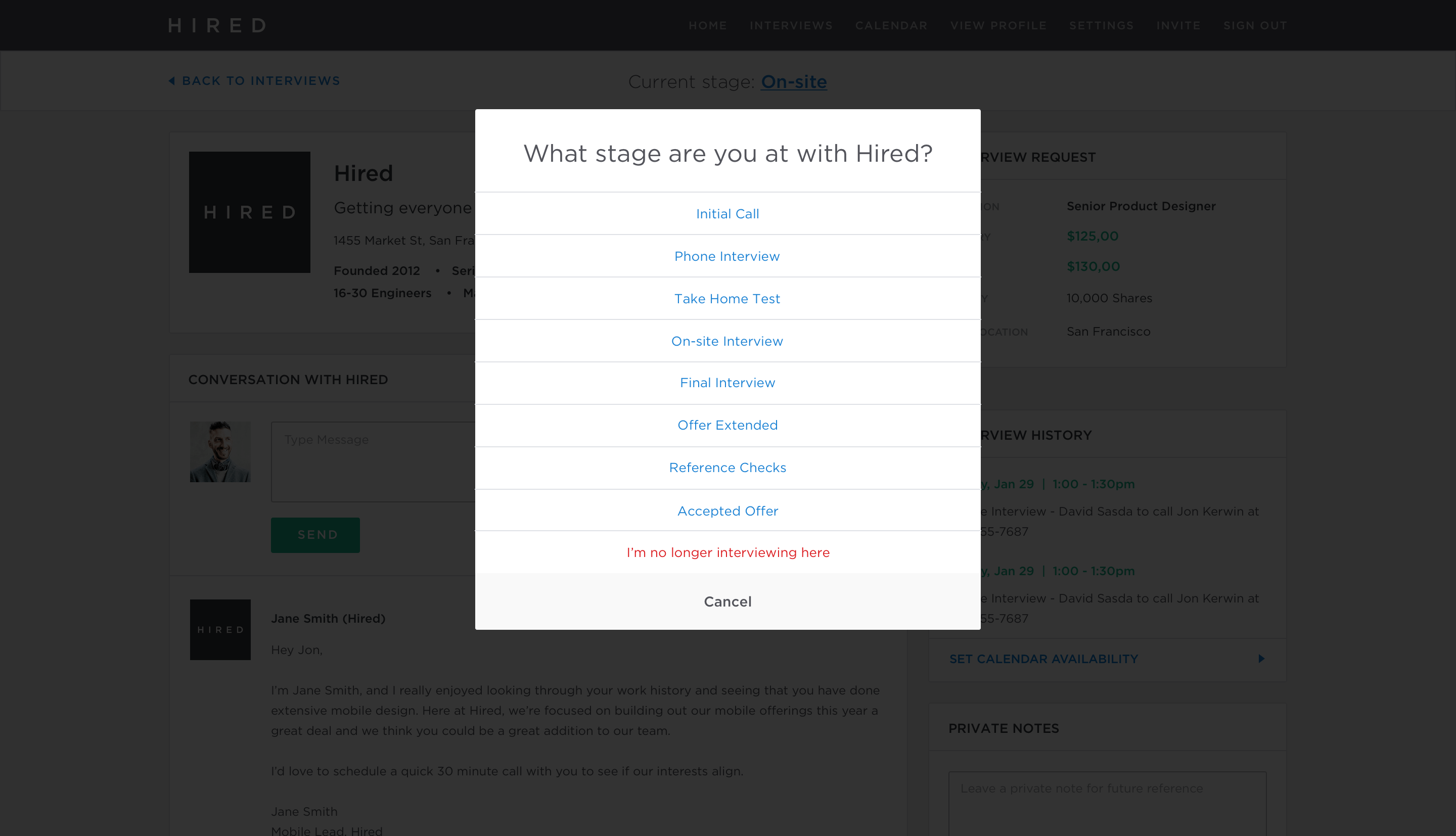
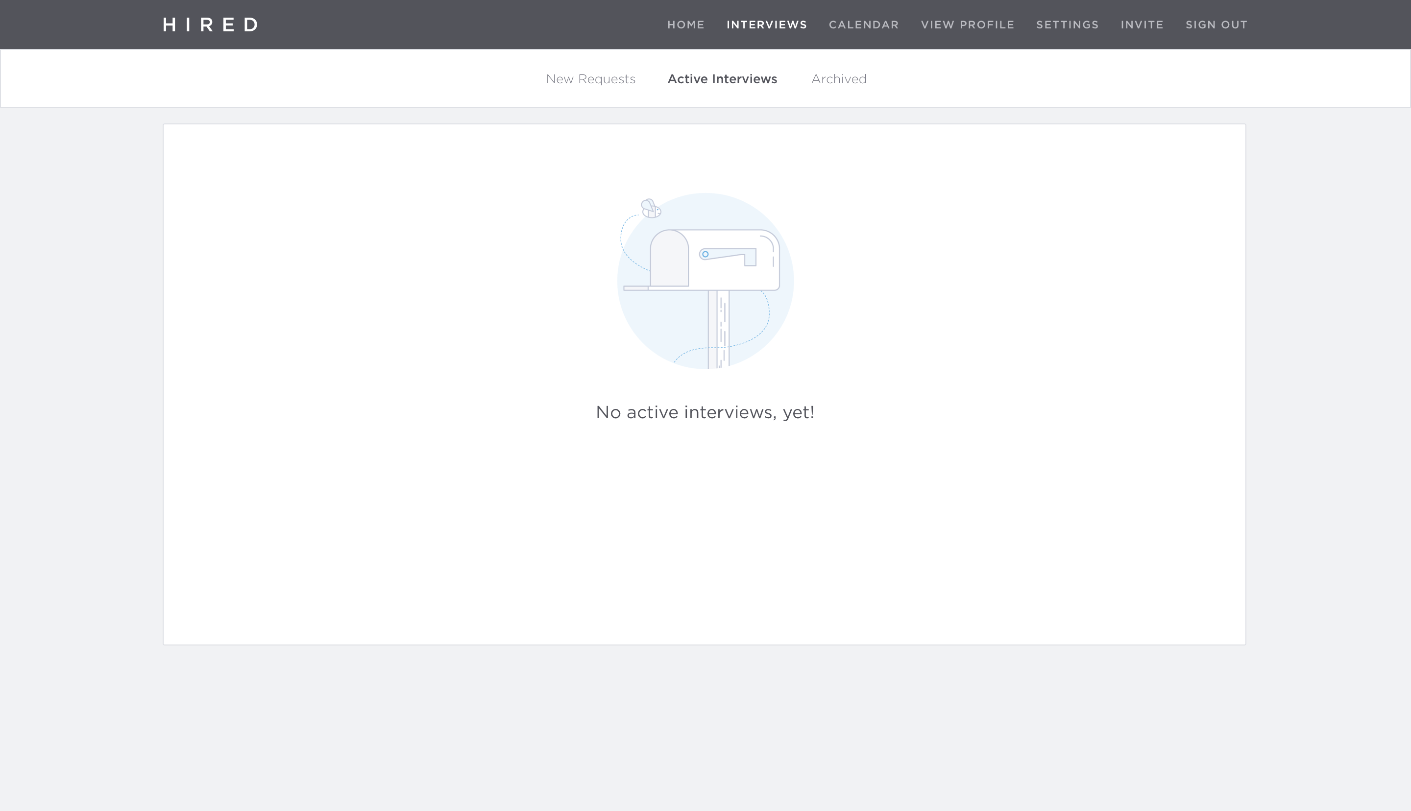
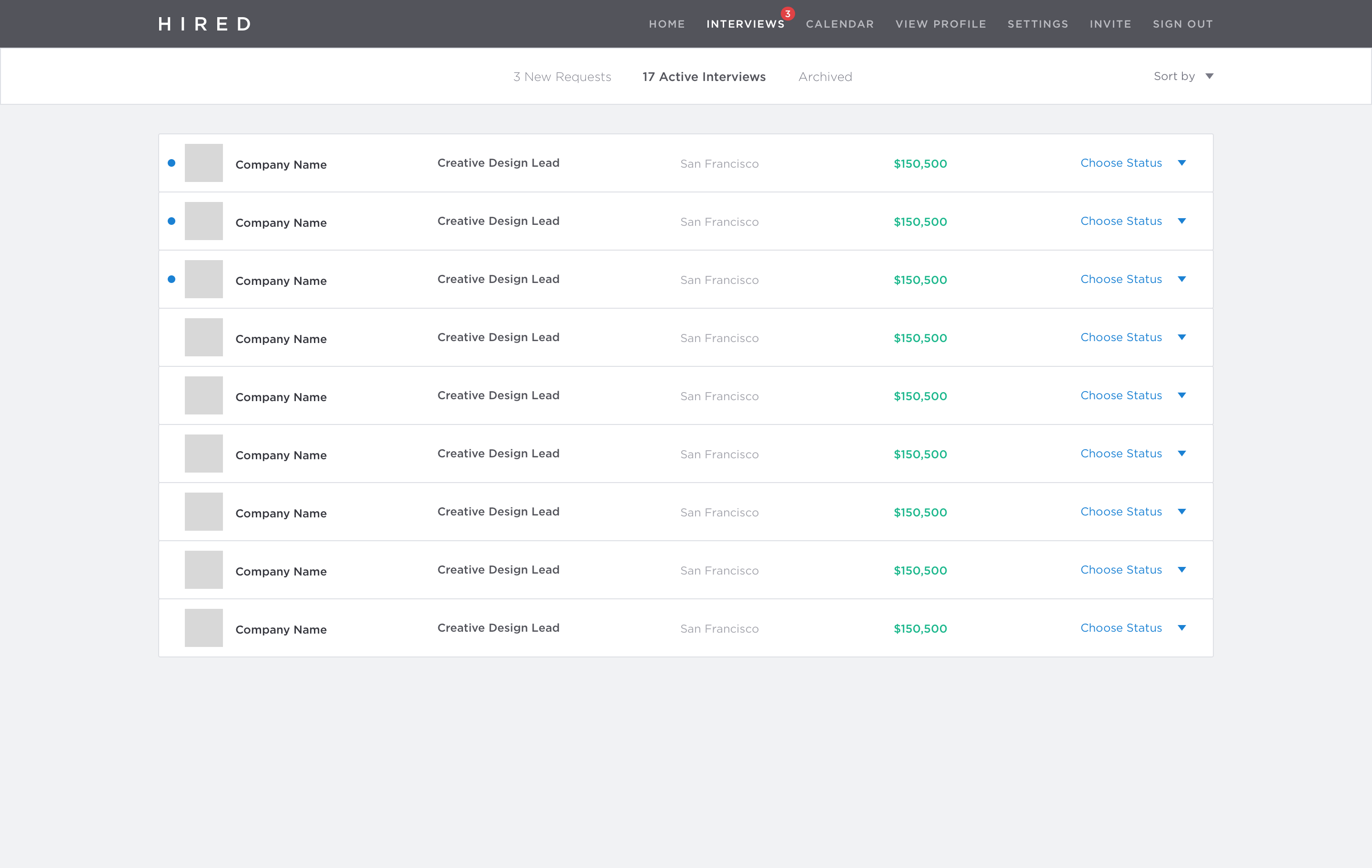
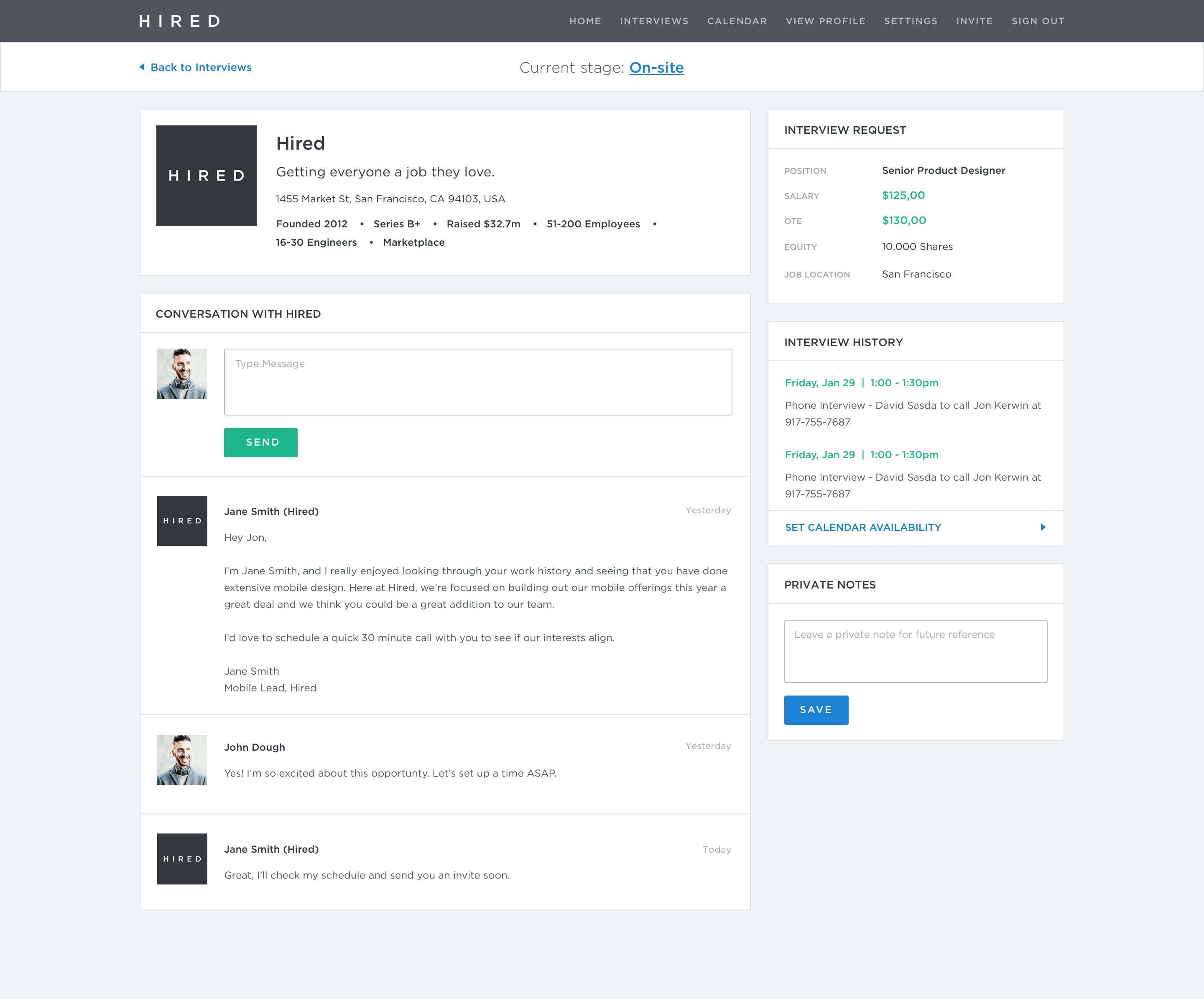
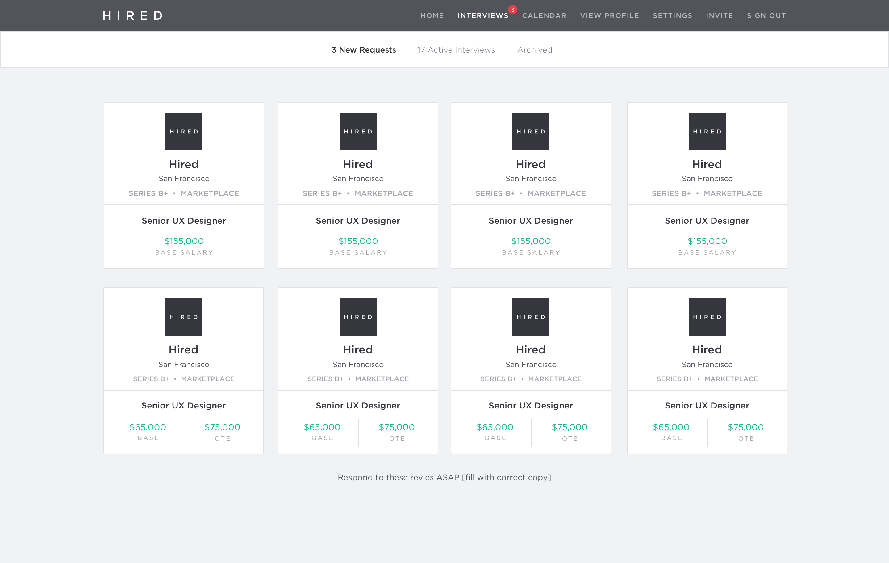
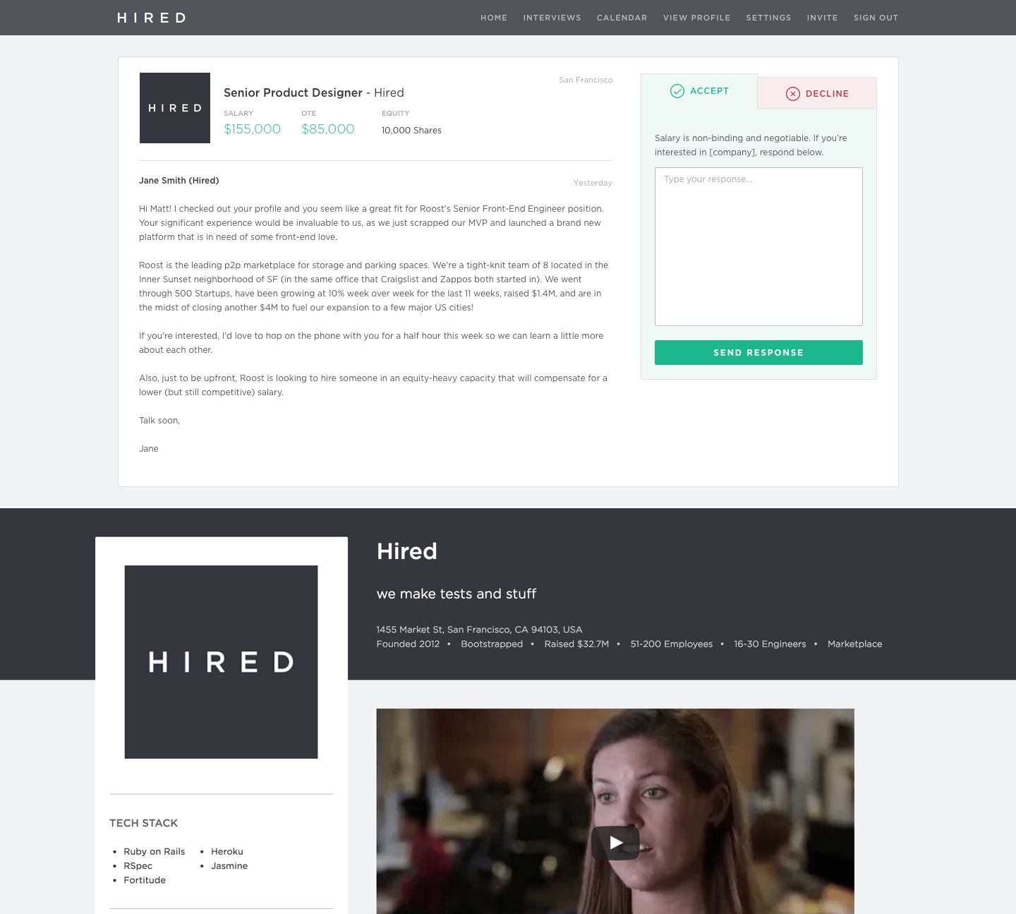
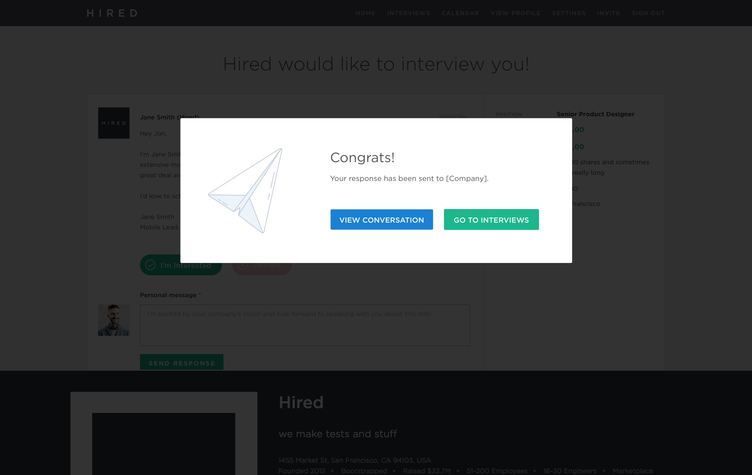
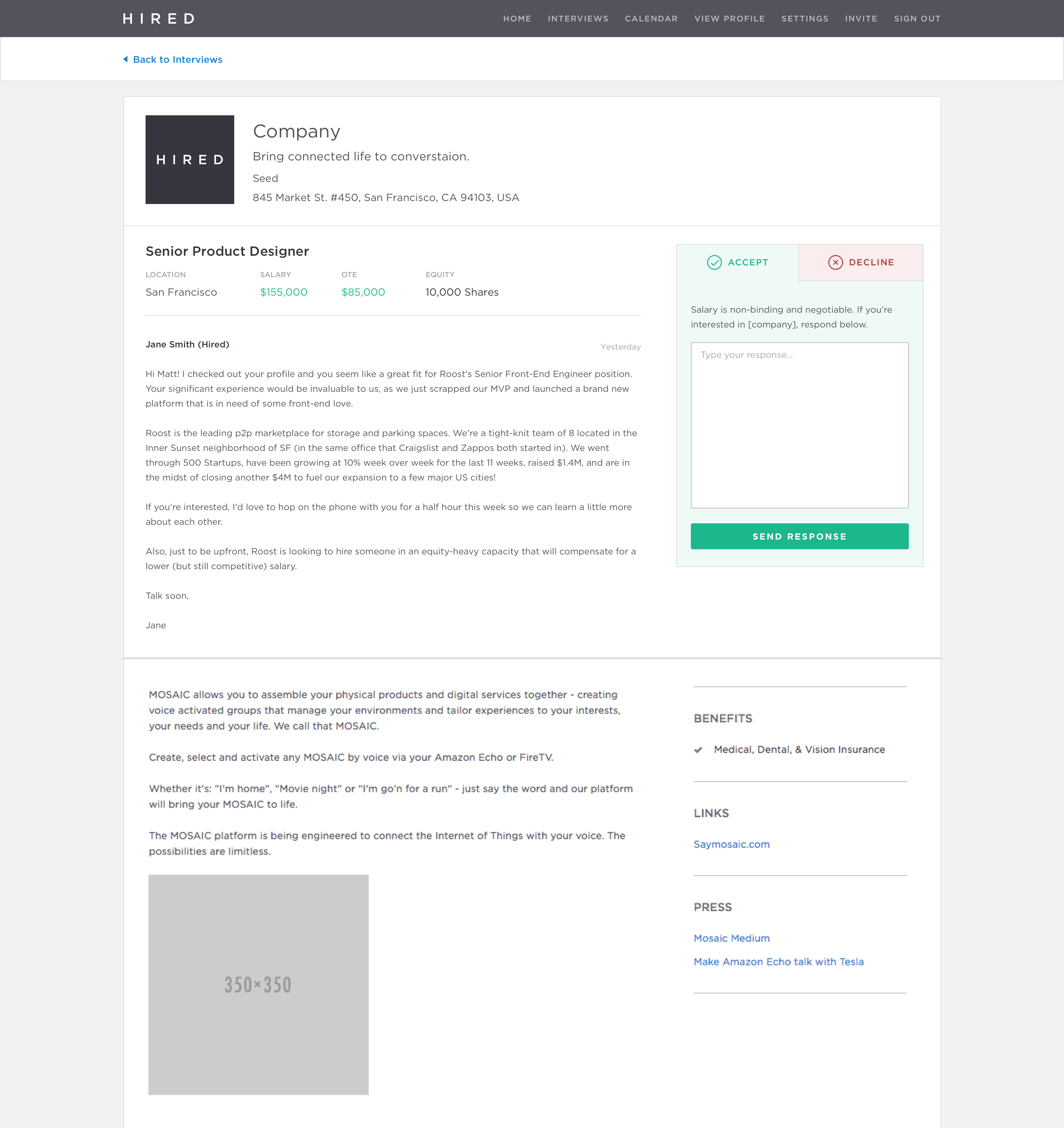
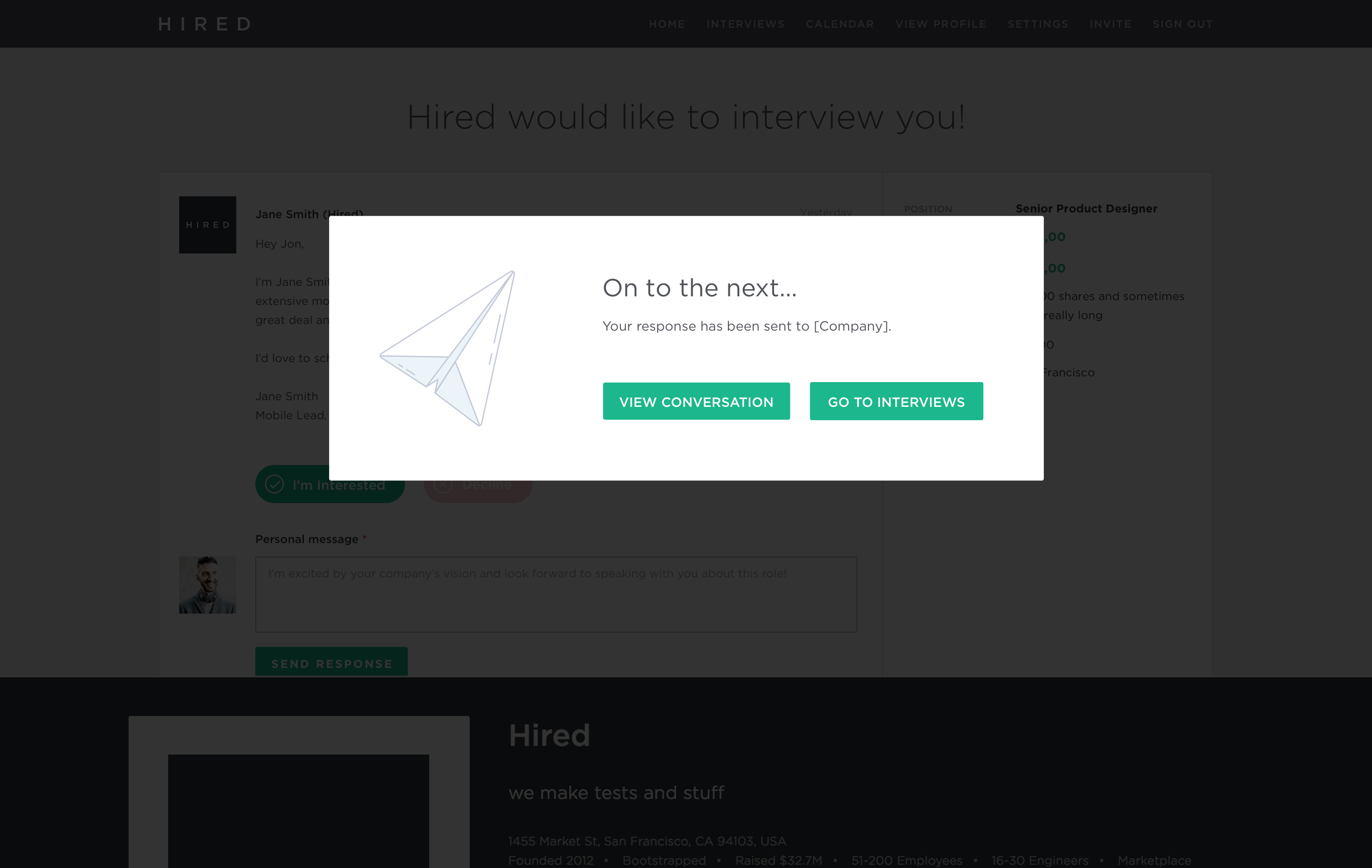
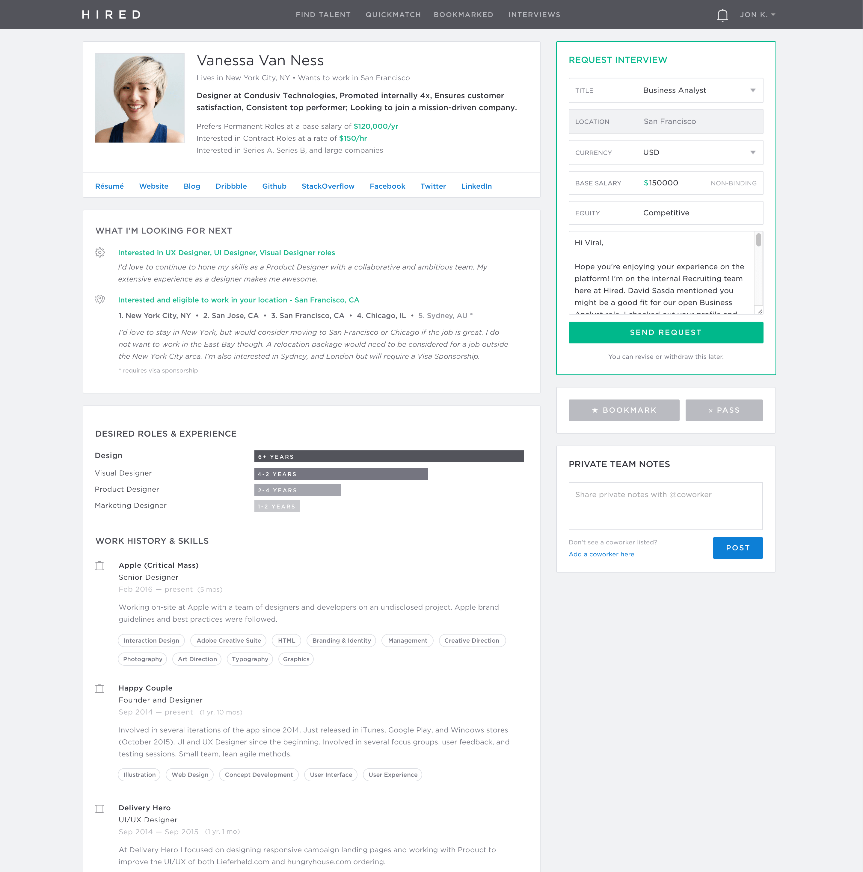
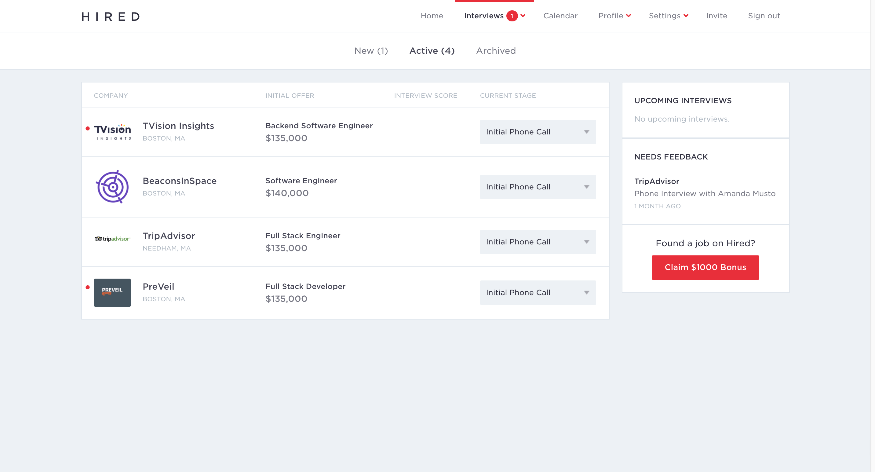
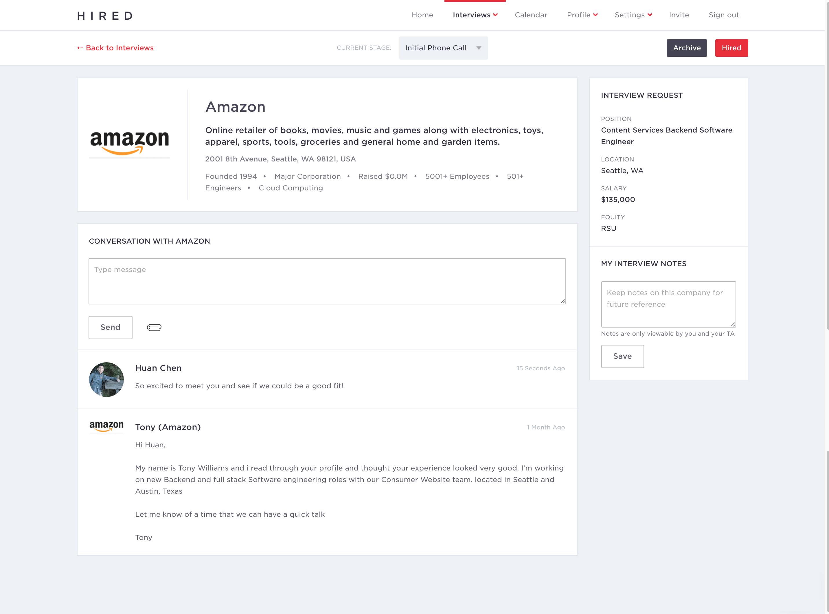
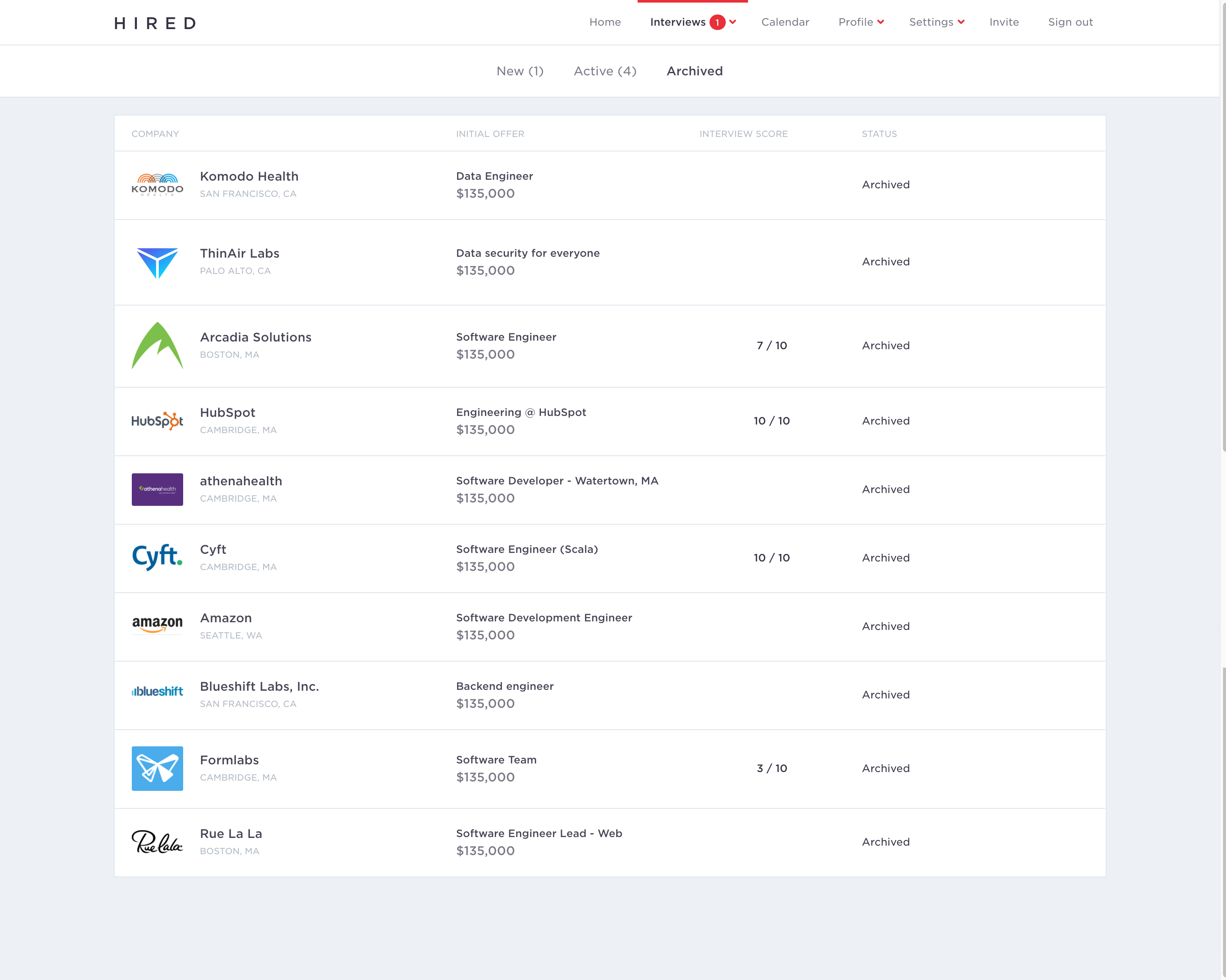
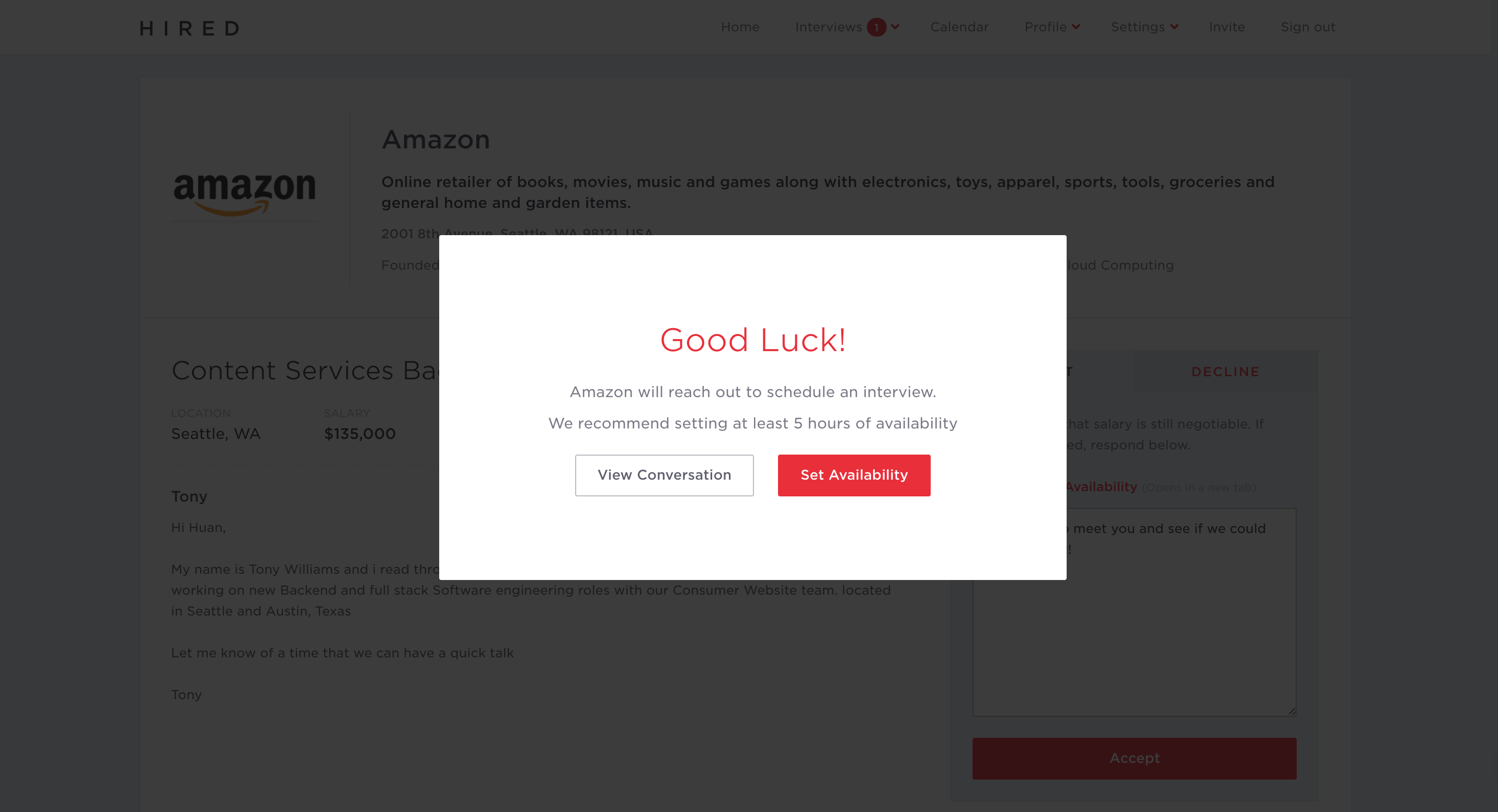
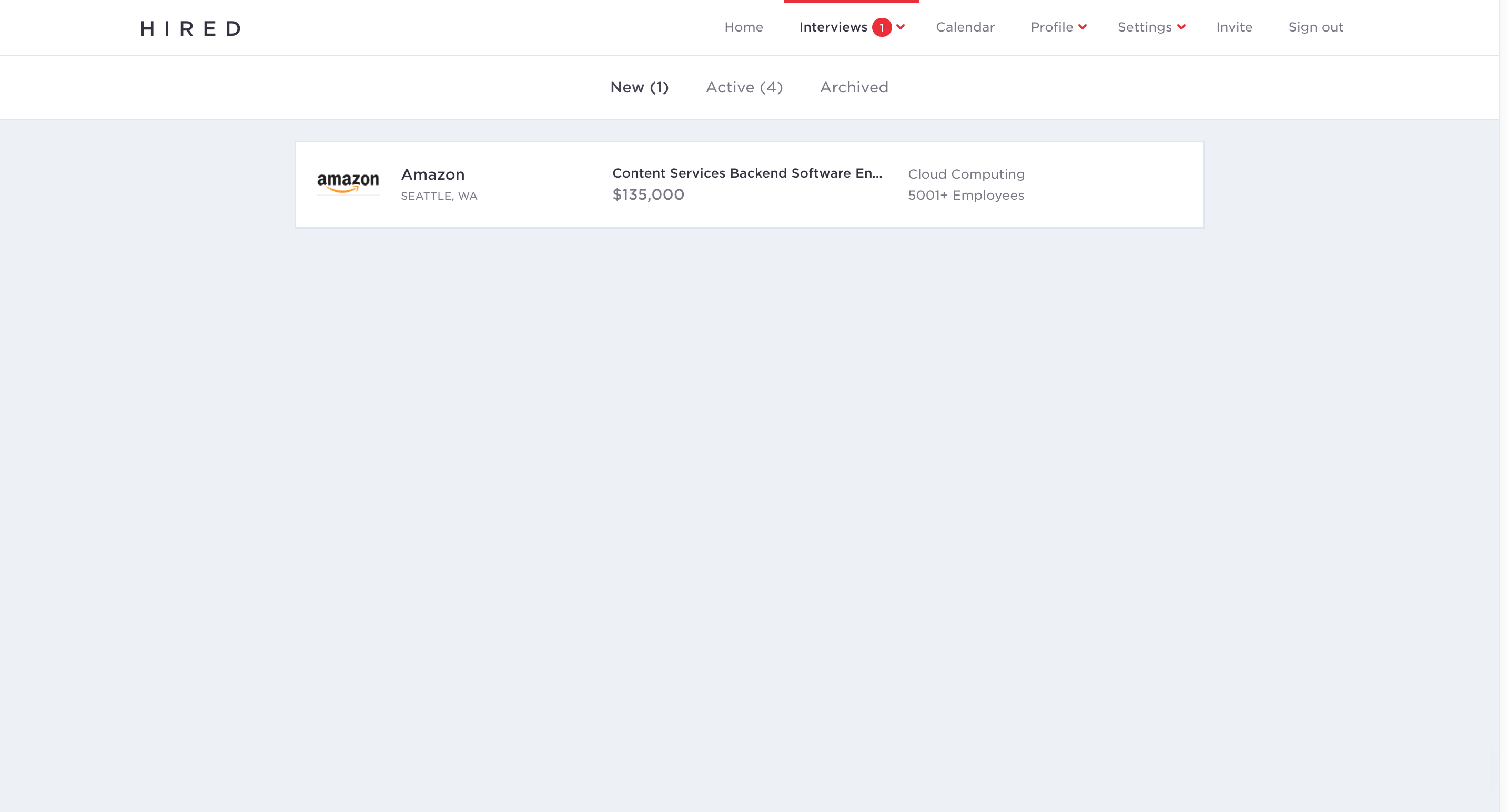
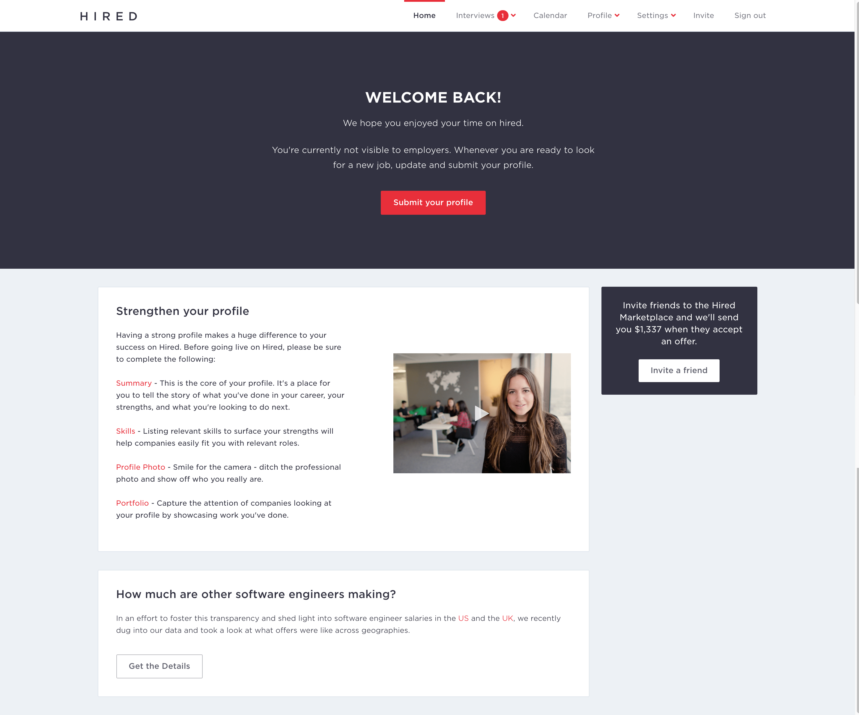
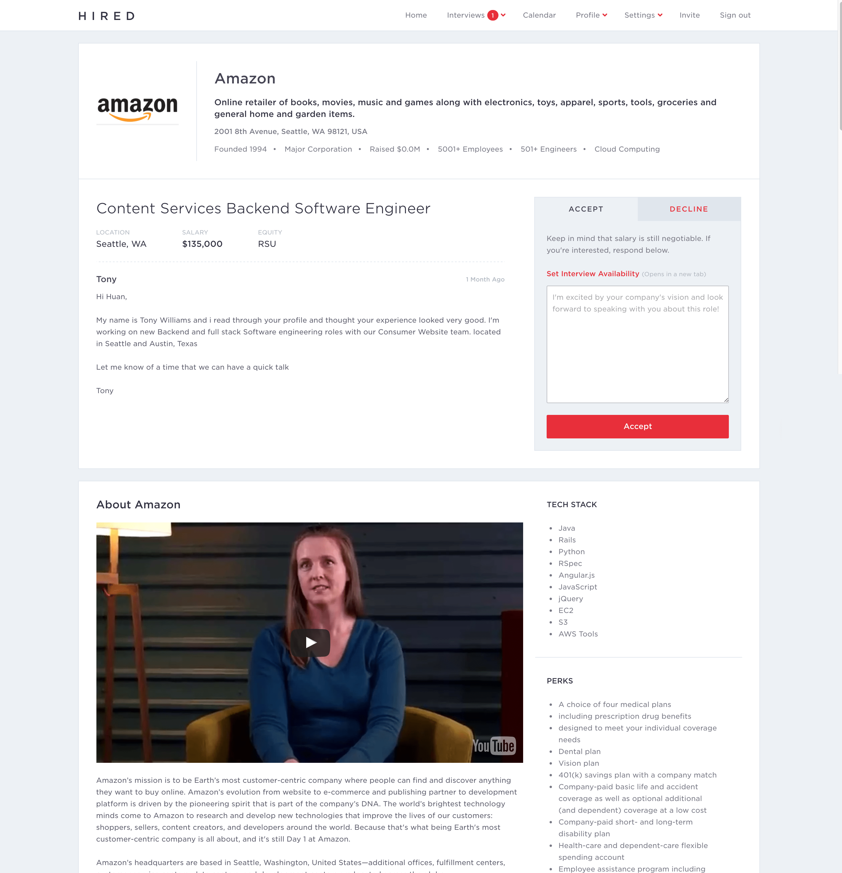
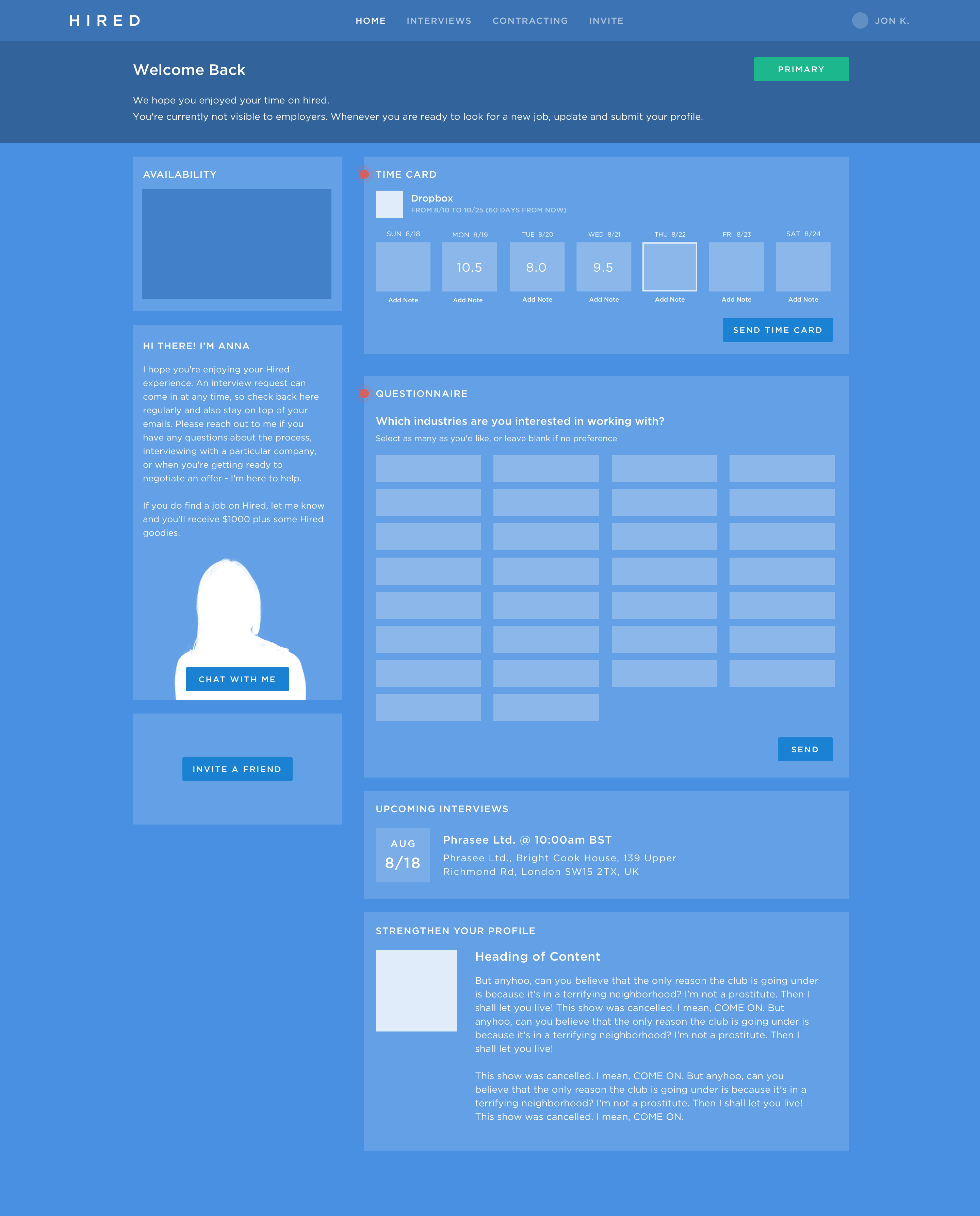
My first task at Hired was to redesign the candidate-side interview app and locations section of the candidate profile. The interviews app is the main area where candidates receive interview requests, communicate with prospective employers, and plan out the interview process. After having some time to dissect where we where, I sat down with the PM who laid out some goals of the new iteration:
• Surface information for each stage of the interview process
• Increase ability to compare offers
• Integrate an mvp hub experience
• Make new iteration more mobile-friendly
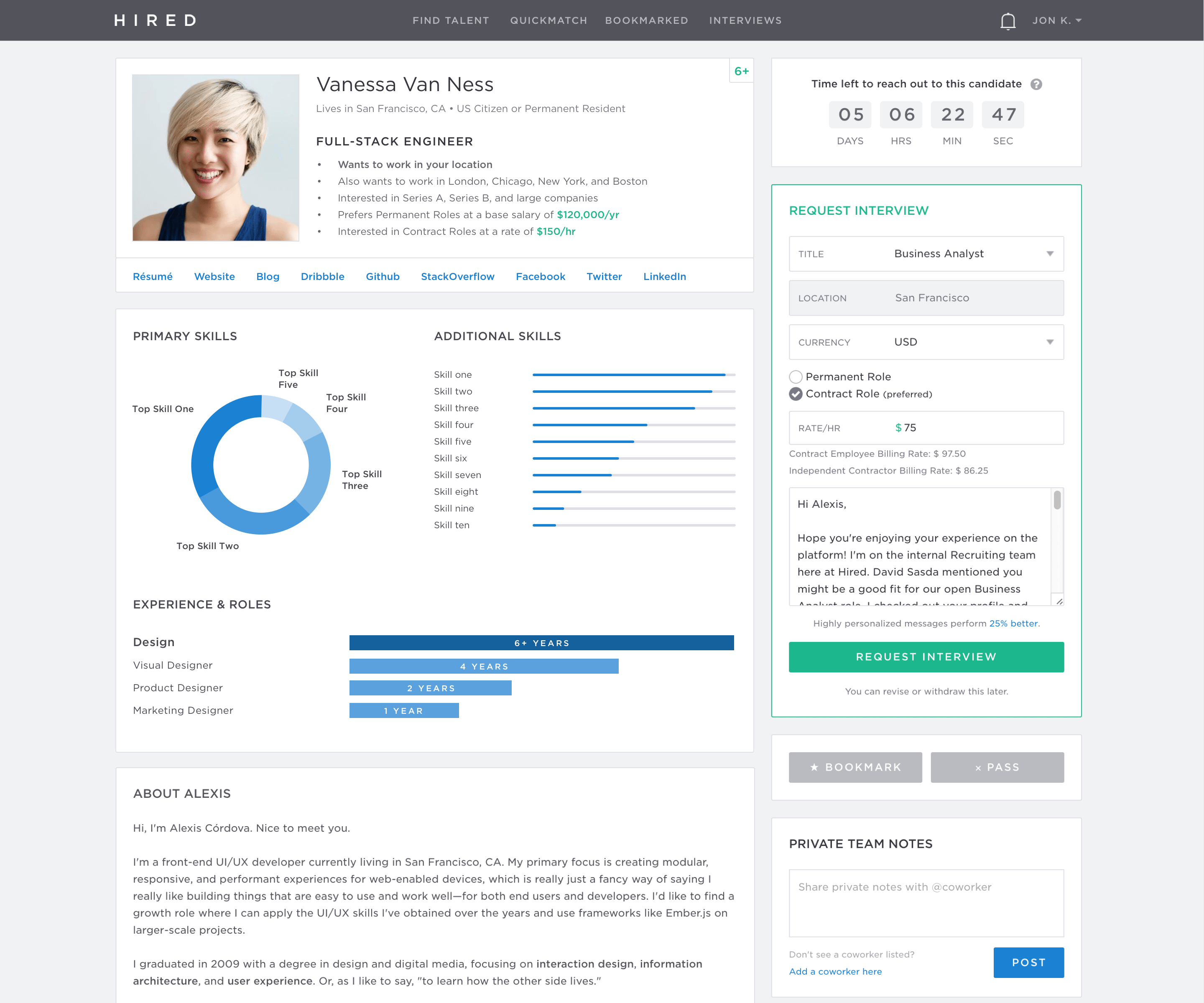
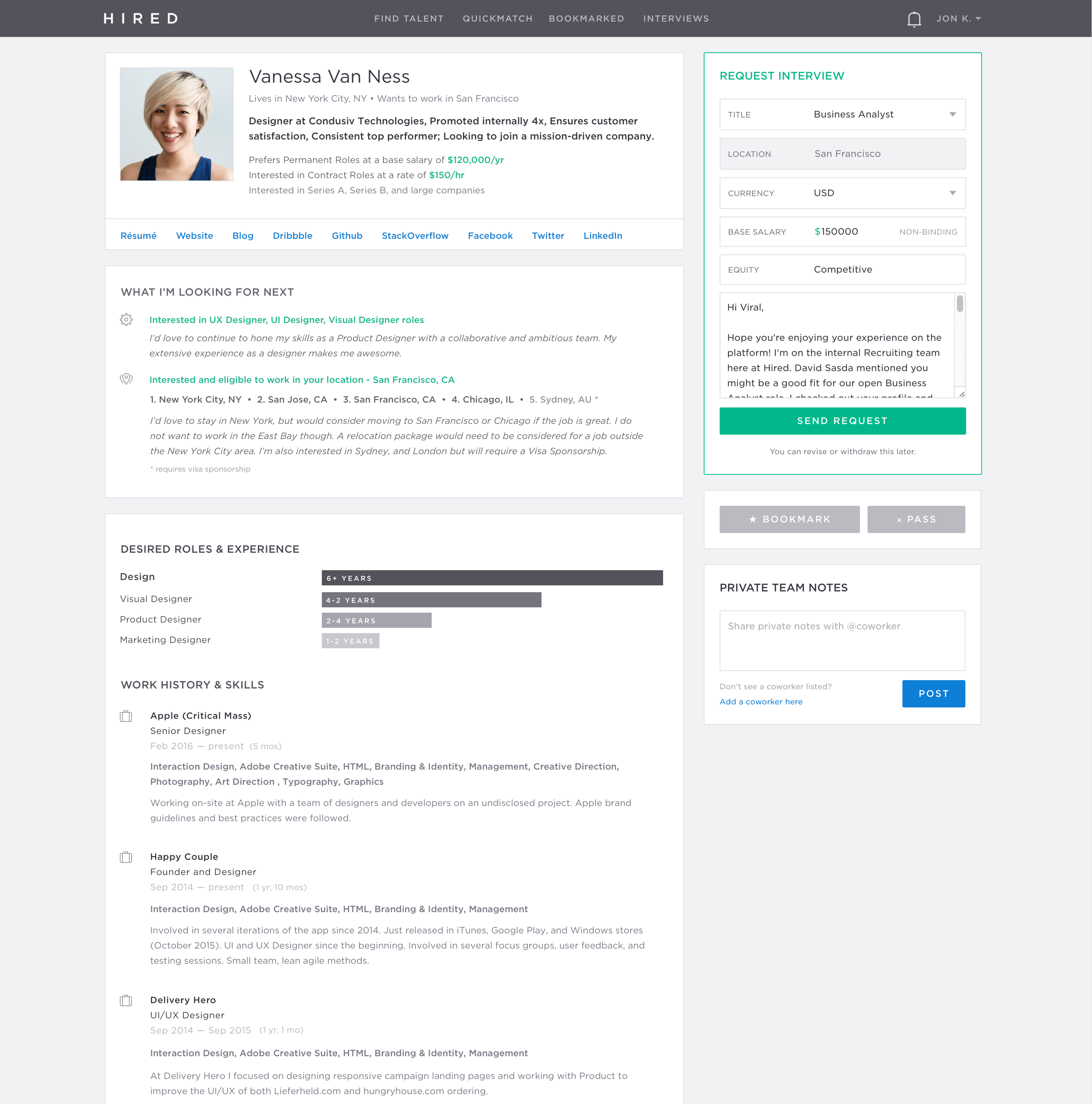
• Integrate a candidate's location preferences into onboarding and profile
Users: All candidates, most likely software developers and some designers. Need to access IVRs quickly on mobile, communicate with clients, and navigate the interview process. Appreciate simplicity, function, and efficiency.
Considerations: Some may have 1 IVR, some may have 15+. Hub states are numerous, so needs to stay flexible and simple.
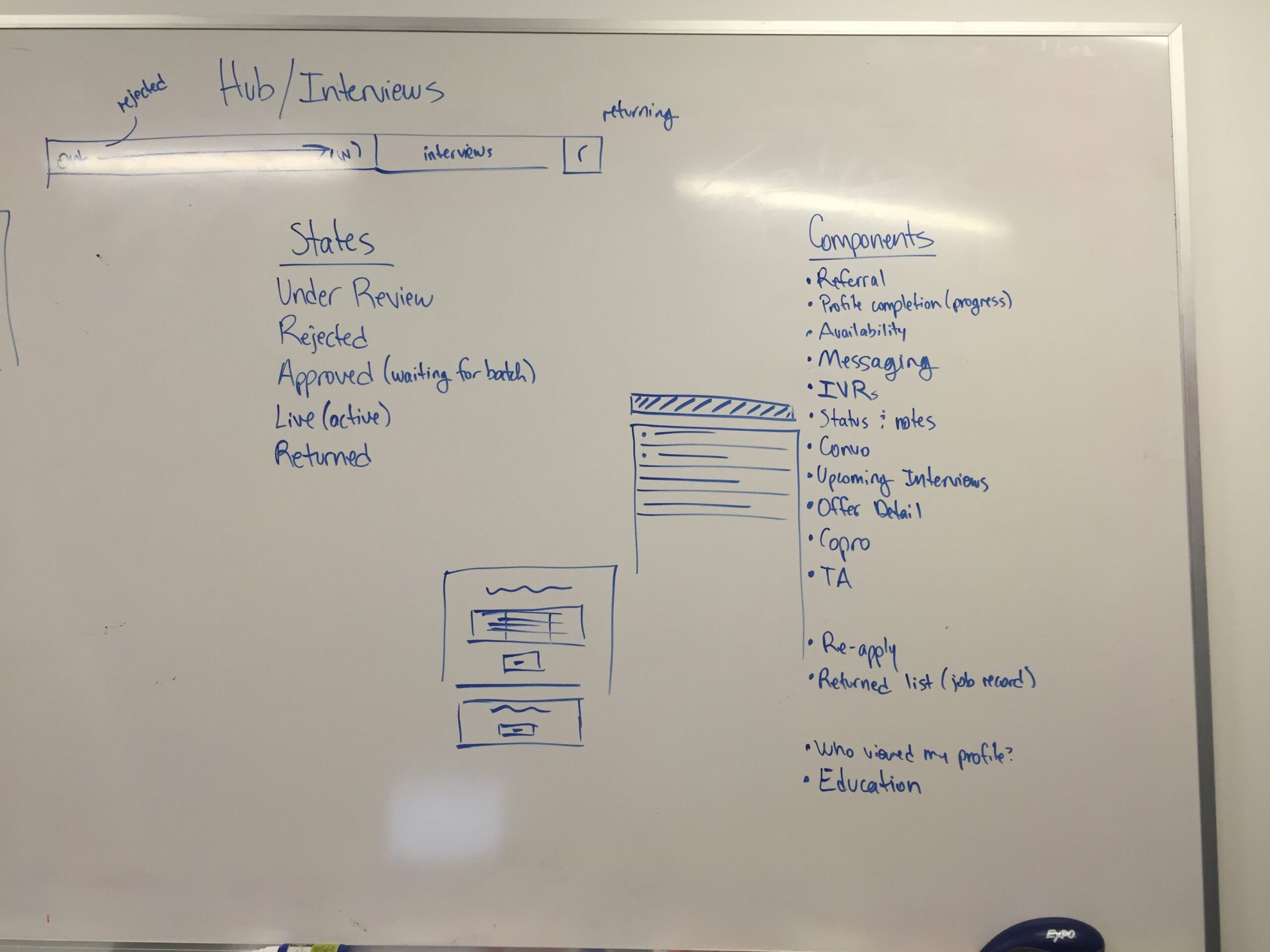
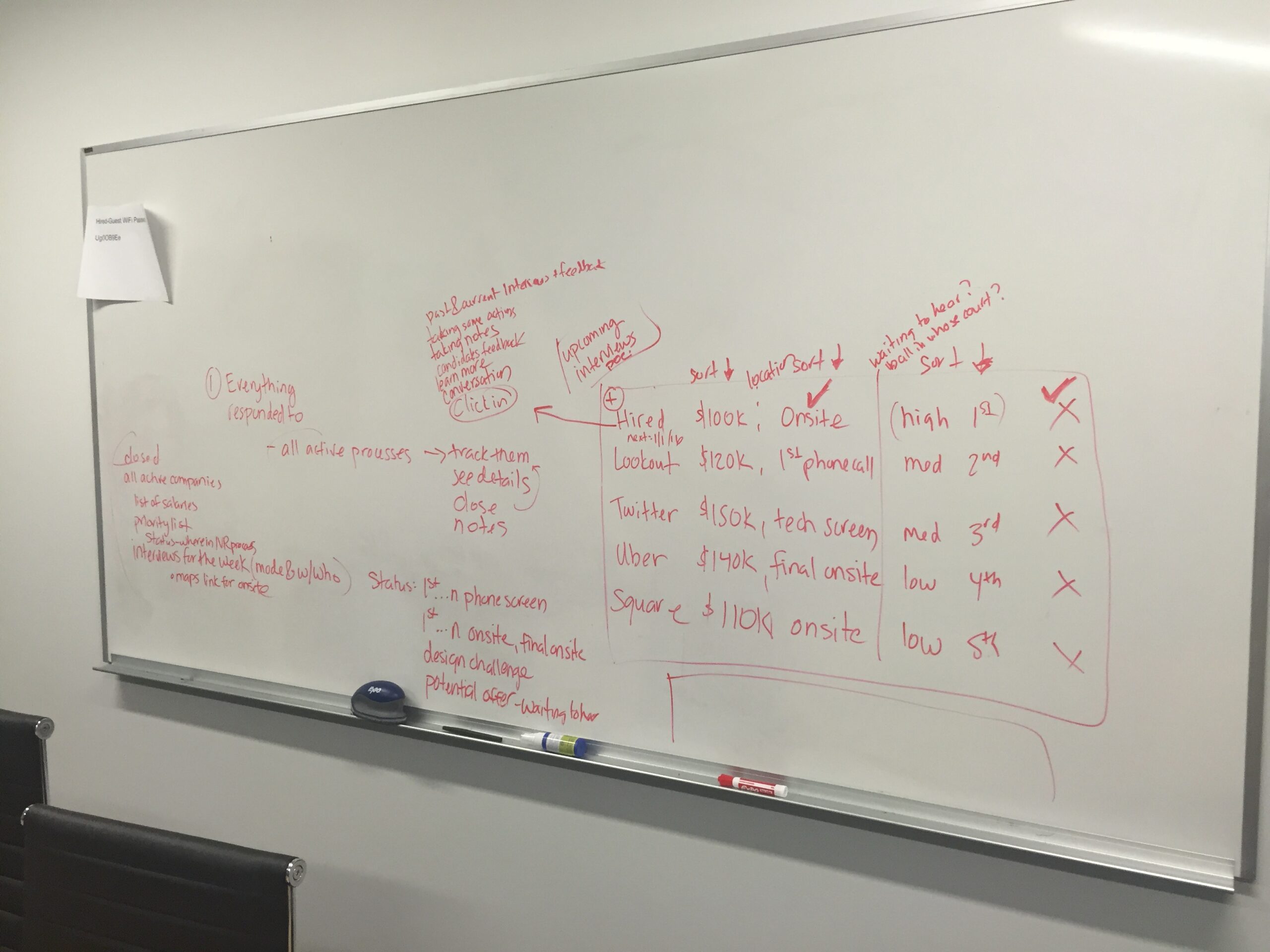
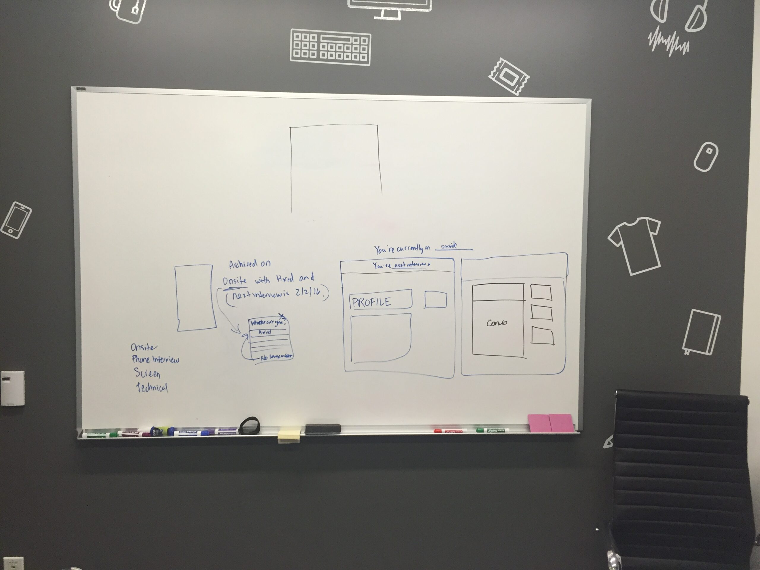
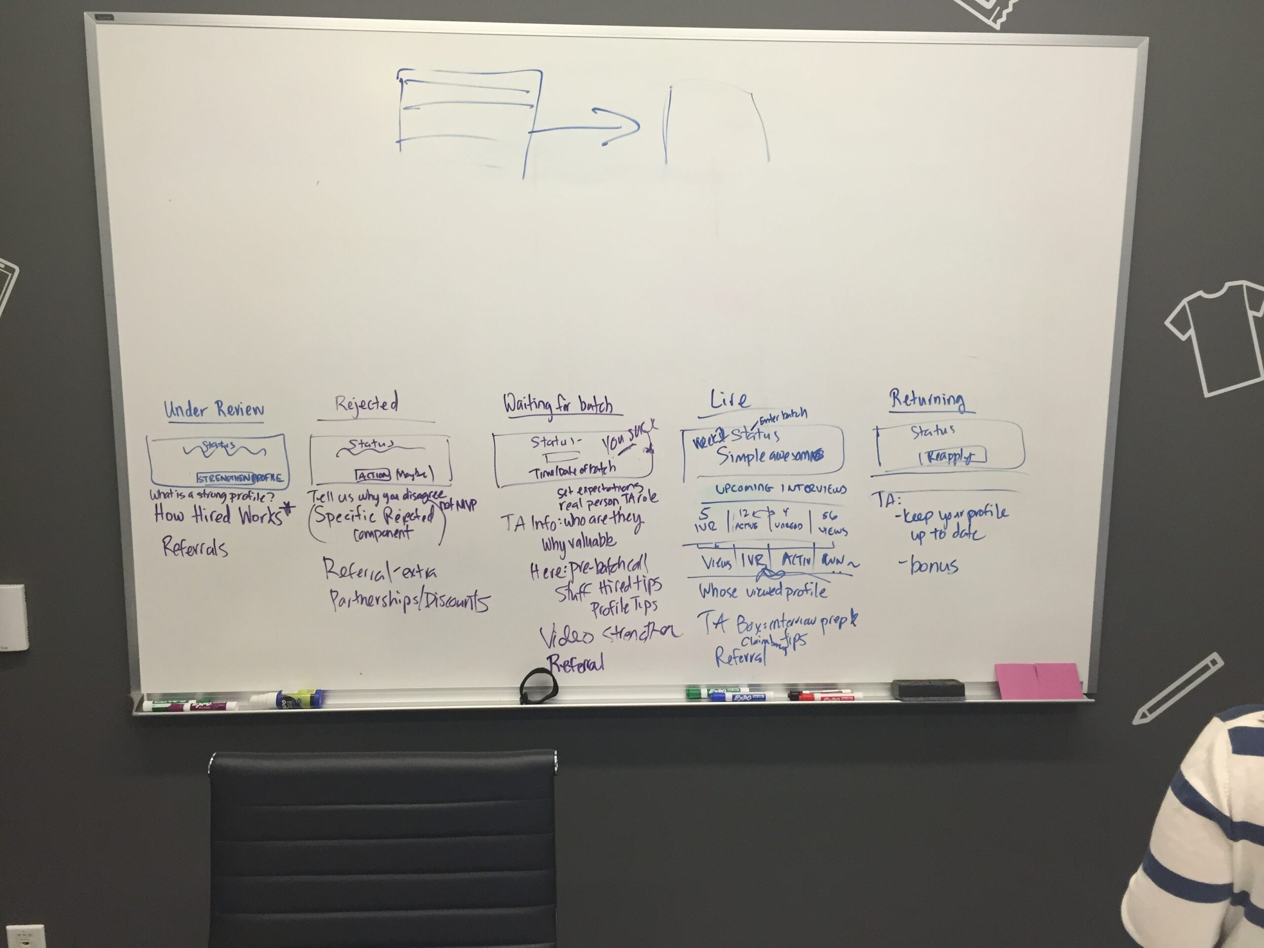
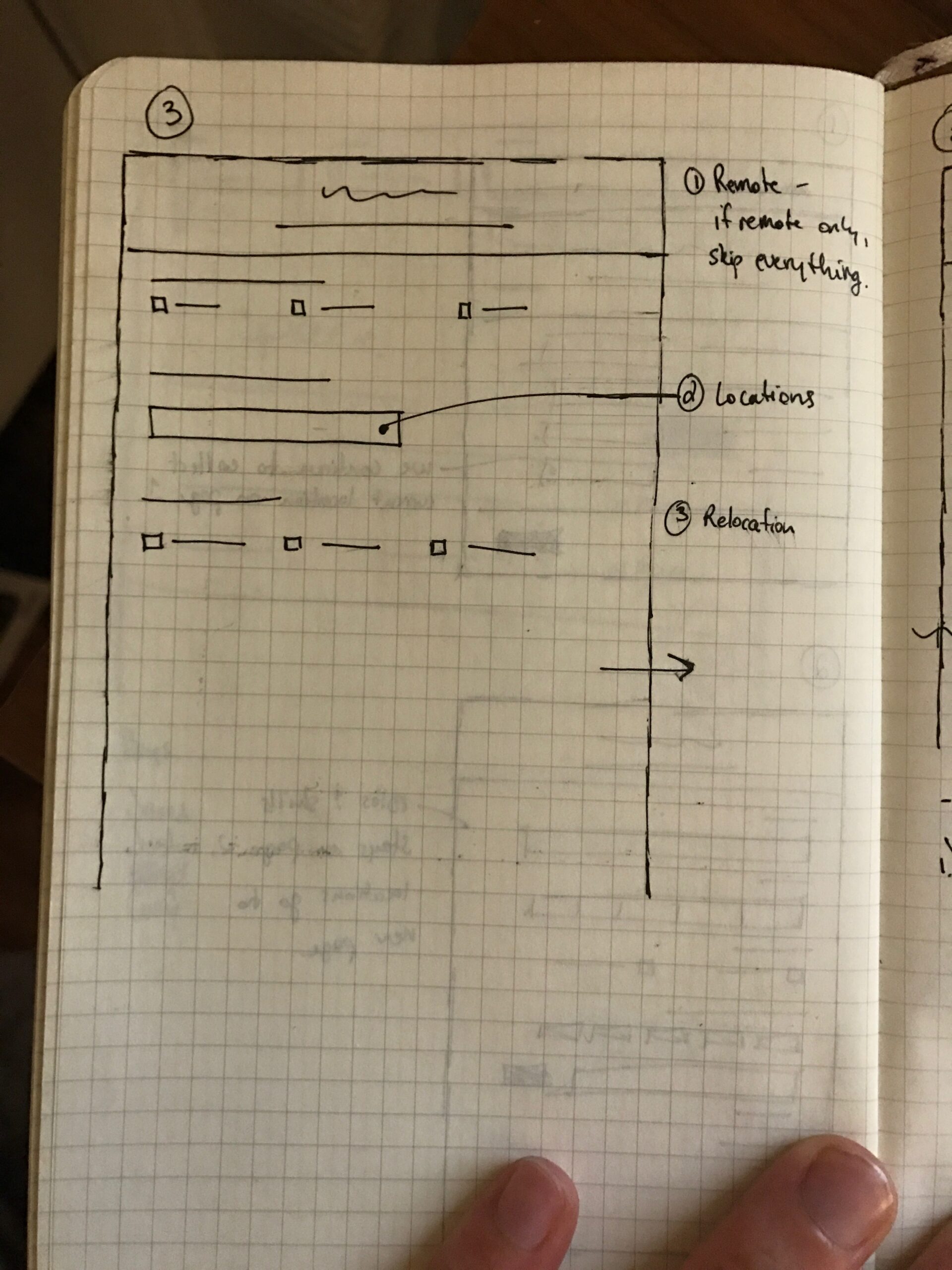
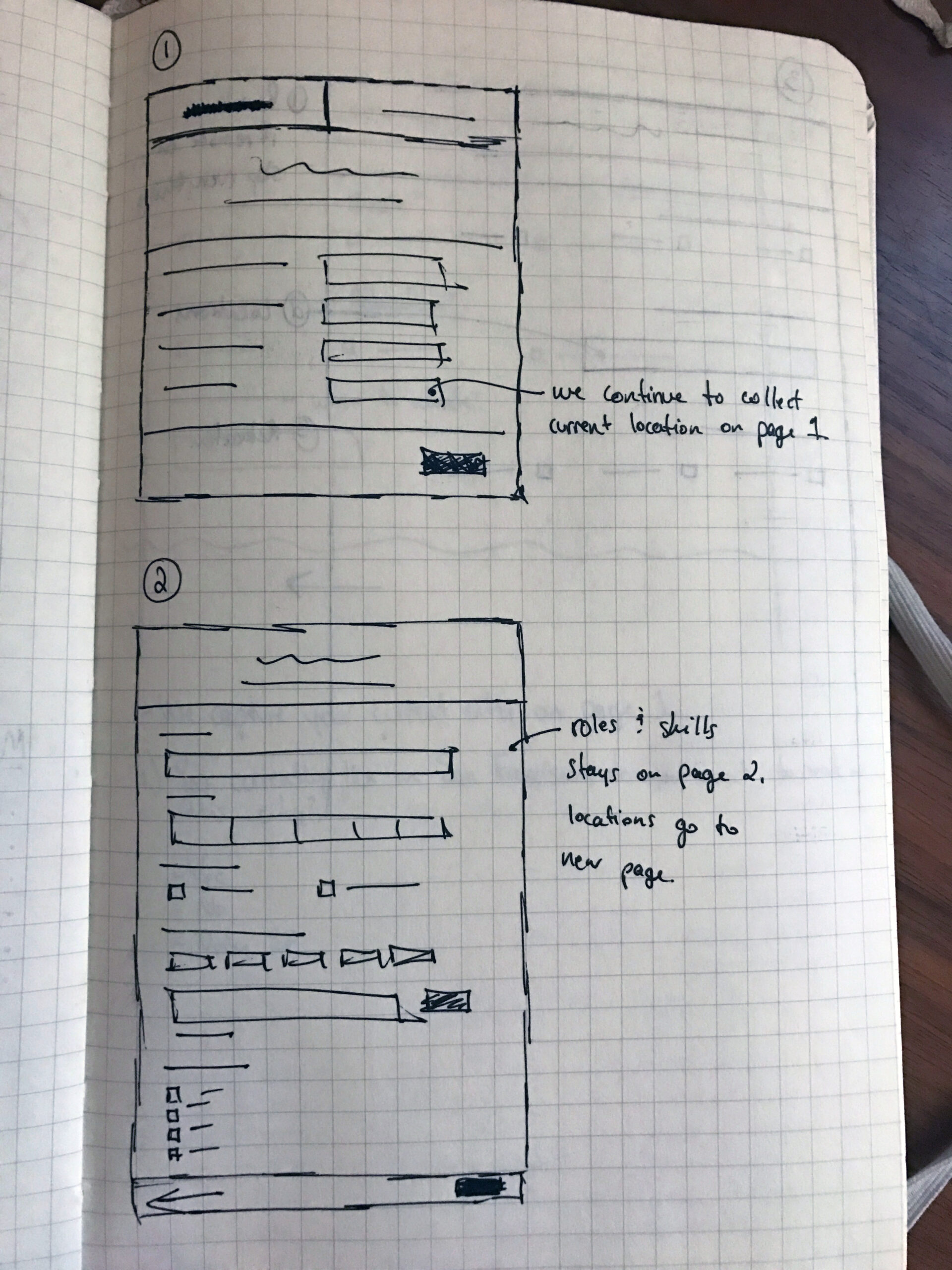
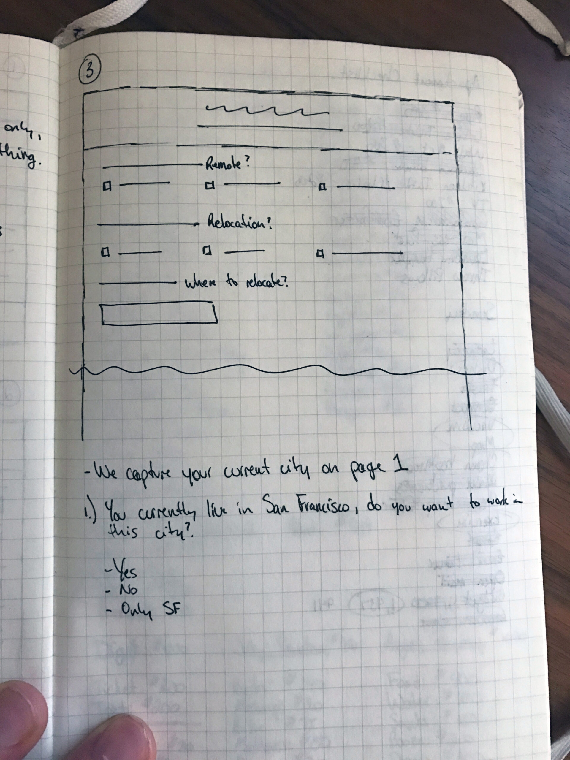
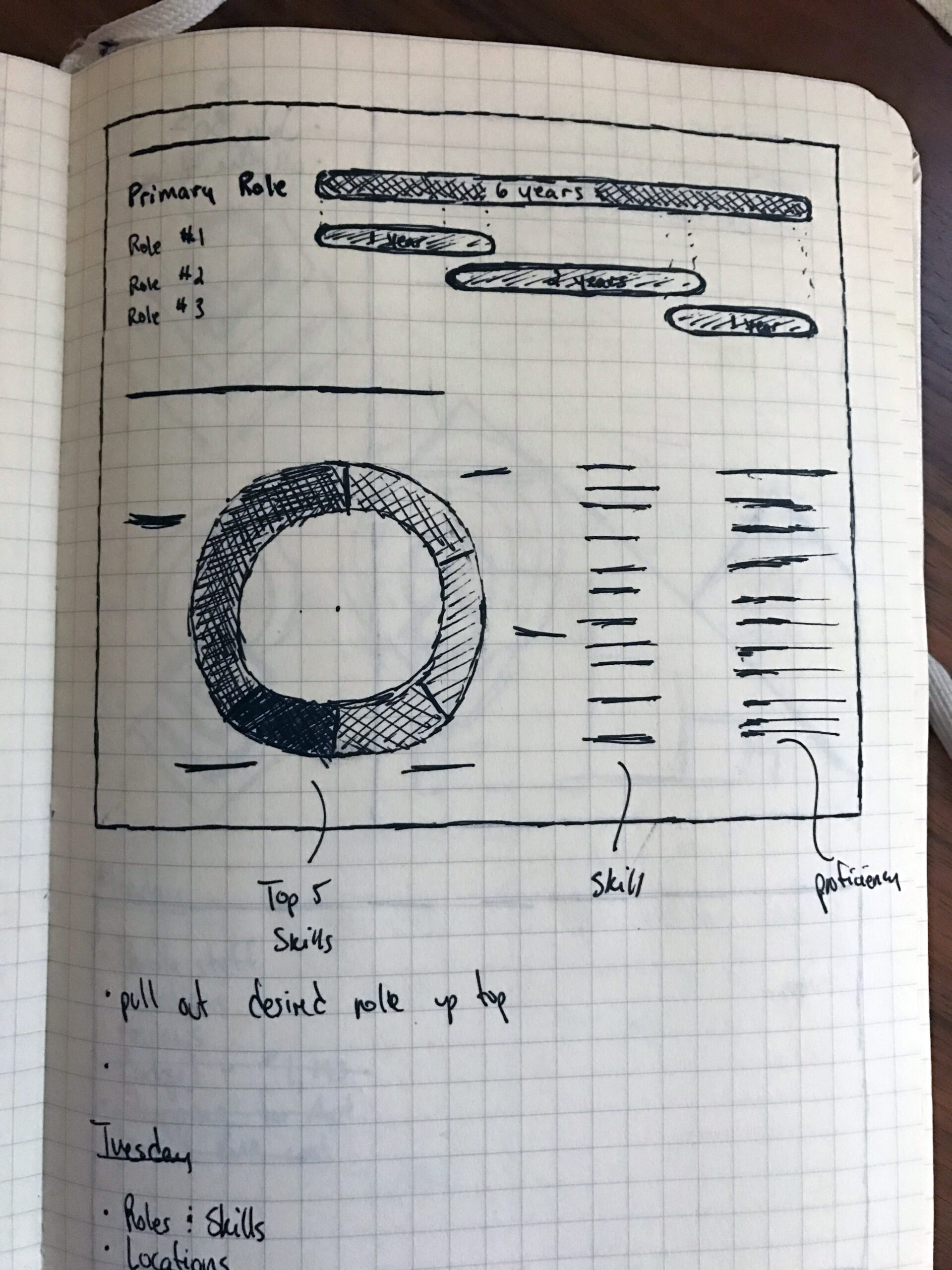
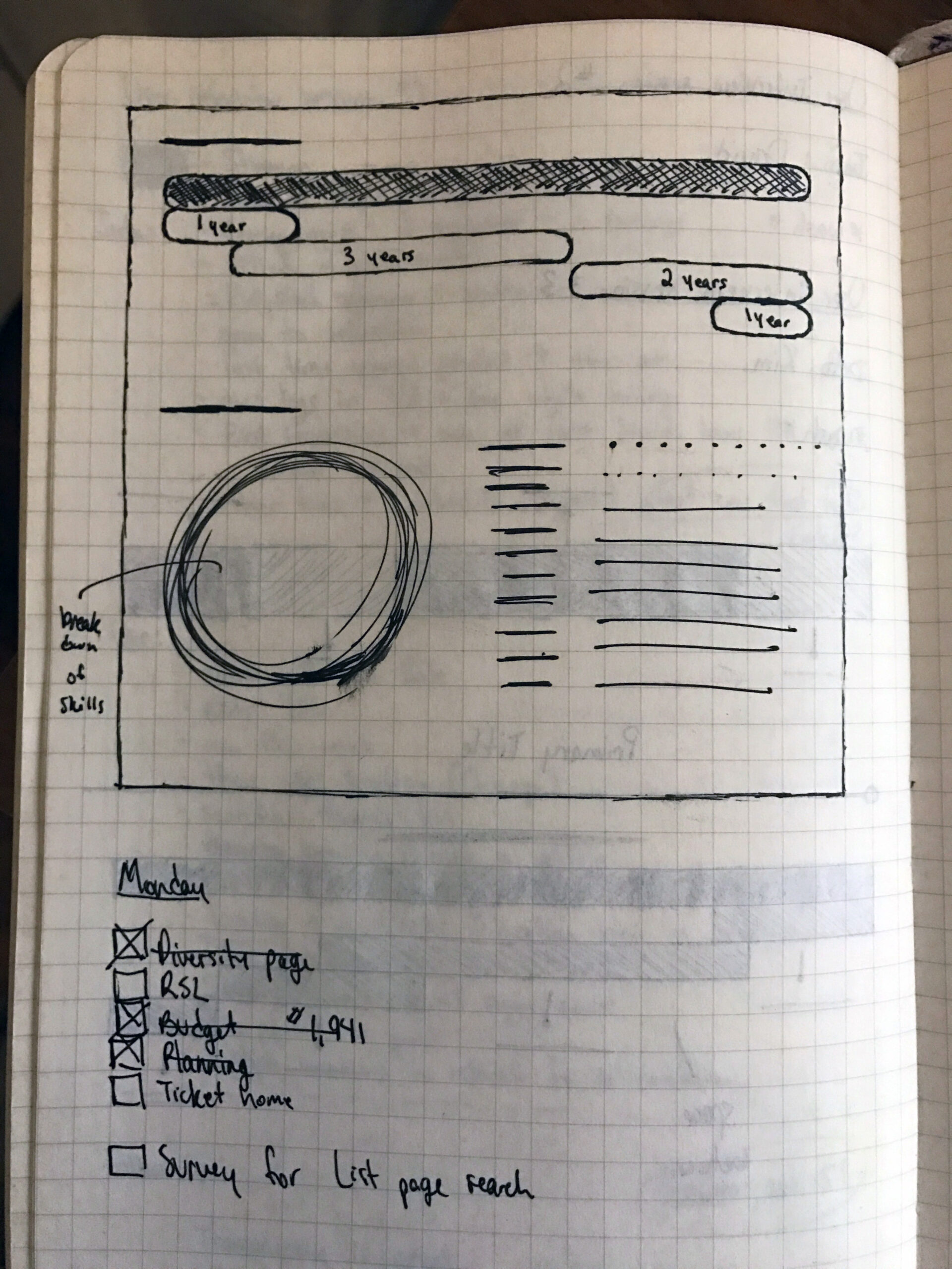
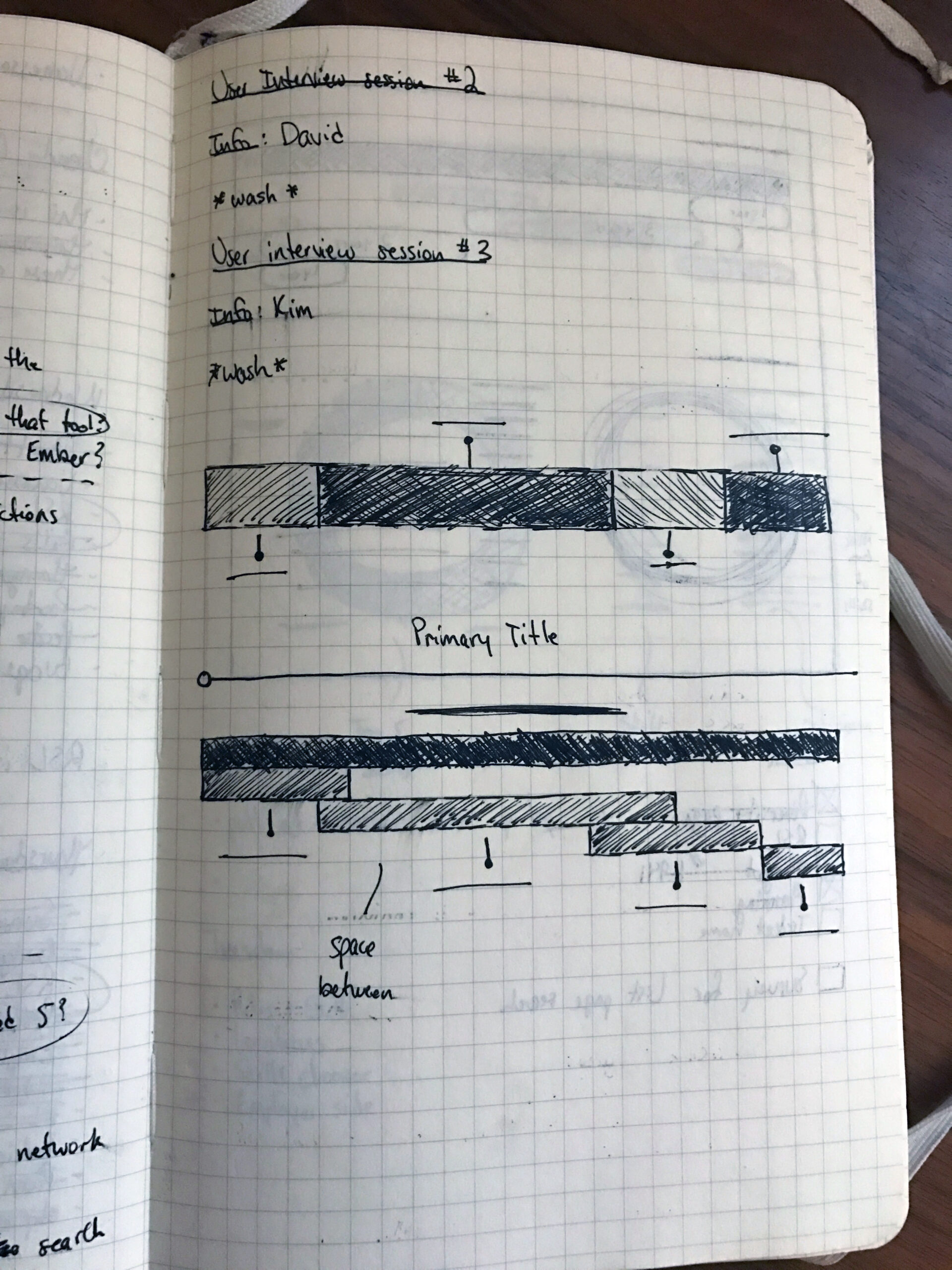
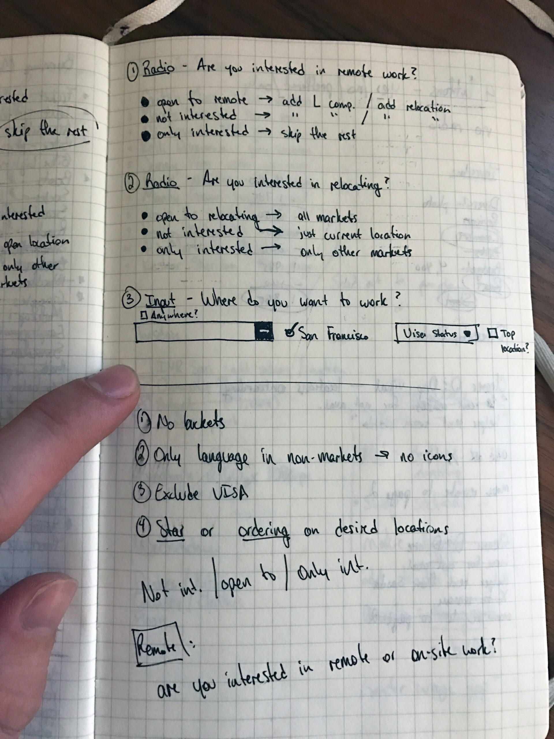
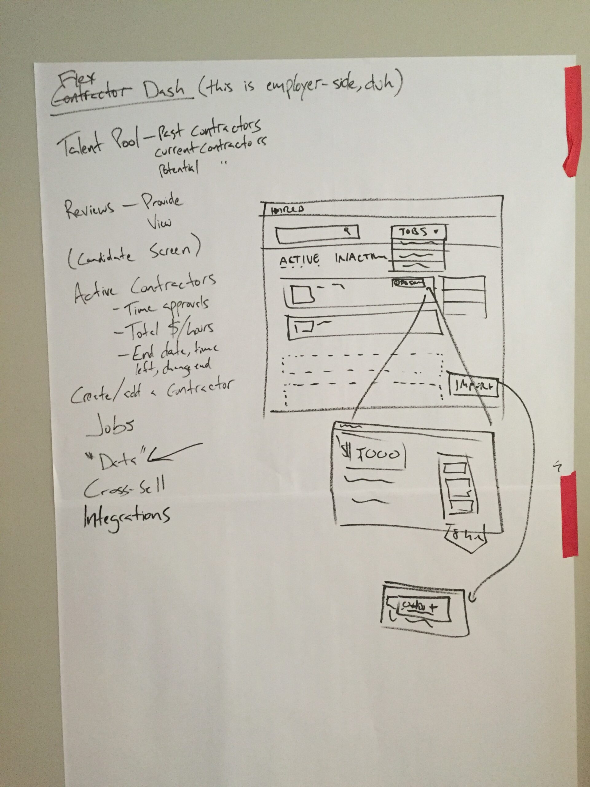
From there, we met and did some paper sketching sessions and white-boarding:
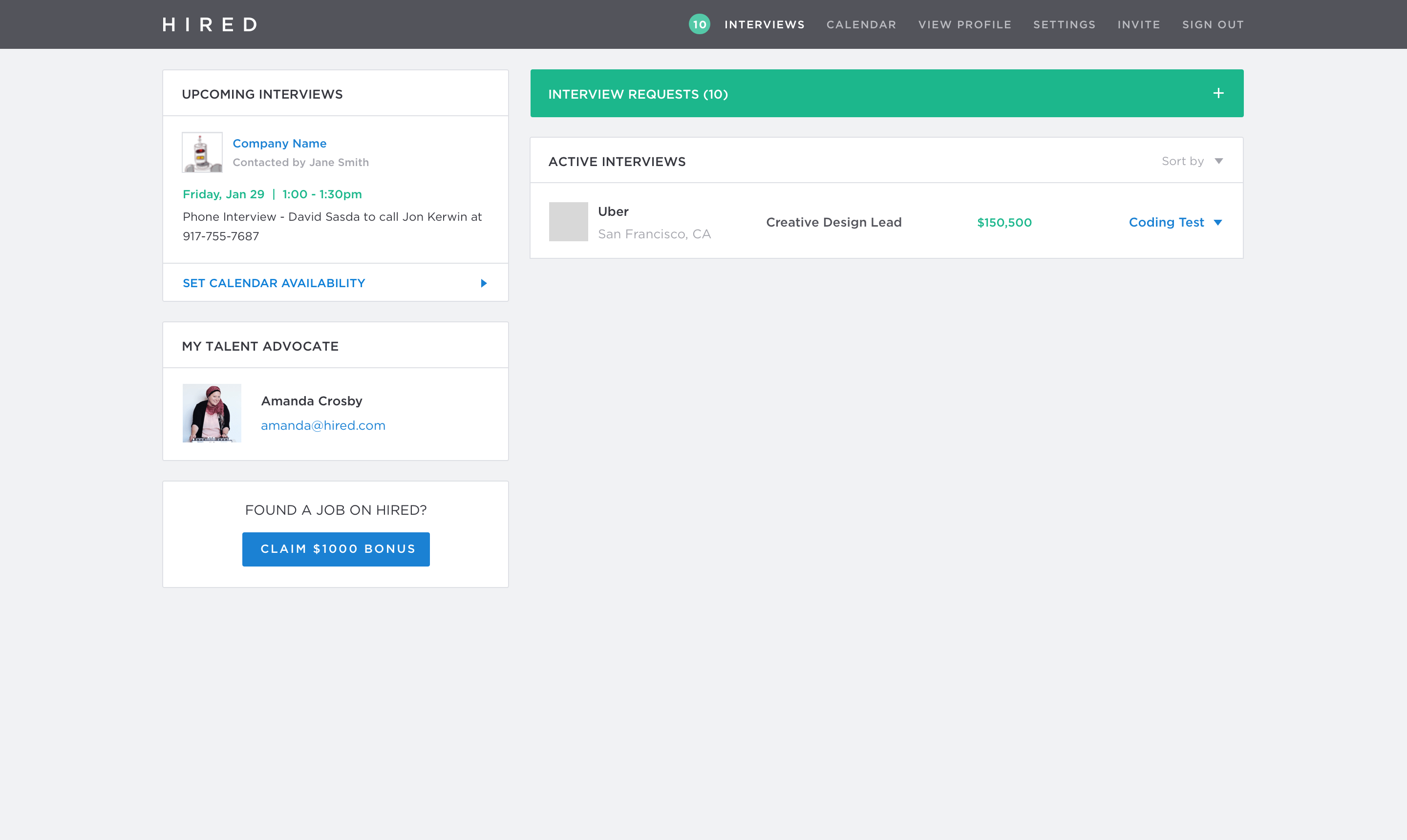
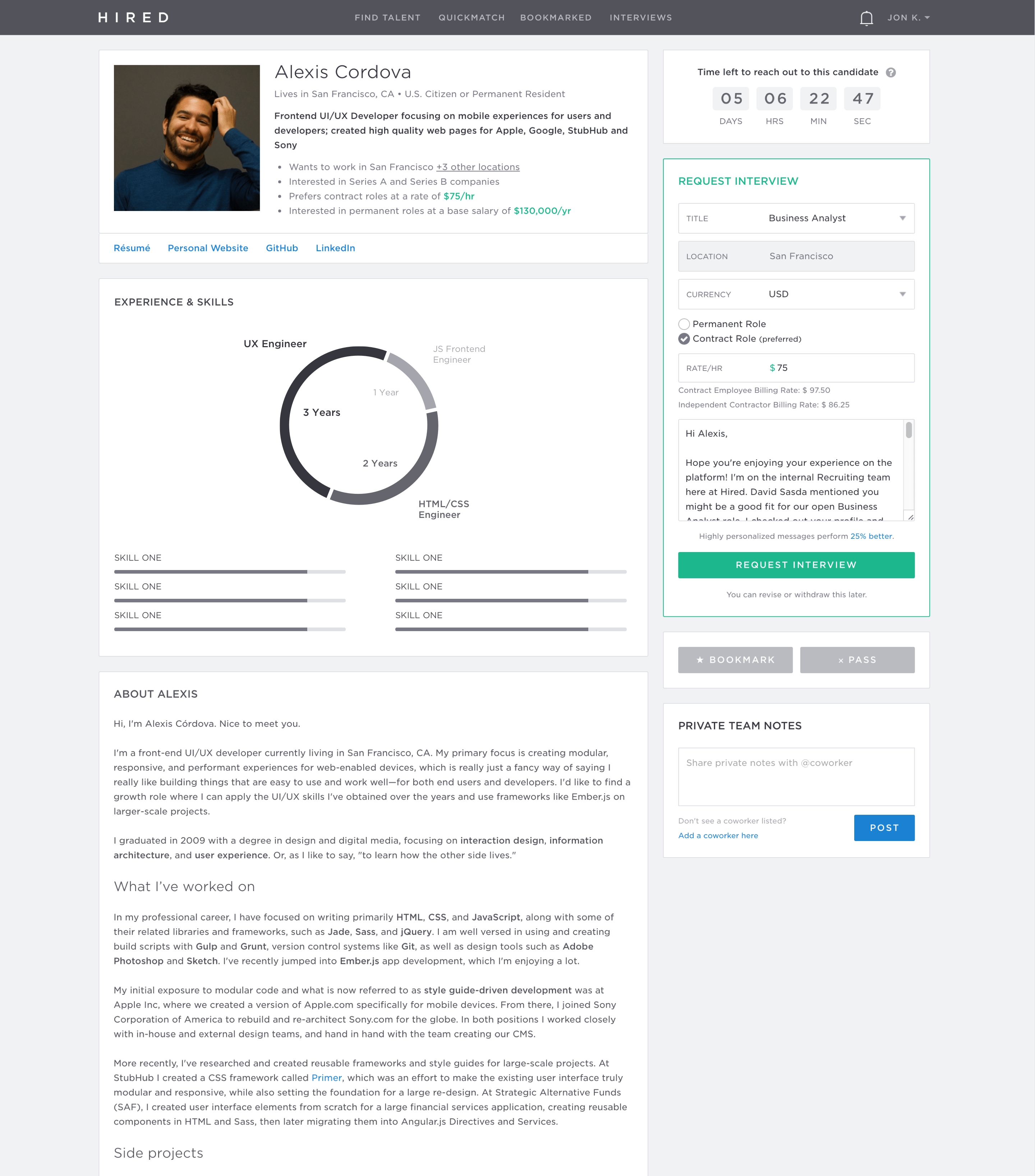
And after that took it into some light mocks:
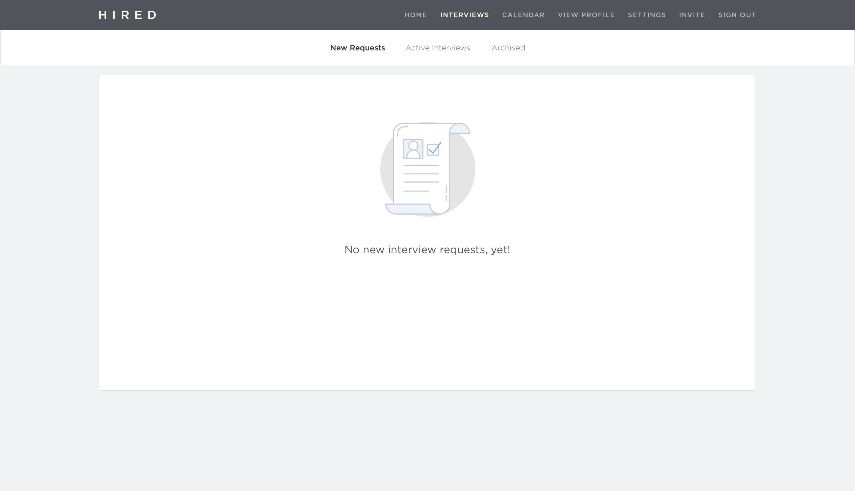
We decided to break the experience up onto separate pages, to enhance ease of use on mobile. And pushed the iteration a bit further:
Flex
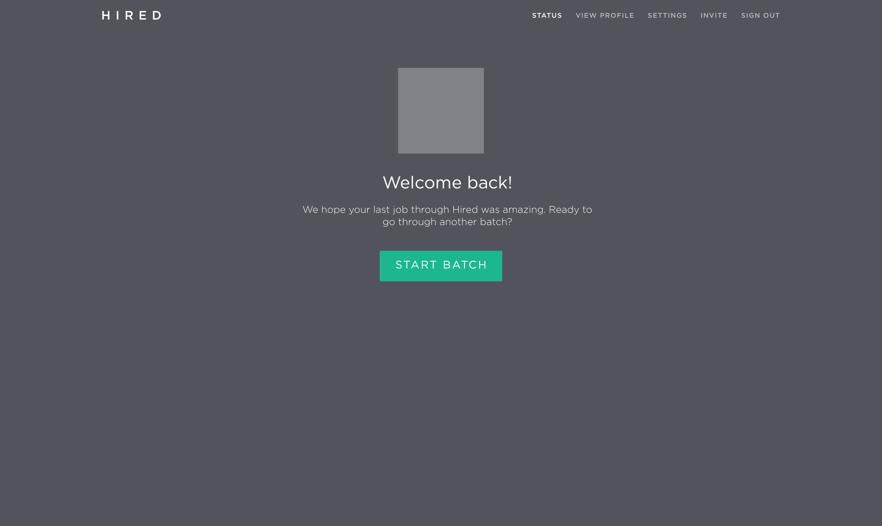
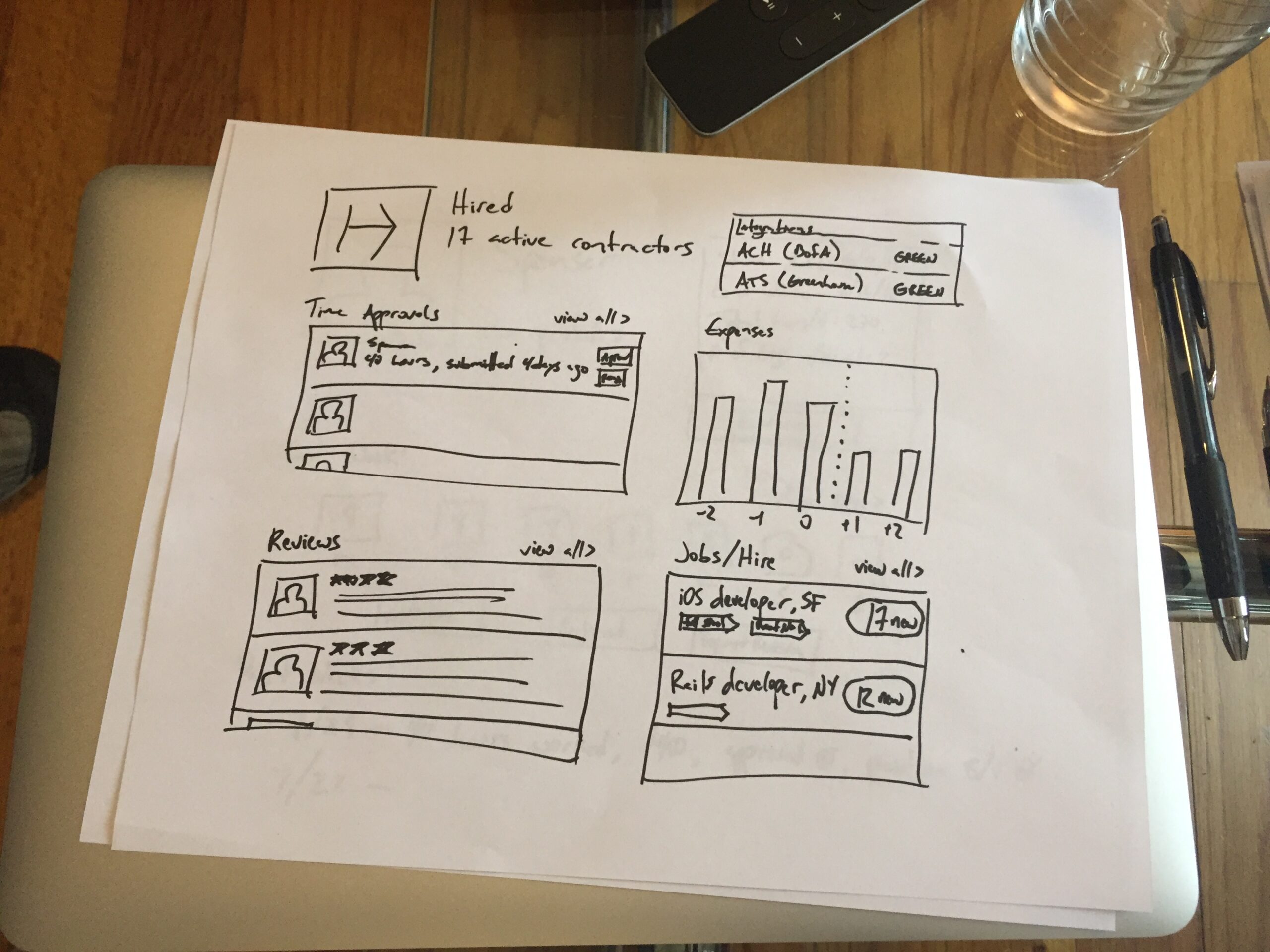
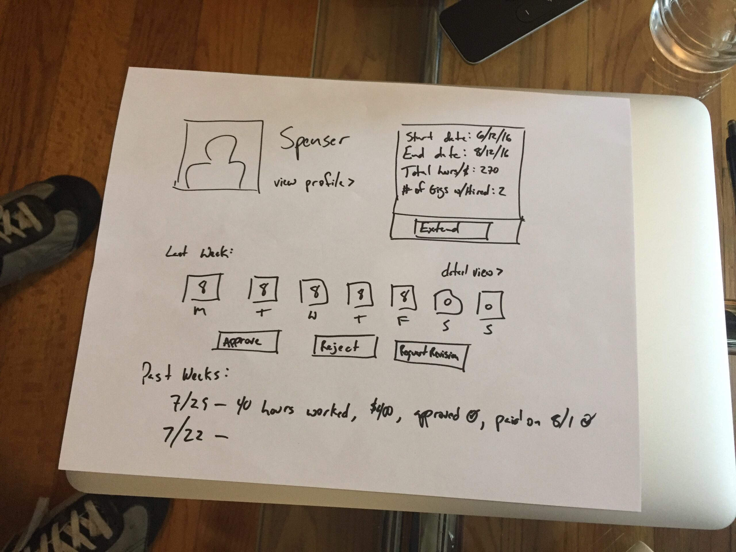
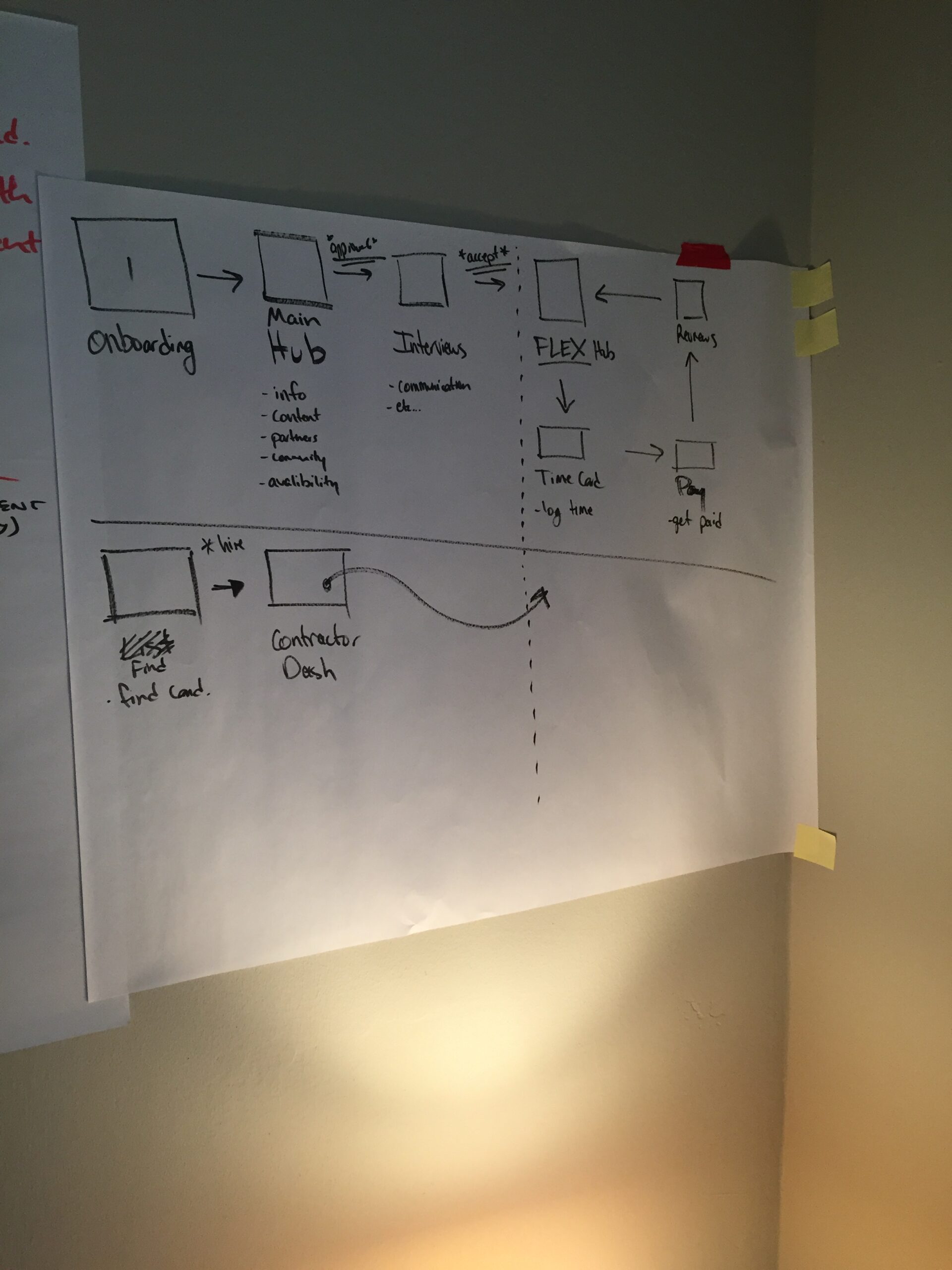
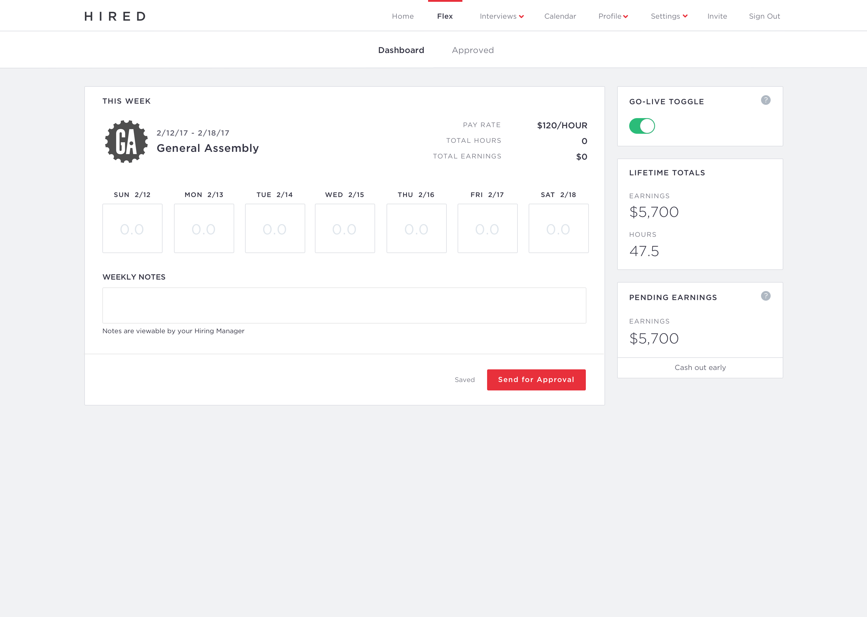
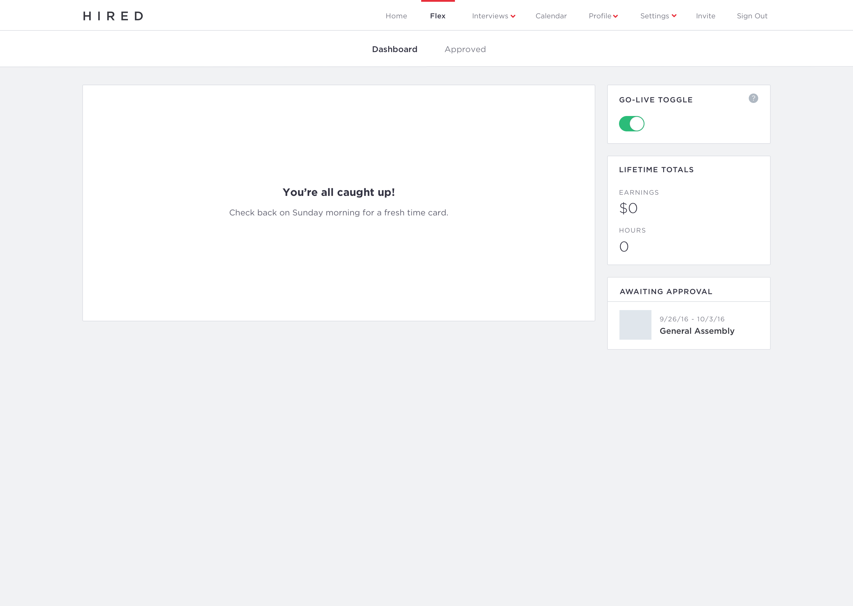
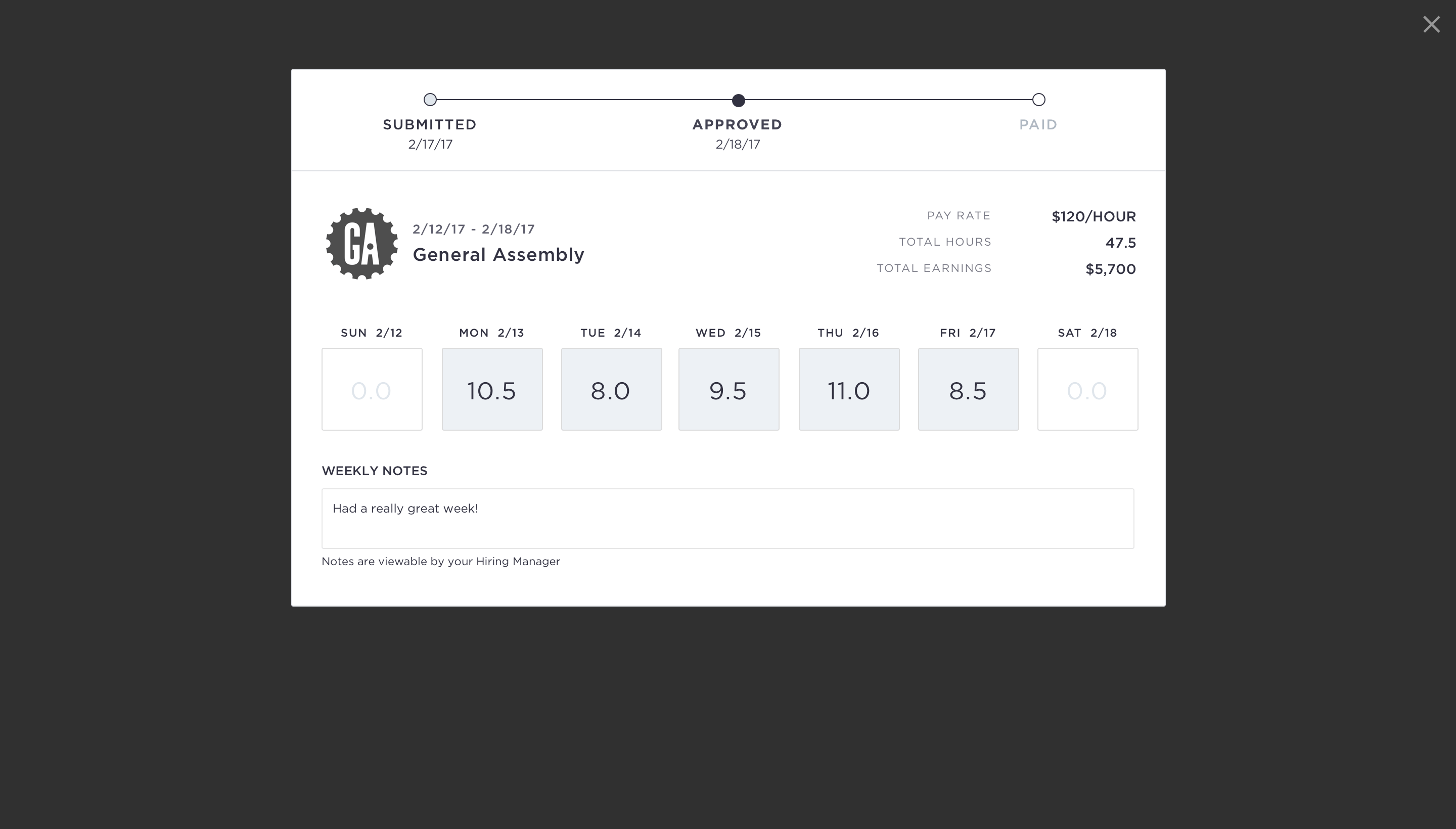
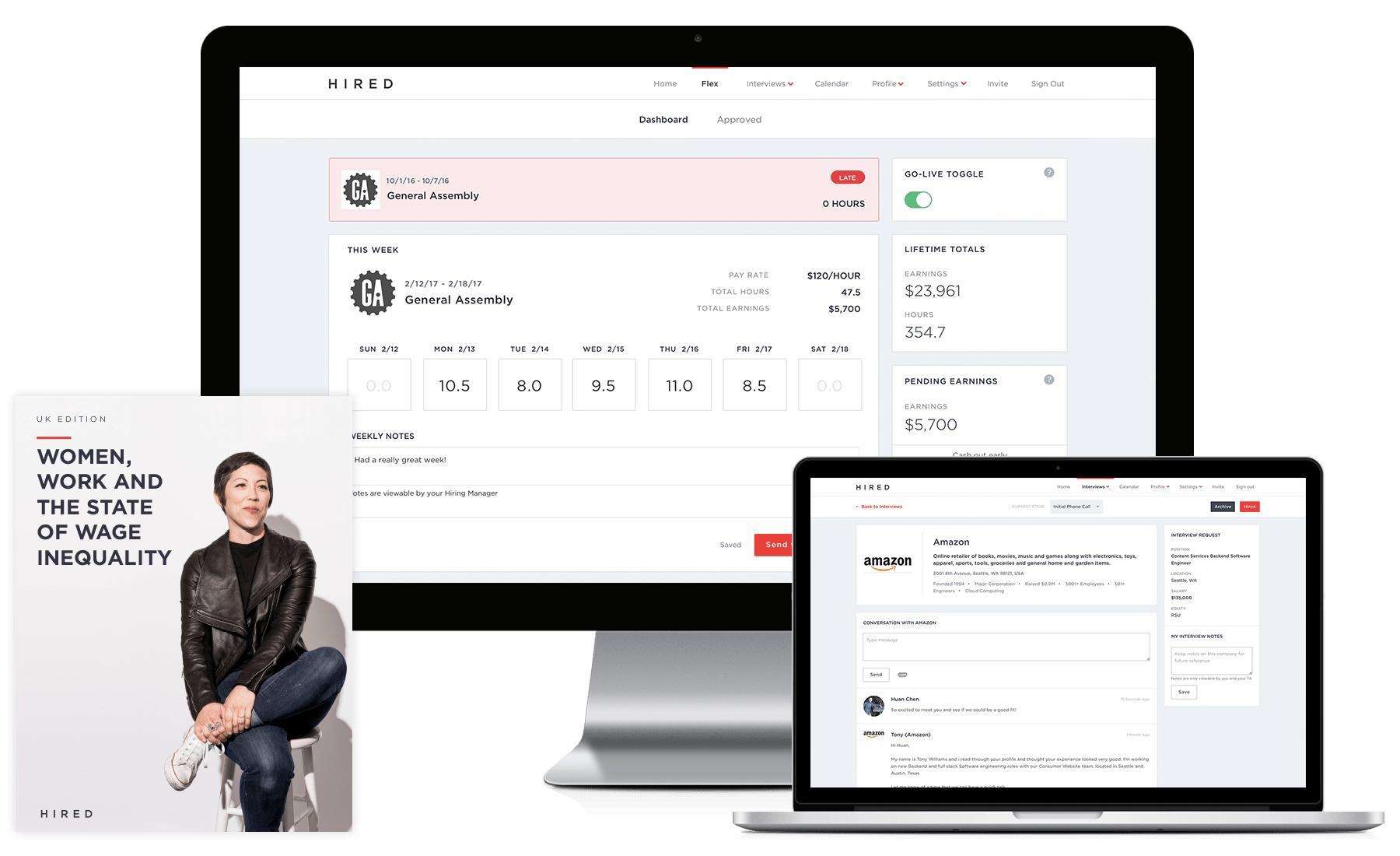
Flex is the internal name for Hired's fledgling contracting app, which is aimed at helping companies hire and track contingent labor, and to open up the Hired experience to our non full-time candidates. I joined the team in August and have been iterating with them since.
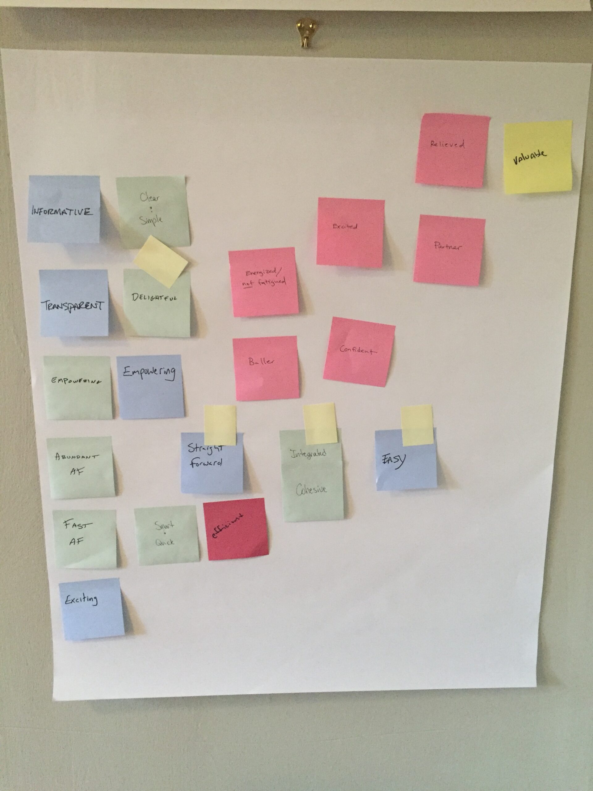
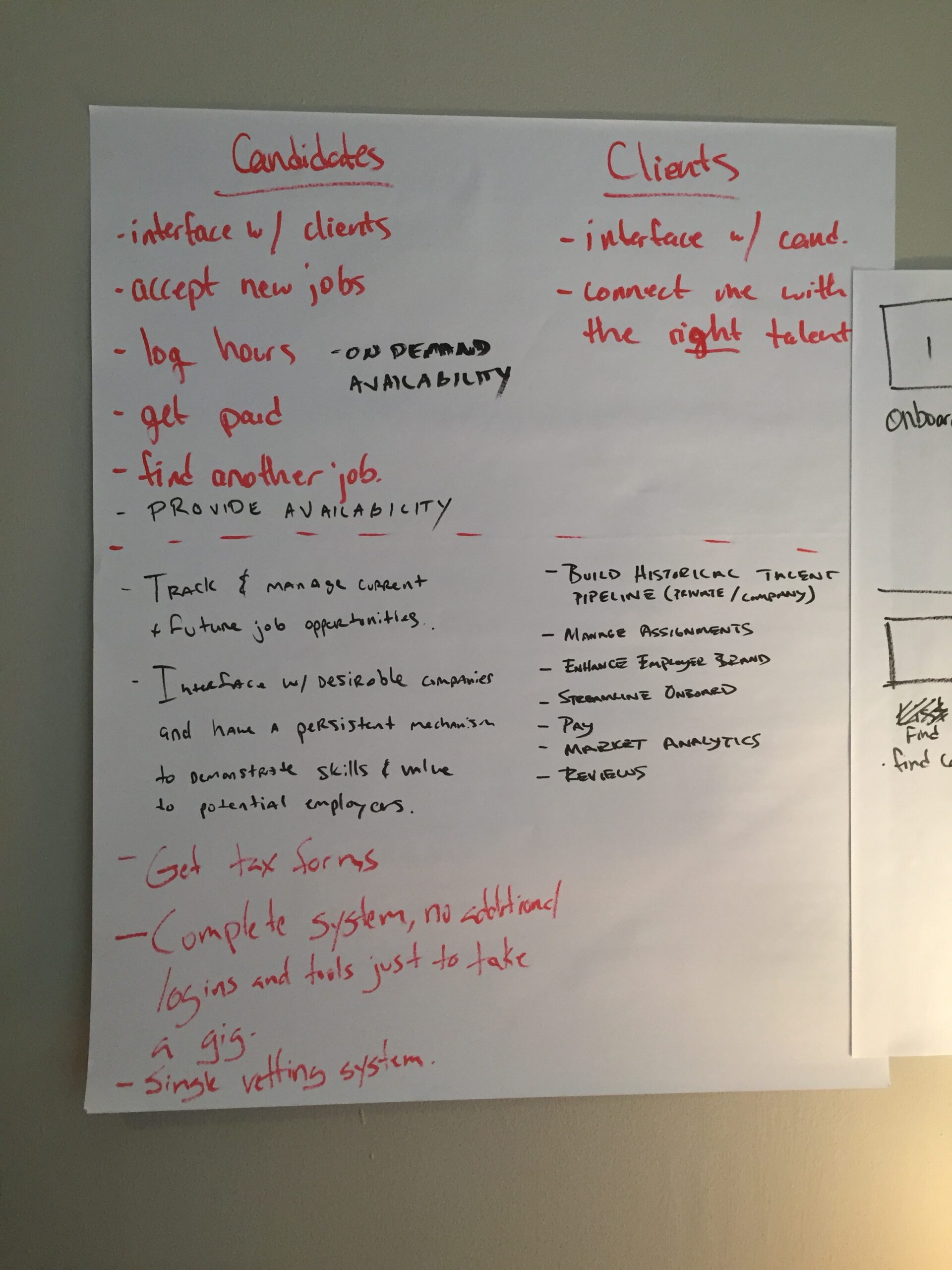
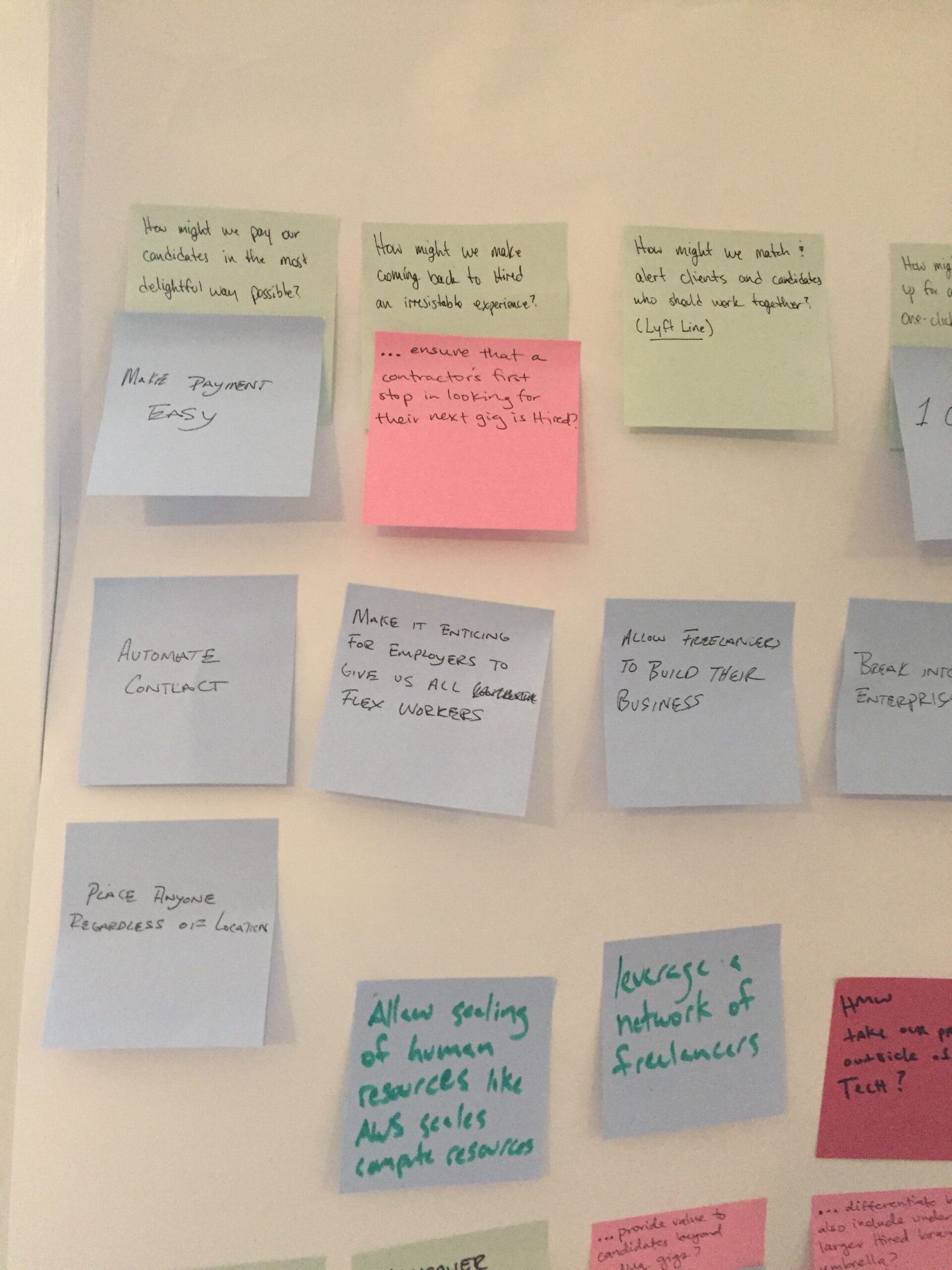
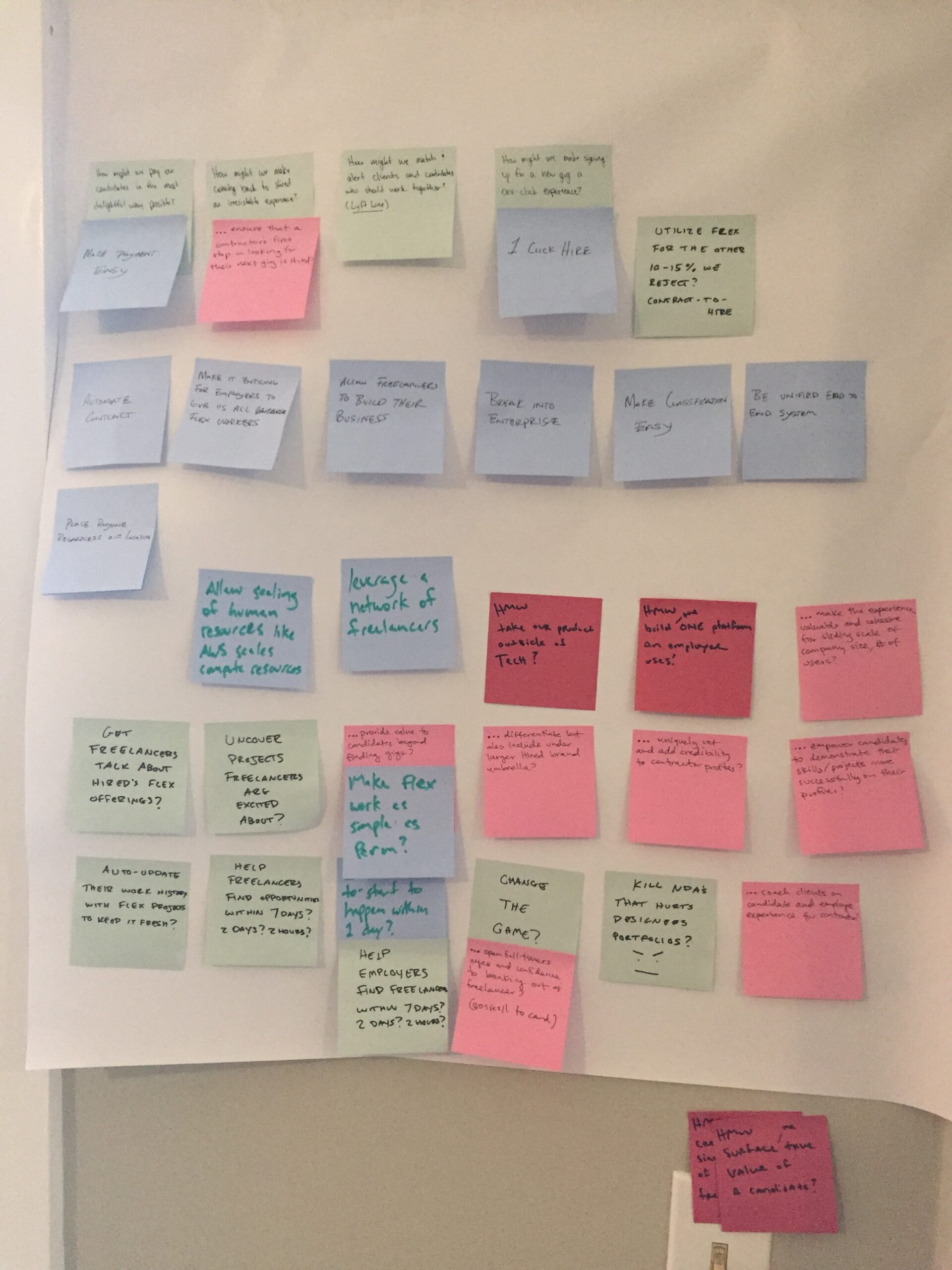
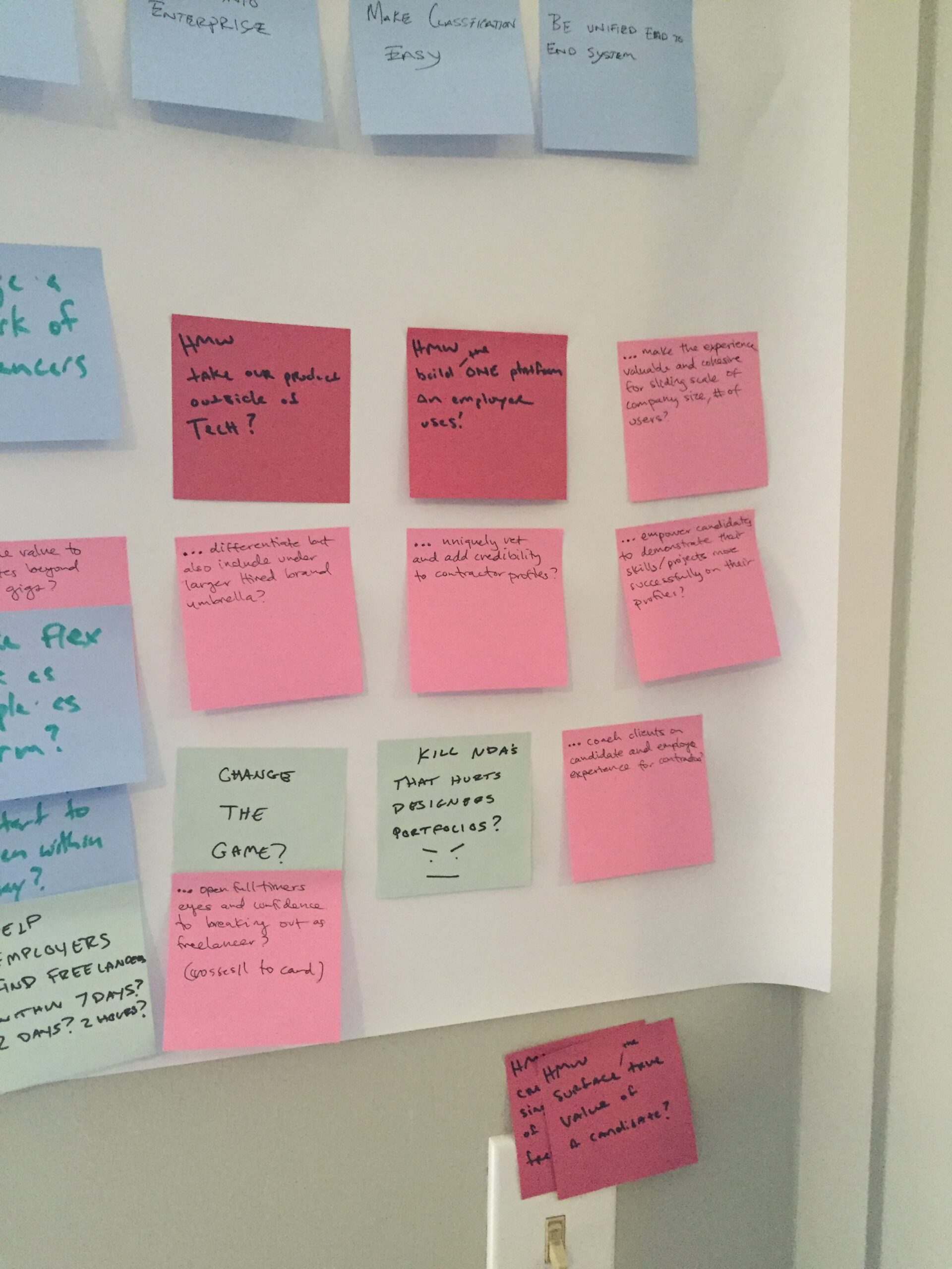
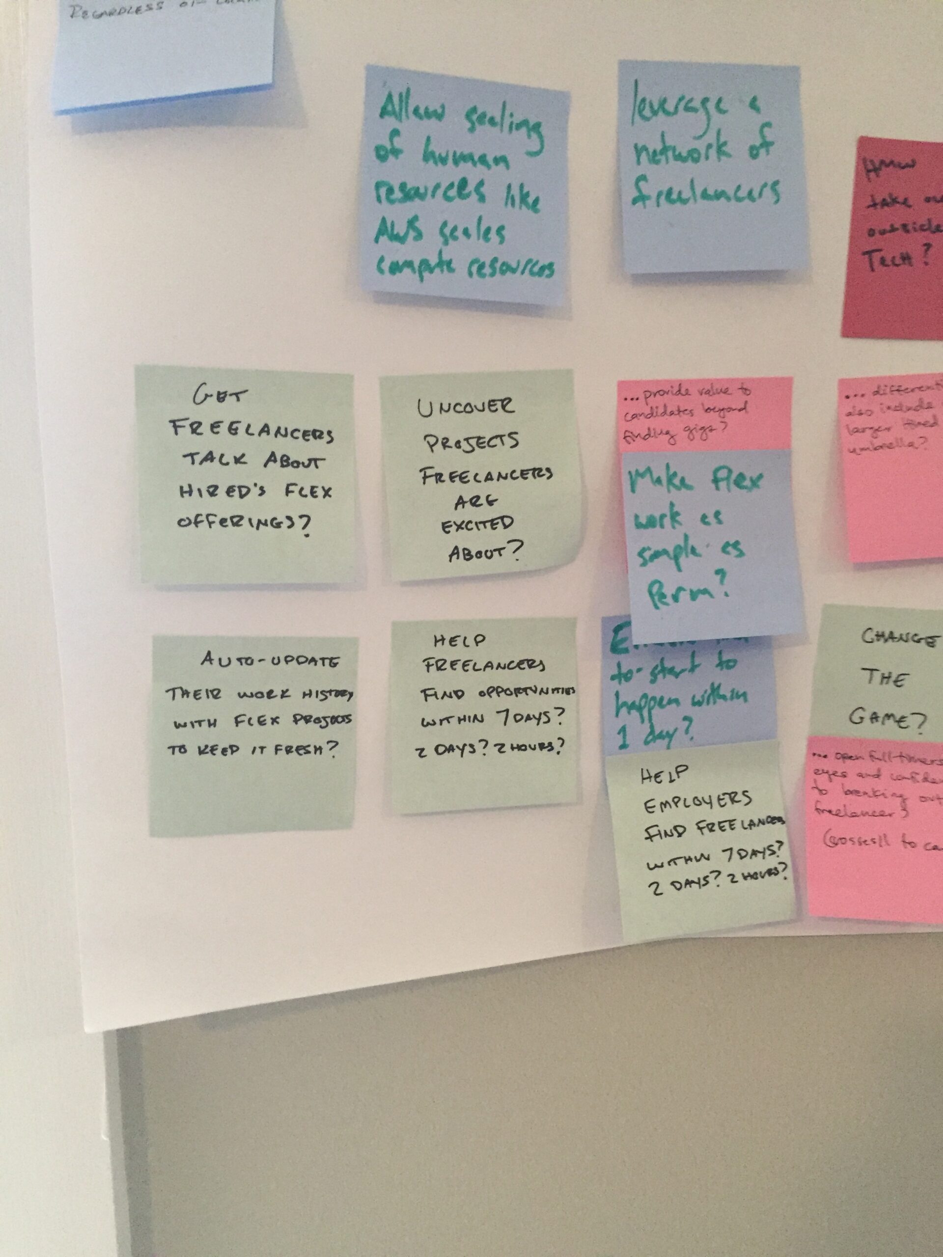
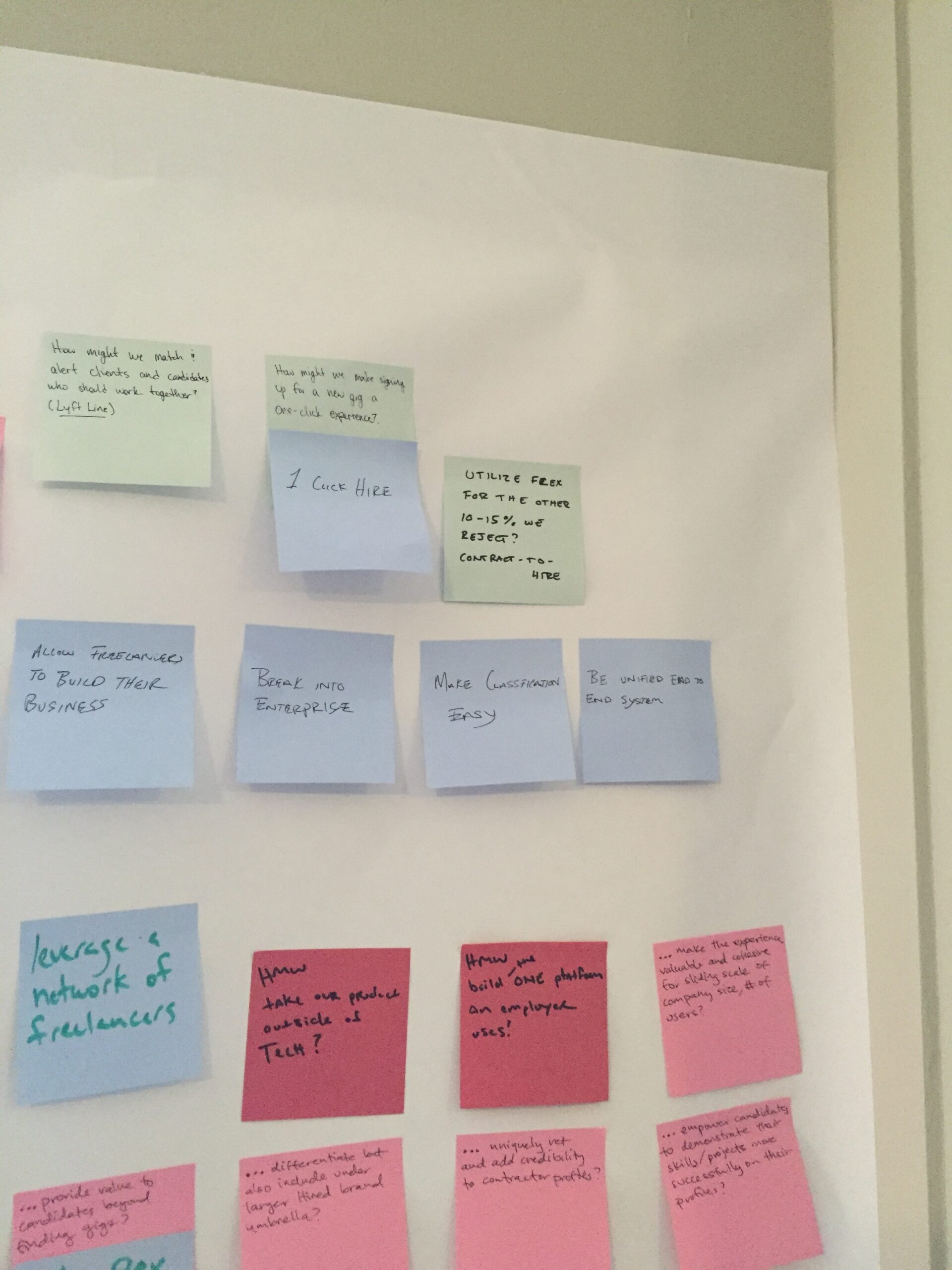
The app started as a simple portal to a third-party app called, People 2.0. It was a simple way to input hours, and not much else. The user experience was pretty terrible, having to go from a Hired product to another one. We met up as a team for a Design Sprint, and laid out some goals for our product:
• Interface with Clients
• Accept new/multiple jobs
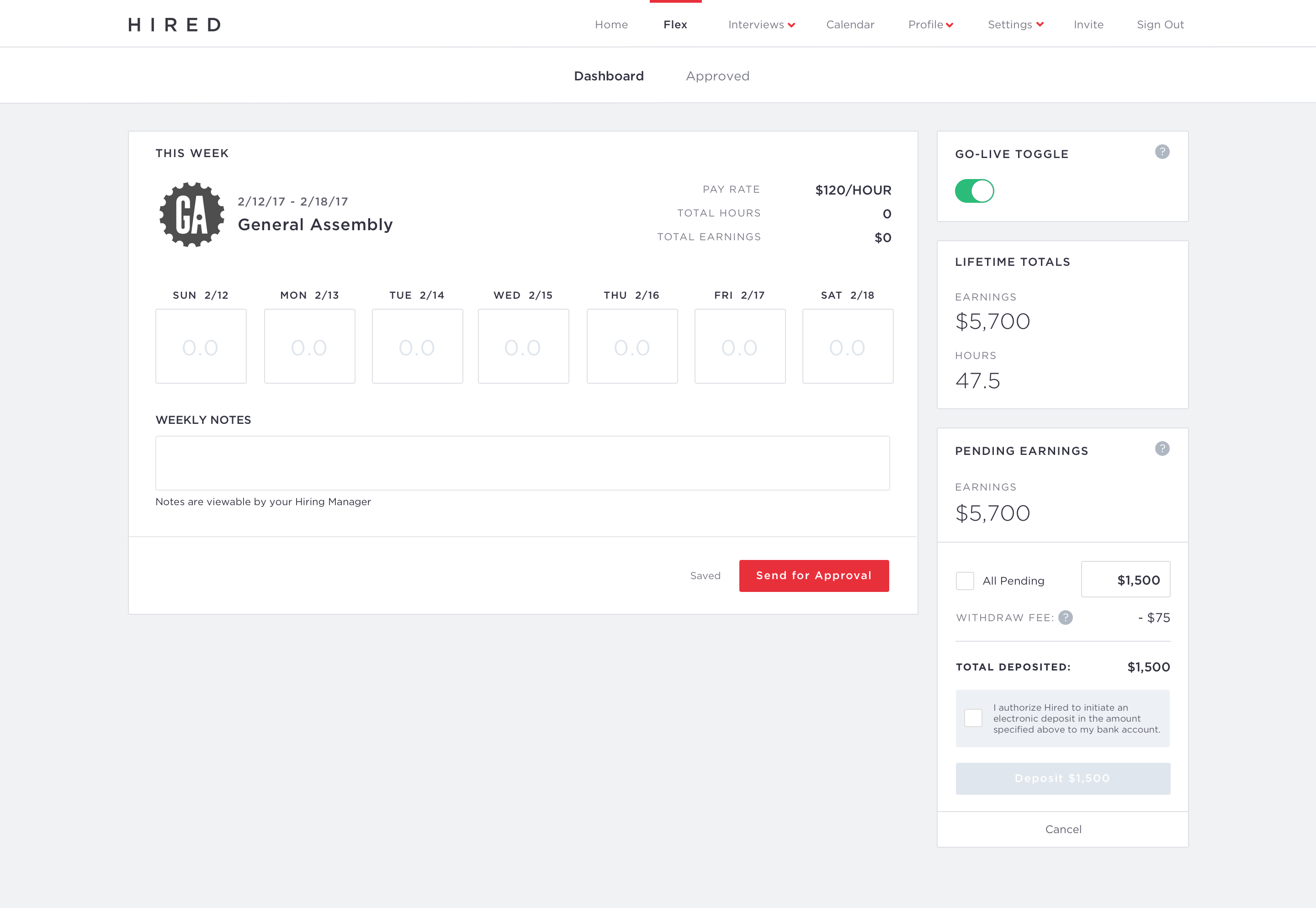
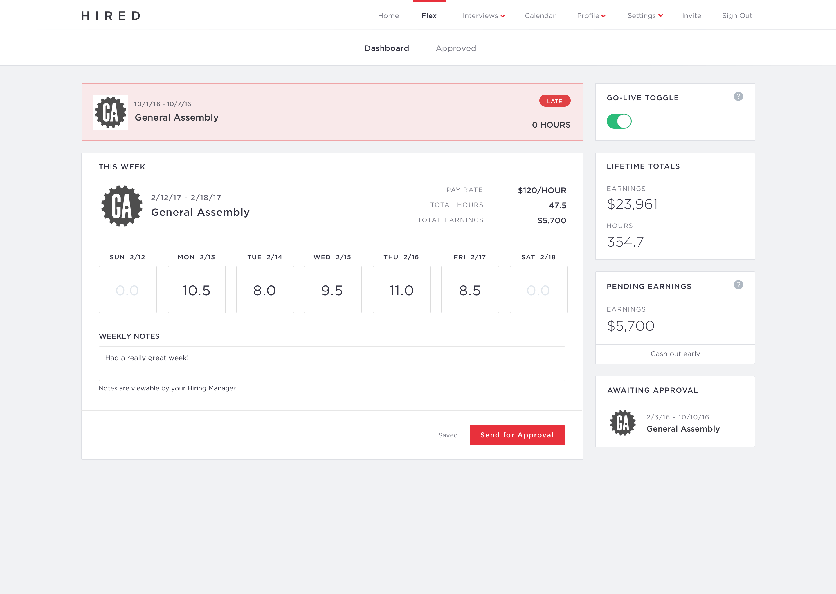
• Log hours
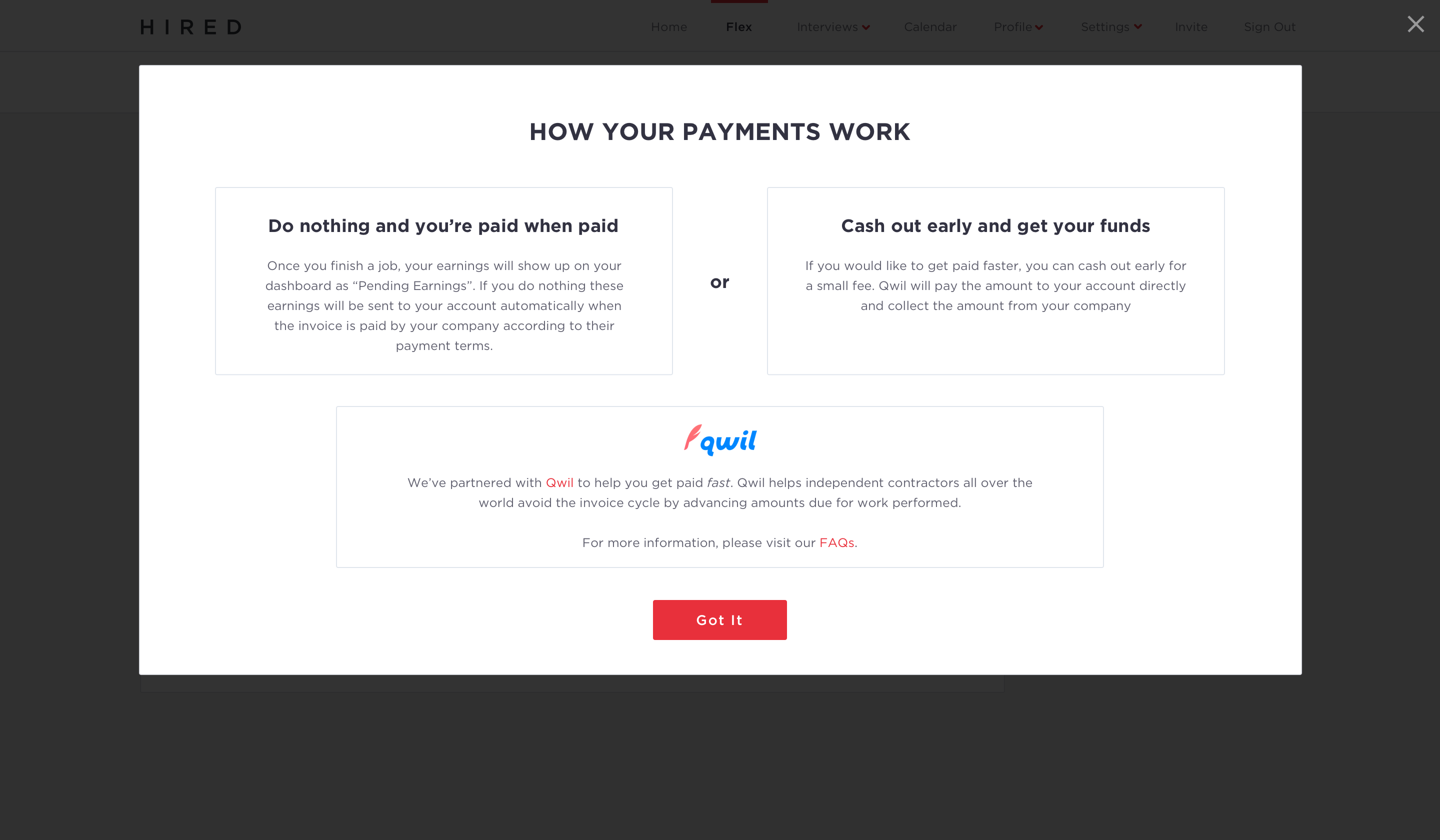
• Get paid
• Track and manage future and current opportunities
• Provide availability
• Enhance personal brand and reputation
• Get tax forms
• Unified experience
• Single vetting system
Users: Candidates on Hired who have accepted contingent labor, or freelance, and need to send daily/weekly information to clients instead of our usual users who only engage with our brand once every 1 1/2 years.
Considerations: Contractors are already bogged down with messy UIs and portals from other contractors - make something simple and easy to make it a preferred pool of contract talent and demand.
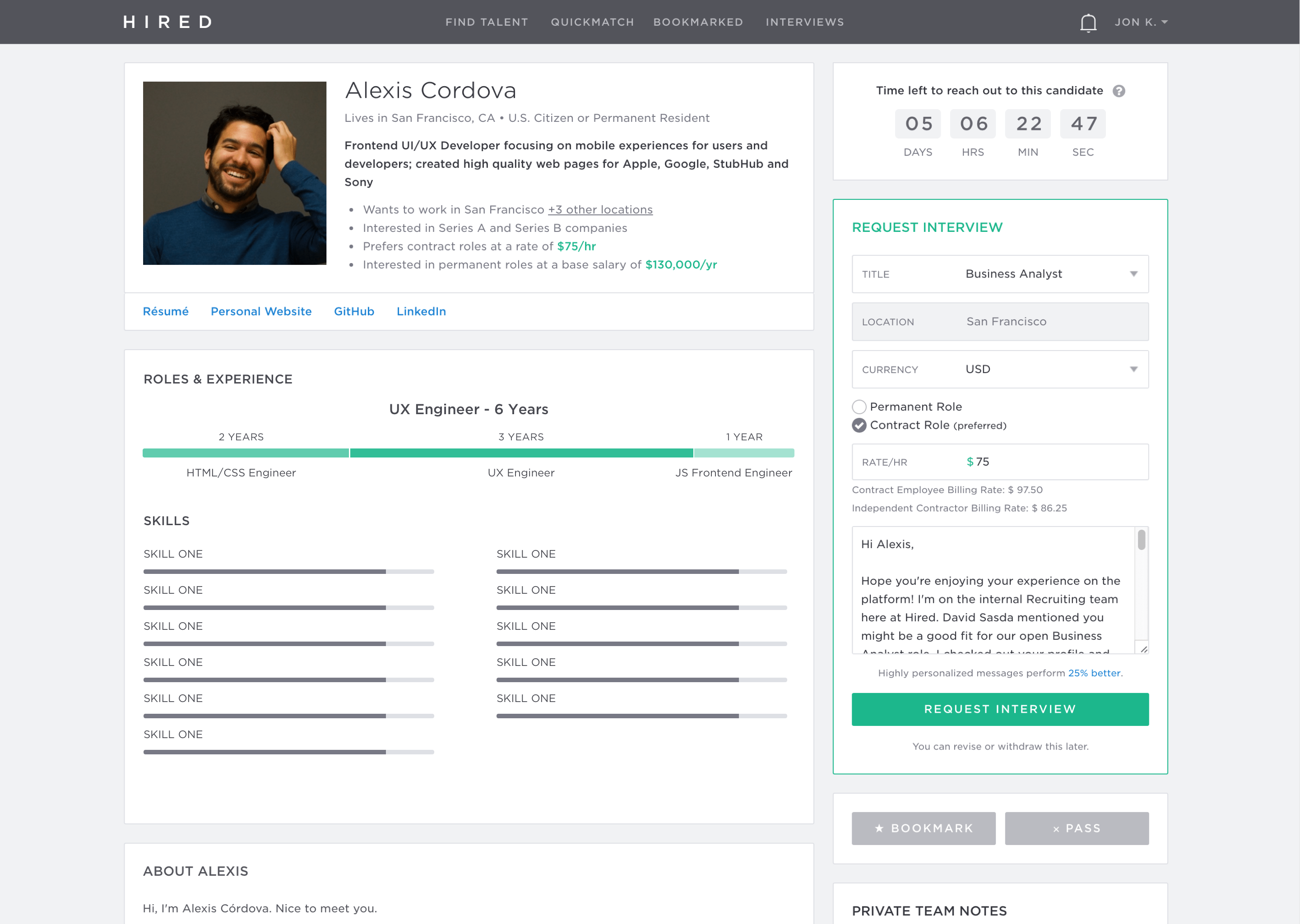
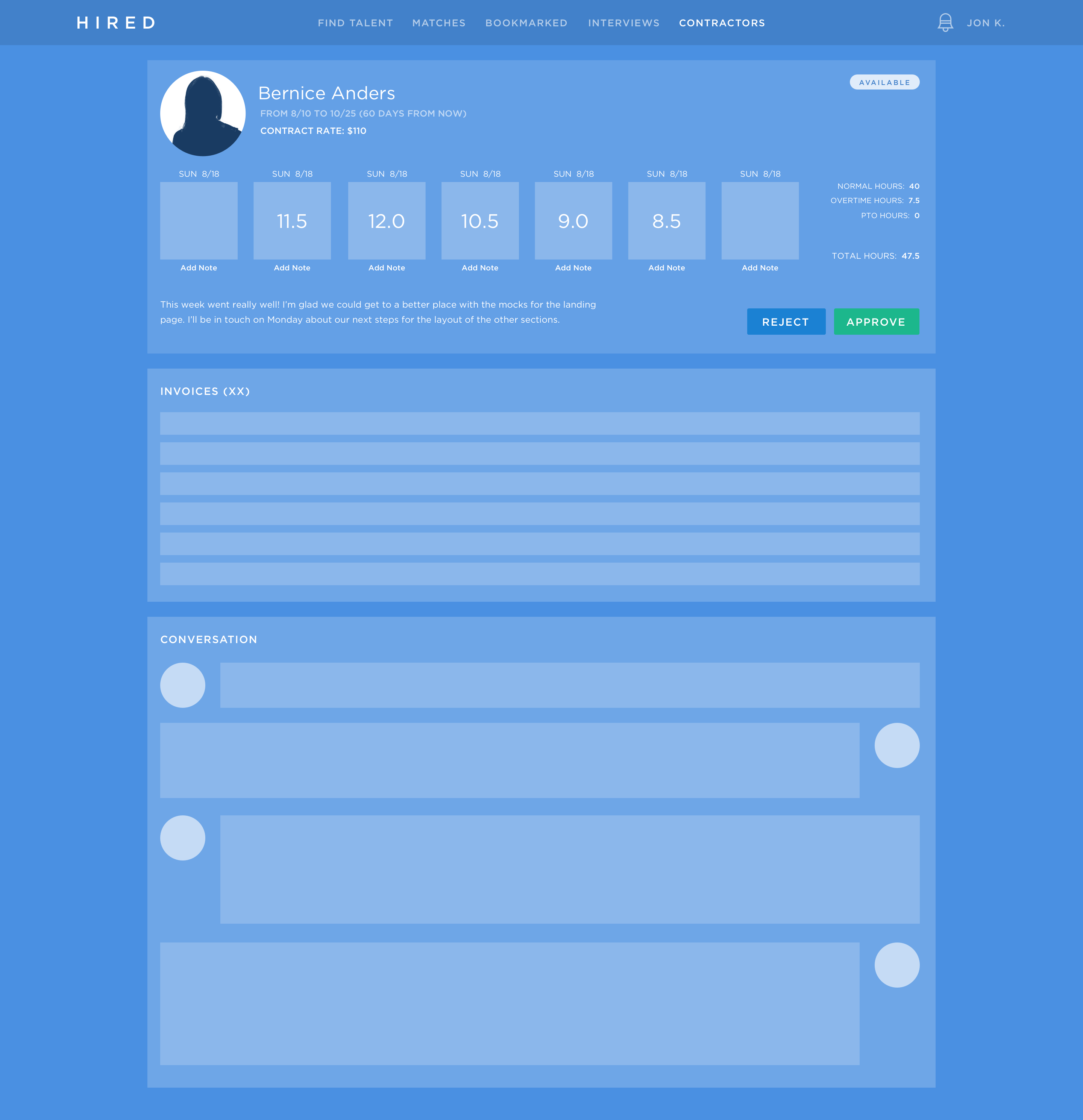
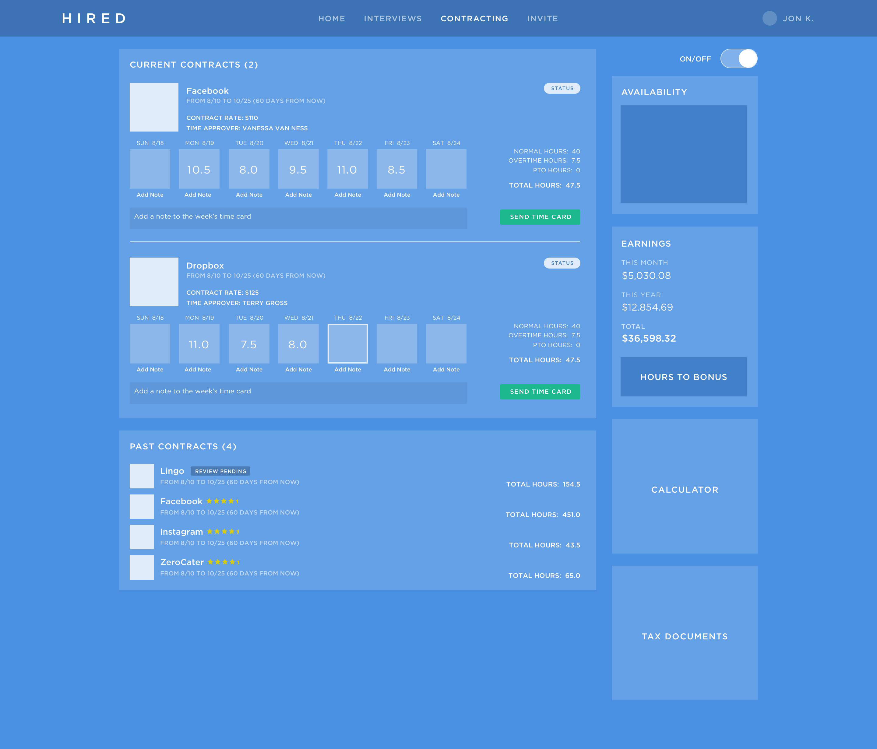
From there, I made a series of future-thinking mockups called blueframes. This was used to communicate the value to stakeholders and get resourcing for the coming year. It was very successful and allowed the team to showcase what the product could be in a year's time.
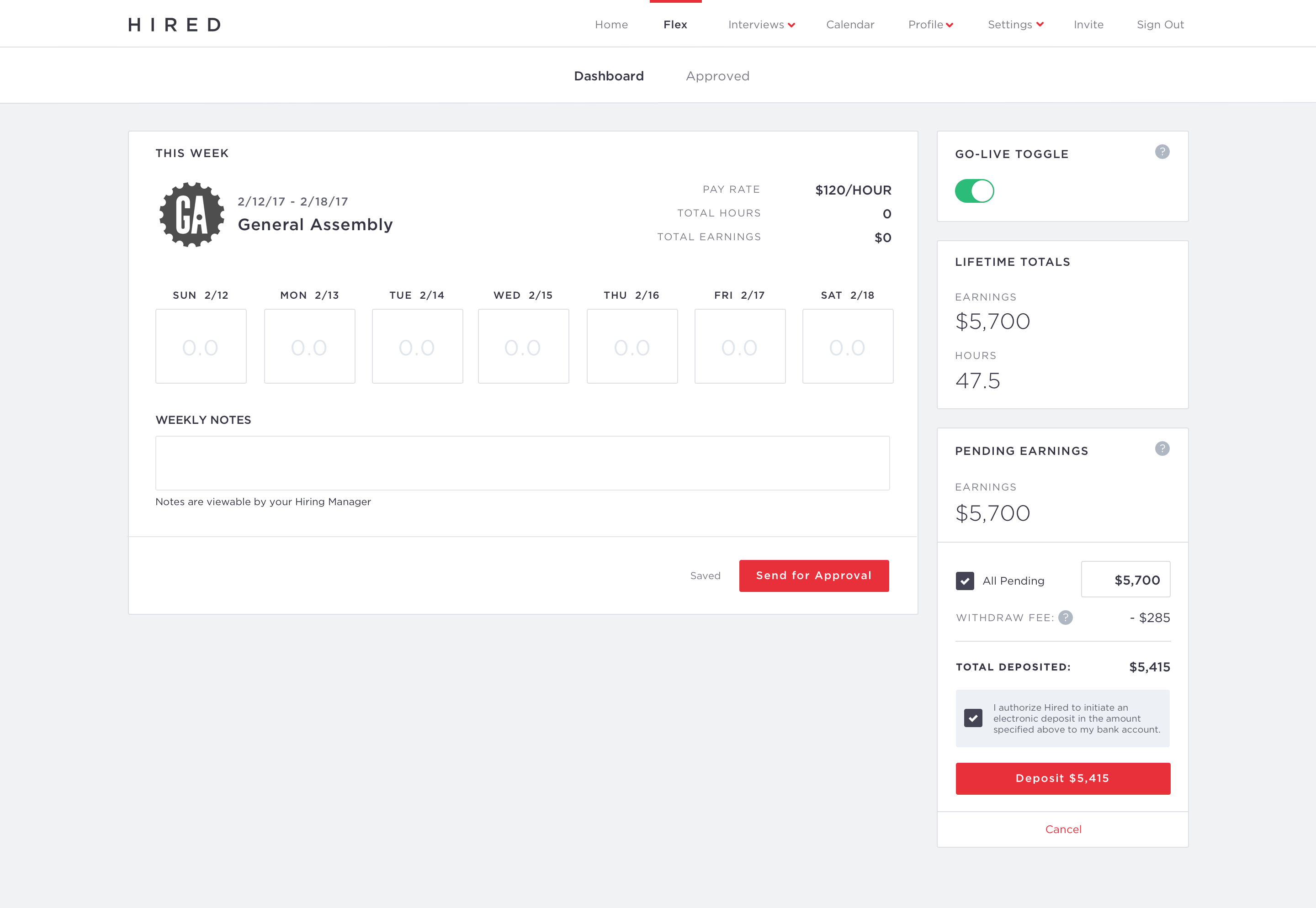
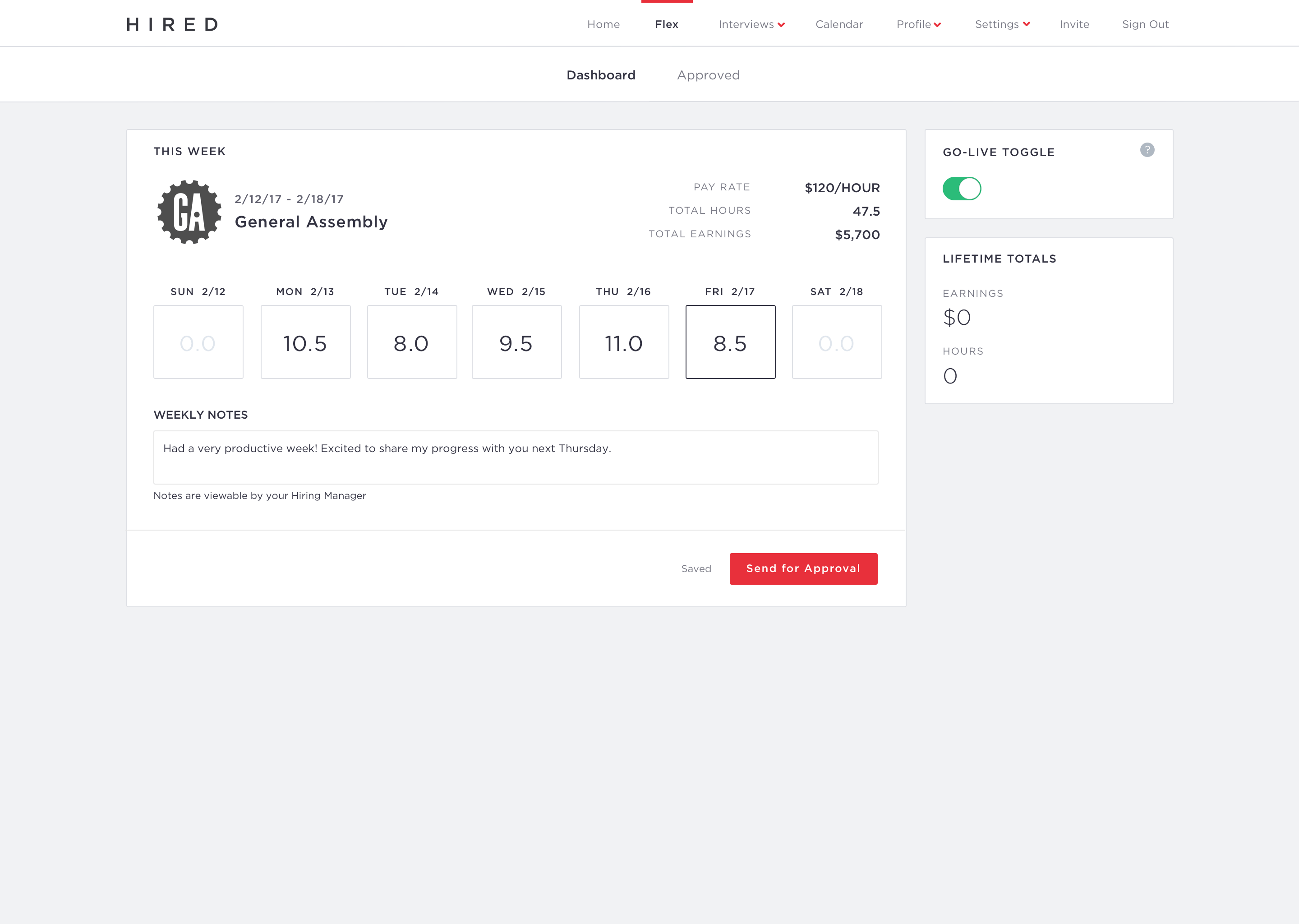
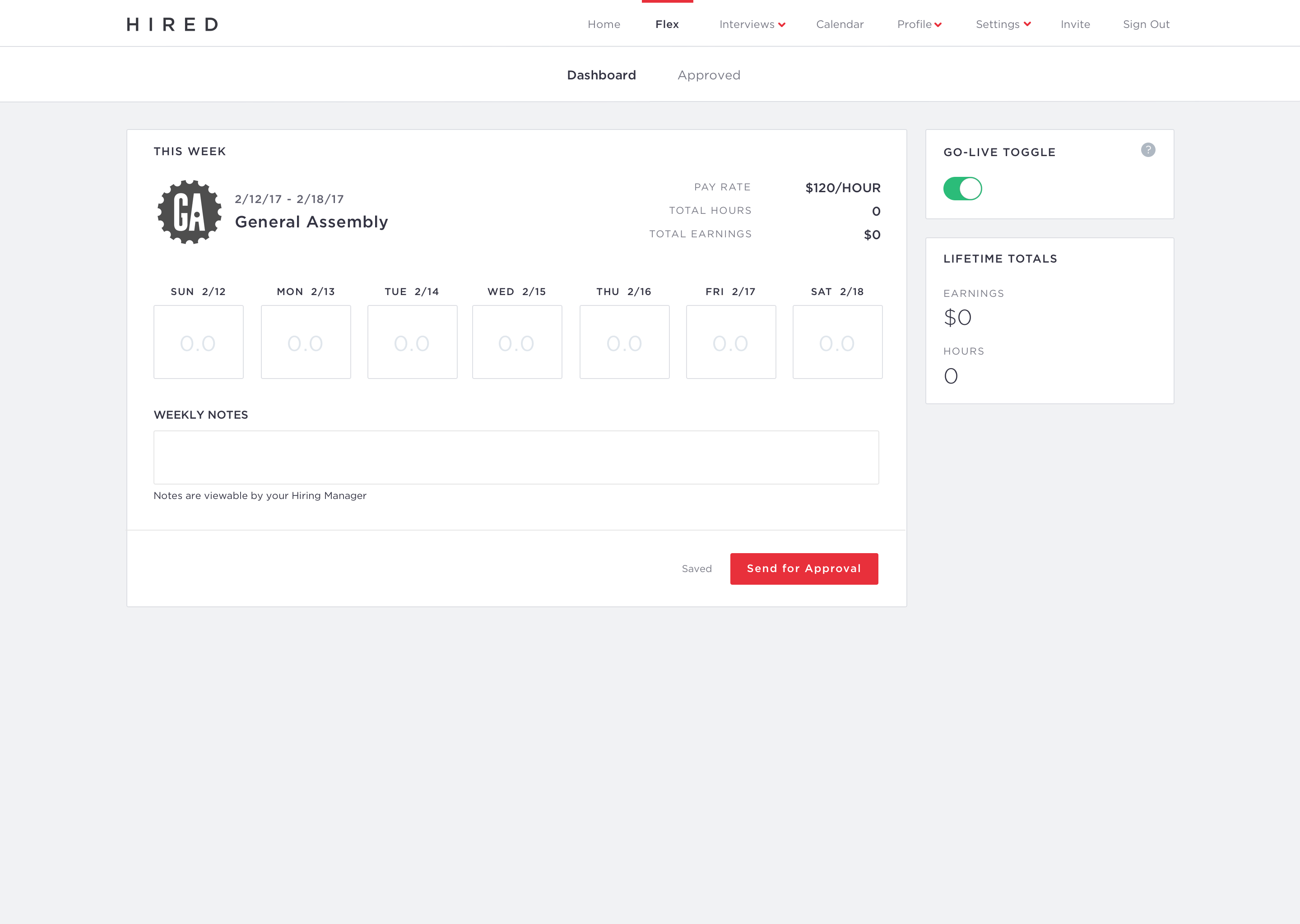
From there, I started to tackle some layout and product goals to work into a V2. We went through a few round of user testing which taught us a few things:
• Users didn't care about daily notes - they could just make one long note weekly. We decided to remove the legacy feature.
• Having control over their visibility in a batch was key.
• Cash out early was originally Cash advance, which had a negative connotation to it, and wasn't quite what the feature was anyway, so we smoothed the content and naming appropriately.
I used InVision to make a prototype of the idea to communicate to my team where we were going and how it would all work.
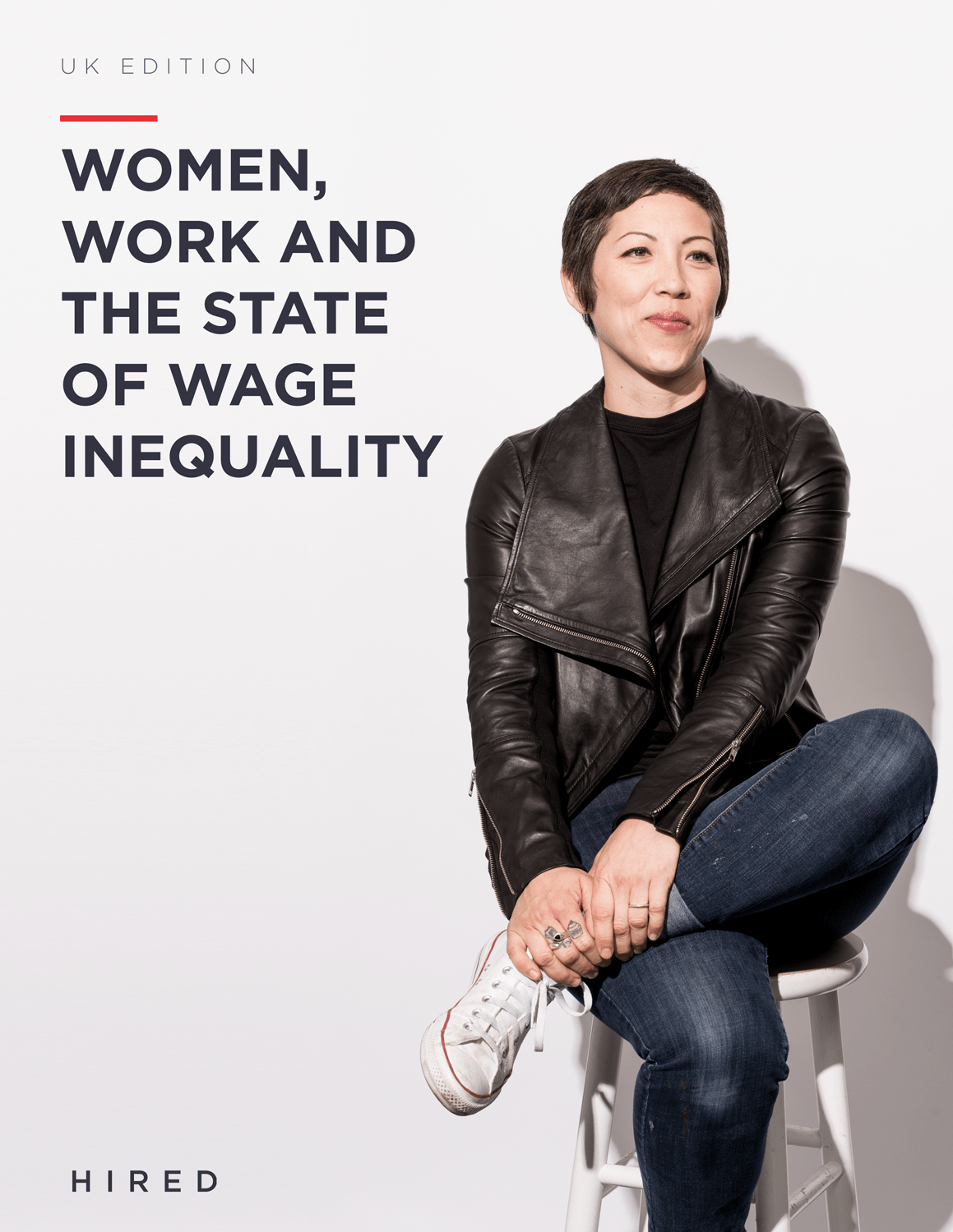
Gender Wage Gap Brochure and Site
From time to time I like to take on print projects - I love tactile things just as much as the digital! So, I was excited to take on a diversity issue and a design project all-in-one. The goal of this was to have a beautiful physical brochure of the report, along with a site that could be easily assembled from the pages and graphs.
The Outcome
Hired was my favorite job yet - I got to learn a lot about real product development and had a blast while doing it. I had a hand in all areas of the product, and ultimately got to get a big revenue driver for the company off the ground. Hired took good care of me, and I will always remember the great times we had working together.
© Jon Kerwin 2020
