This content is outdated. I'll be making updates to non-current work soon. Check back later!
Listings Project
Branding, Web, and Email Design
Overview
I met Stephanie Diamond through a mutual friend a few years ago and we hit it off immediately. She mentioned she needed some helping getting her email listing off the ground, and I offered to do it for her as a small side project.
The listing is an art project of sorts, and it's packed each week with curated spaces and opportunities through the real estate and art world. Now at over 140,000 subscribers, Stephanie and I are currently in talks to revise all of the Listings Project materials. What you see below is the current exploration of that next step on top of the previous work.
Goals
My goal here was to listen to my client and provide as clear feedback as possible. Stephanie and I had a great time working together, and I'm thrilled we're continuing to do so. What I really wanted for Listings Project is for it to feel approachable and personal.
Stephanie sent me some images that struck her as inspiring for the project, and we got to work on talking about branding and the requirements of the site and emails:
Branding
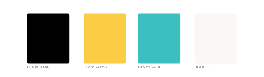
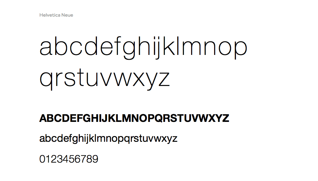
Taking the current branding one step further, I wanted to add an icon that helped convey more of the brand message, and pull the logotype in line with the Helvetica Neue guidelines. I think it matches her initial inspiration well.
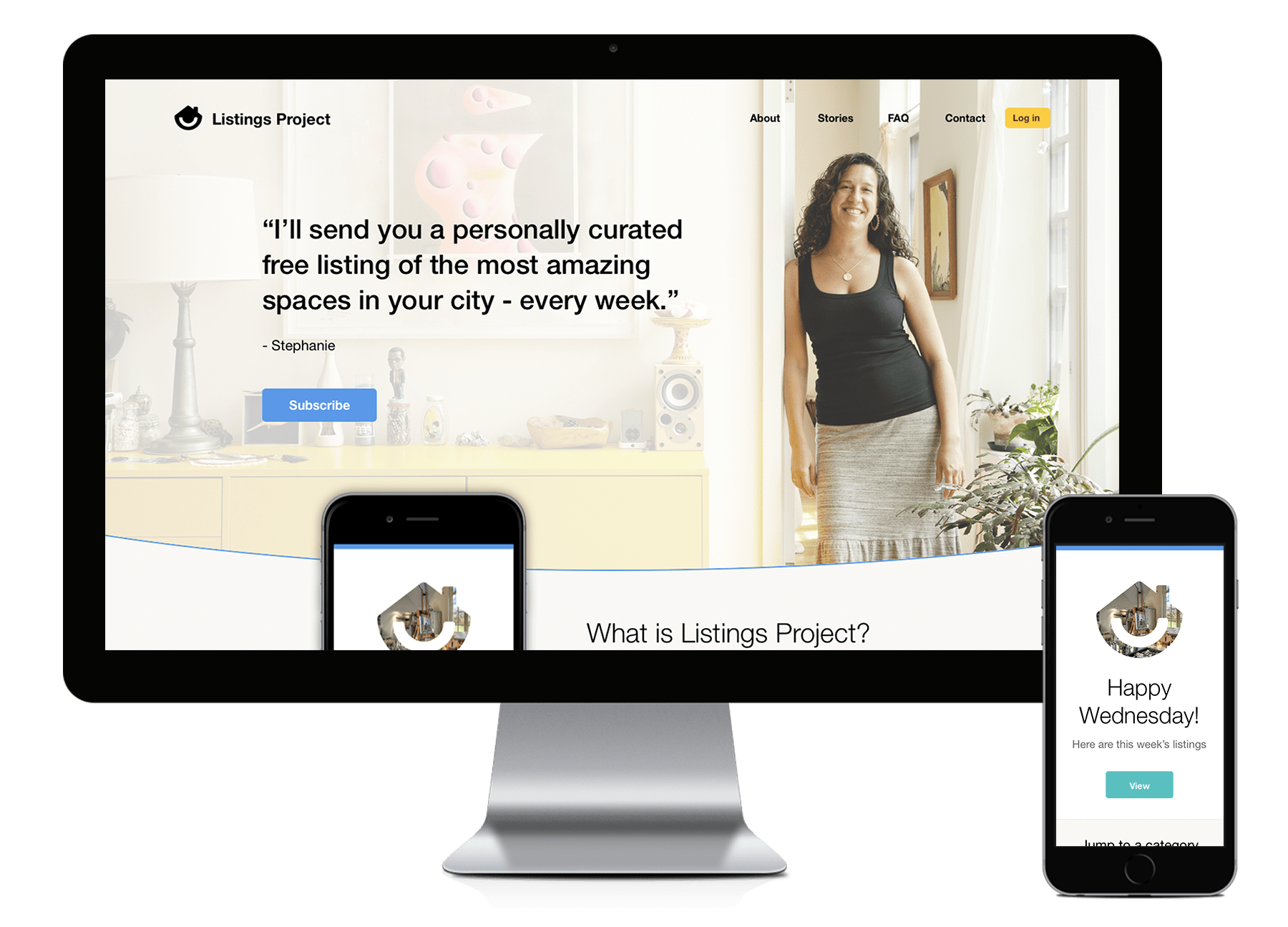
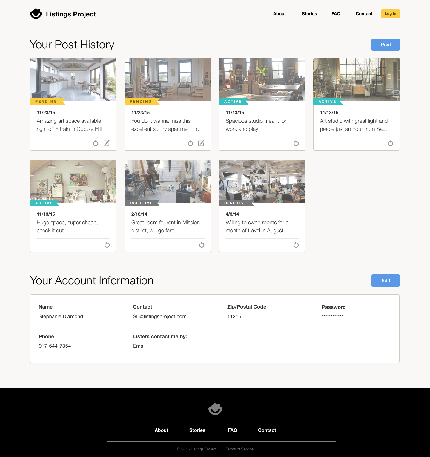
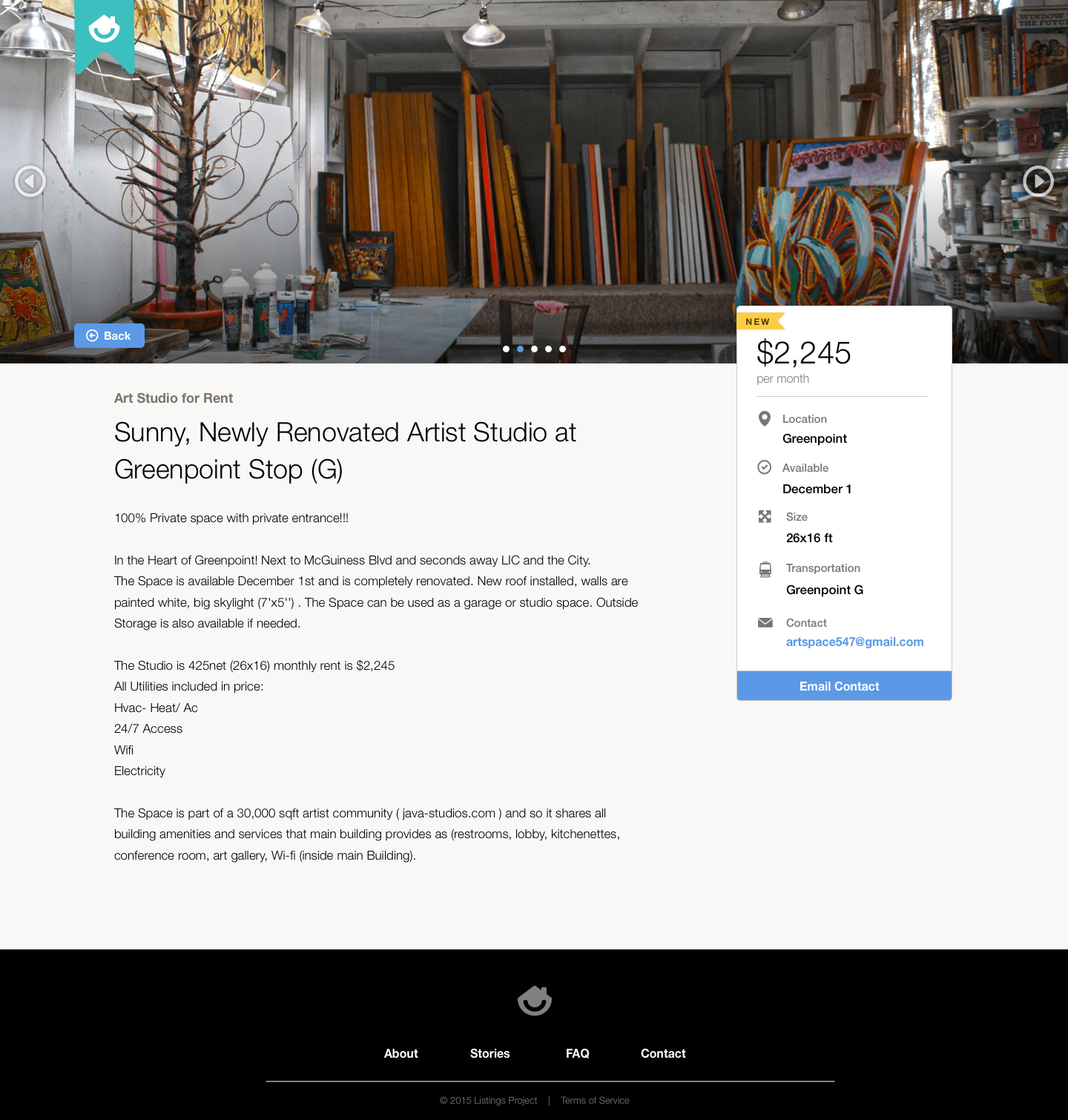
Website
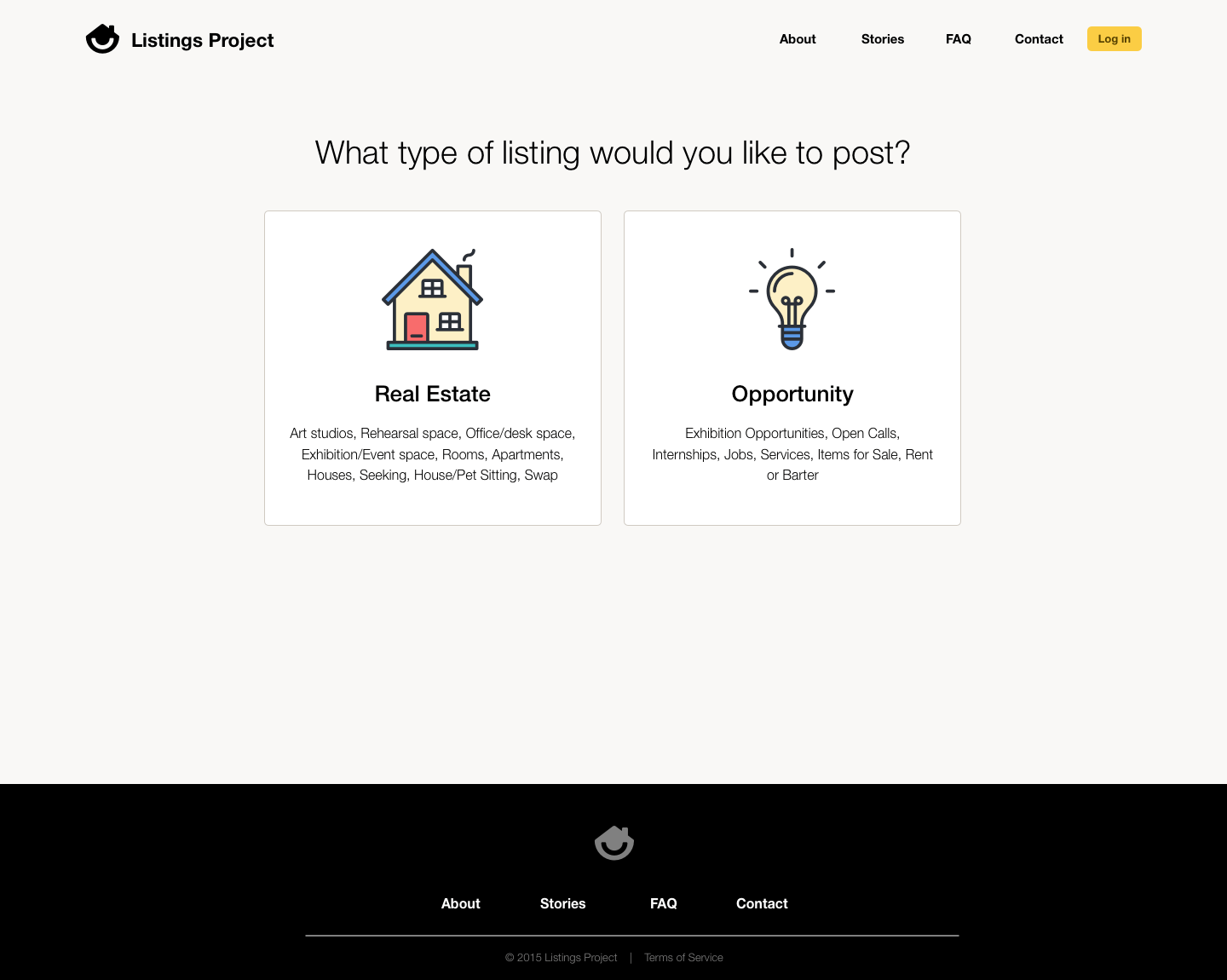
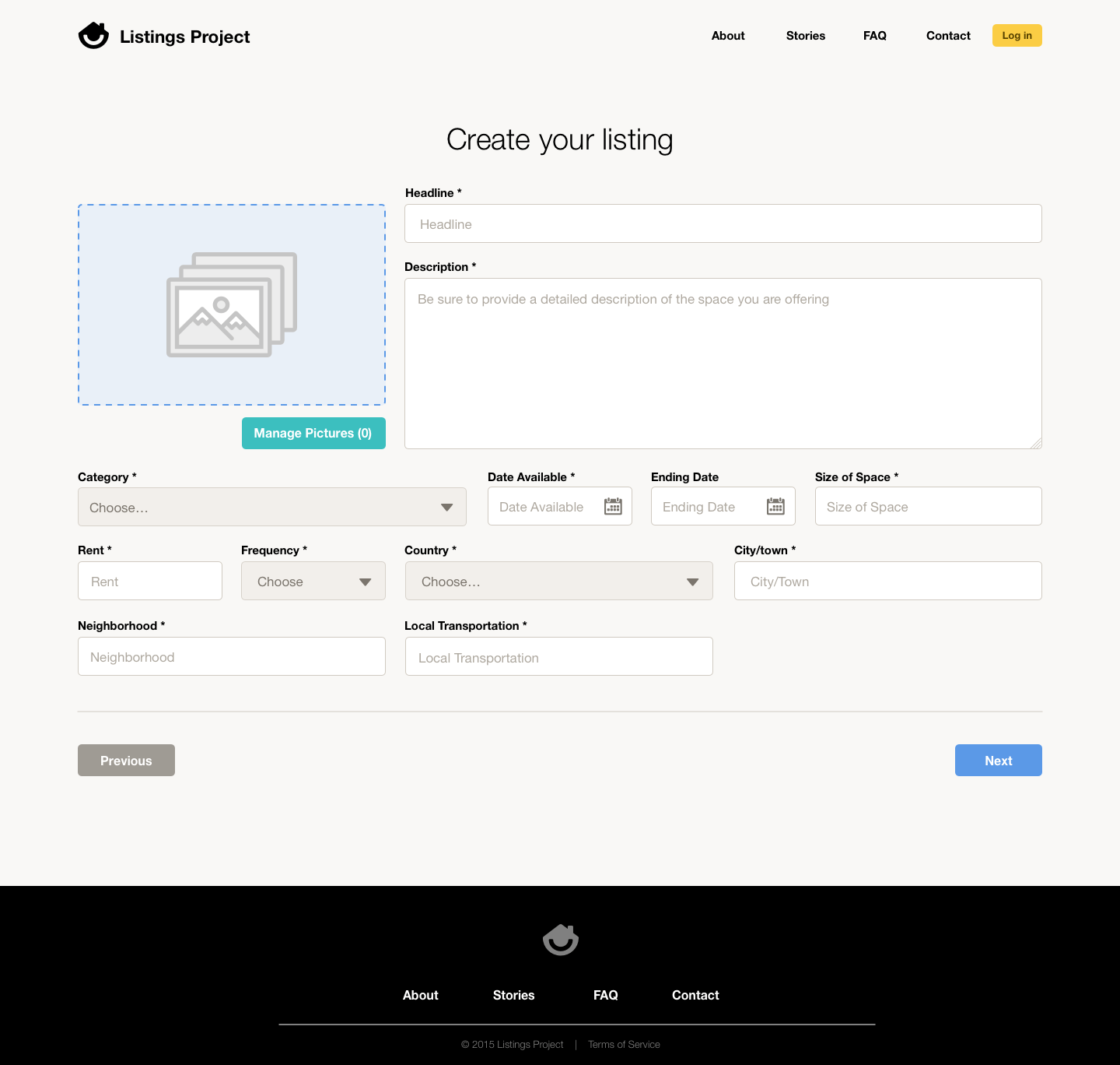
Stephanie and I started out by working up from simple flows and maps for the requirements of the site. This helped inform us on the requirements for the pages, and helped me clear away messy process.
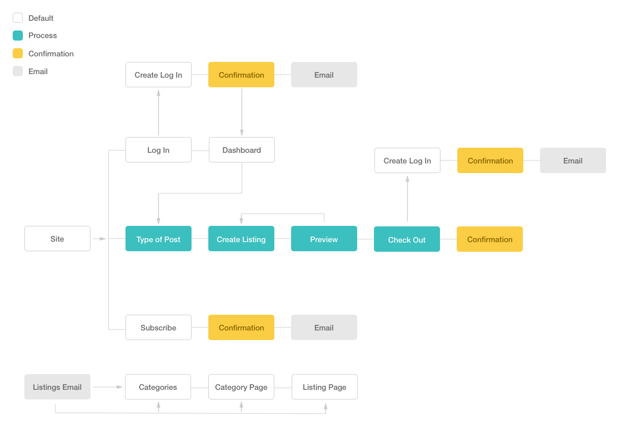
Then we moved on to making lo-fi wireframes. We would meet every week and push things a bit further until all the requirements were in place.
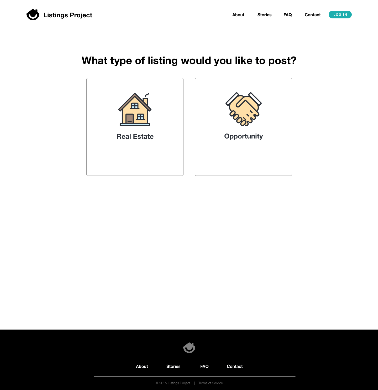
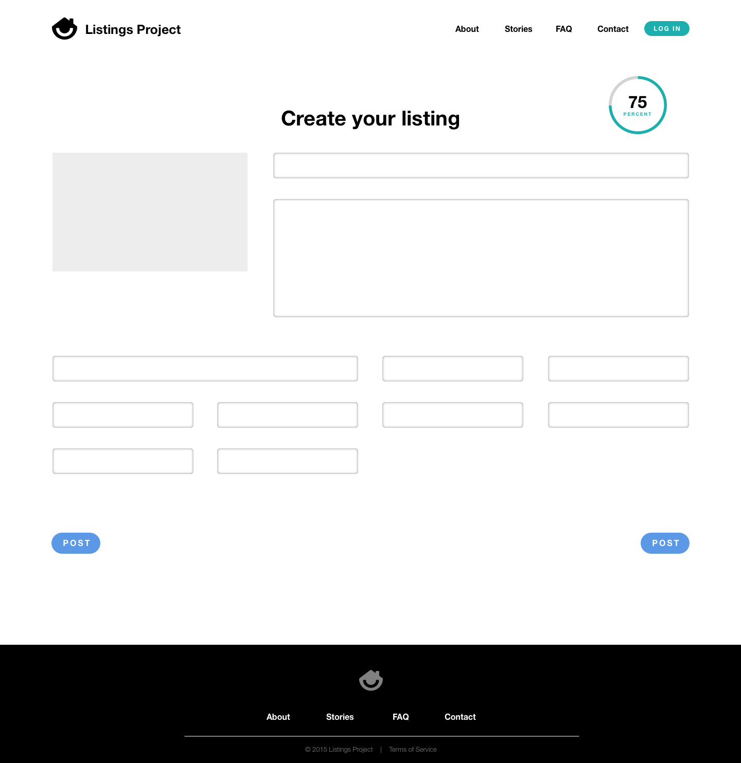
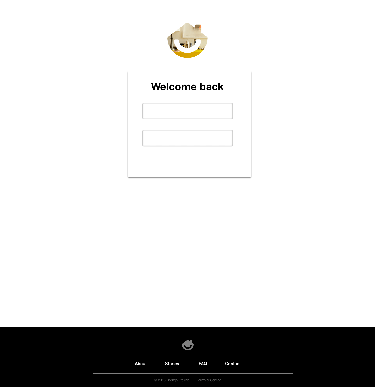
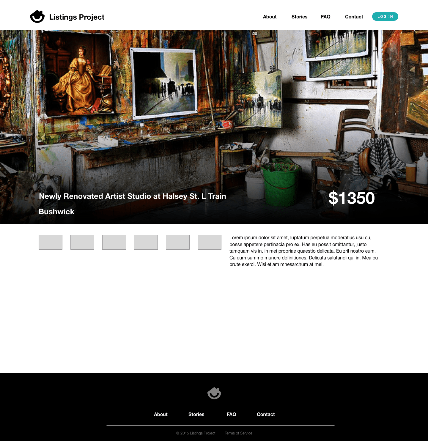
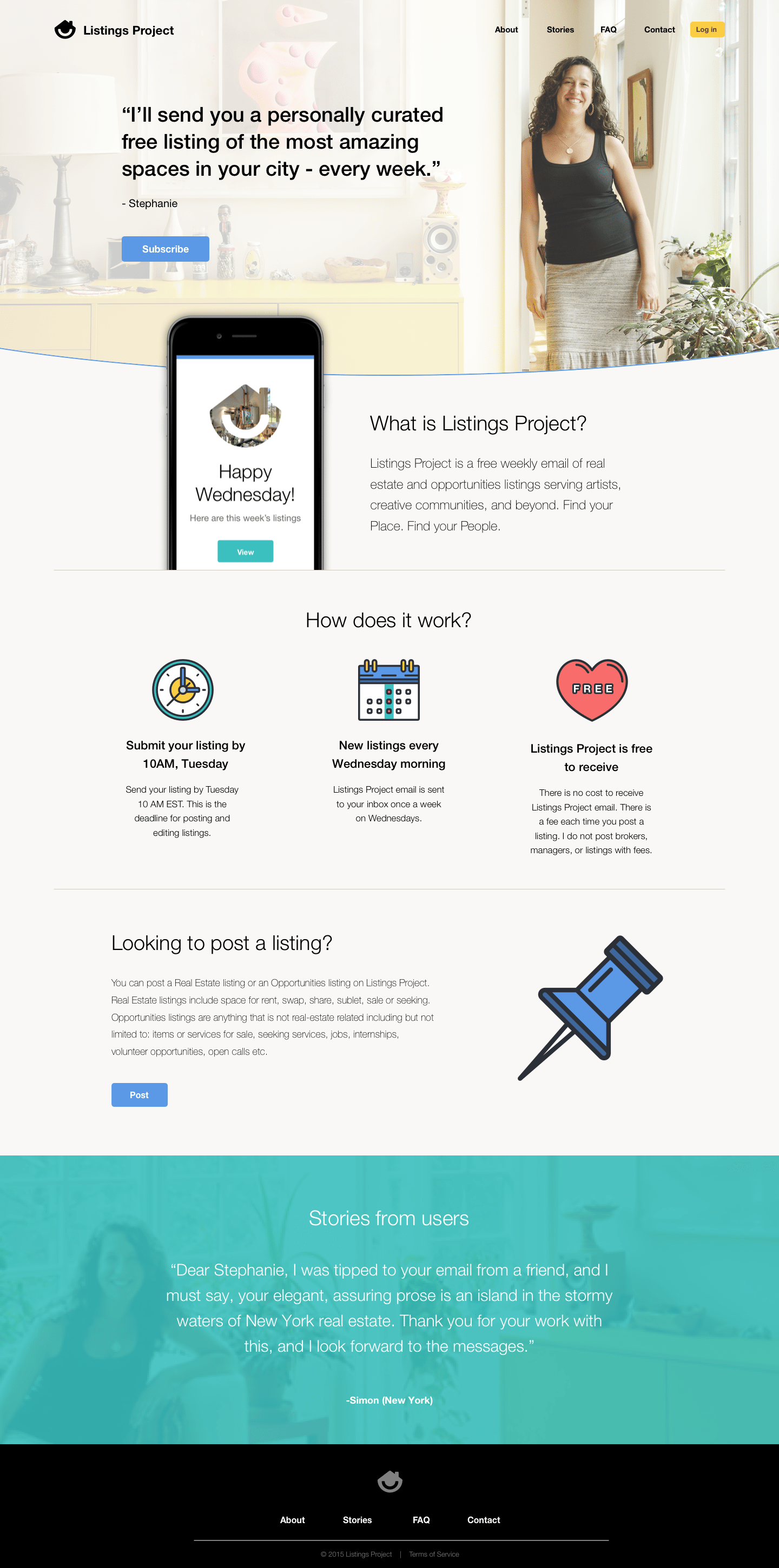
Once we had a general idea on what we needed on the internals, we moved on to hi-fidelity mockups. Through iteration, we arrived at something that had a real voice. I wanted the site to feel fresh, personal, and approachable. We narrowed the navigation a bit through this iteration and it helped to shape the overall brand structure as well.
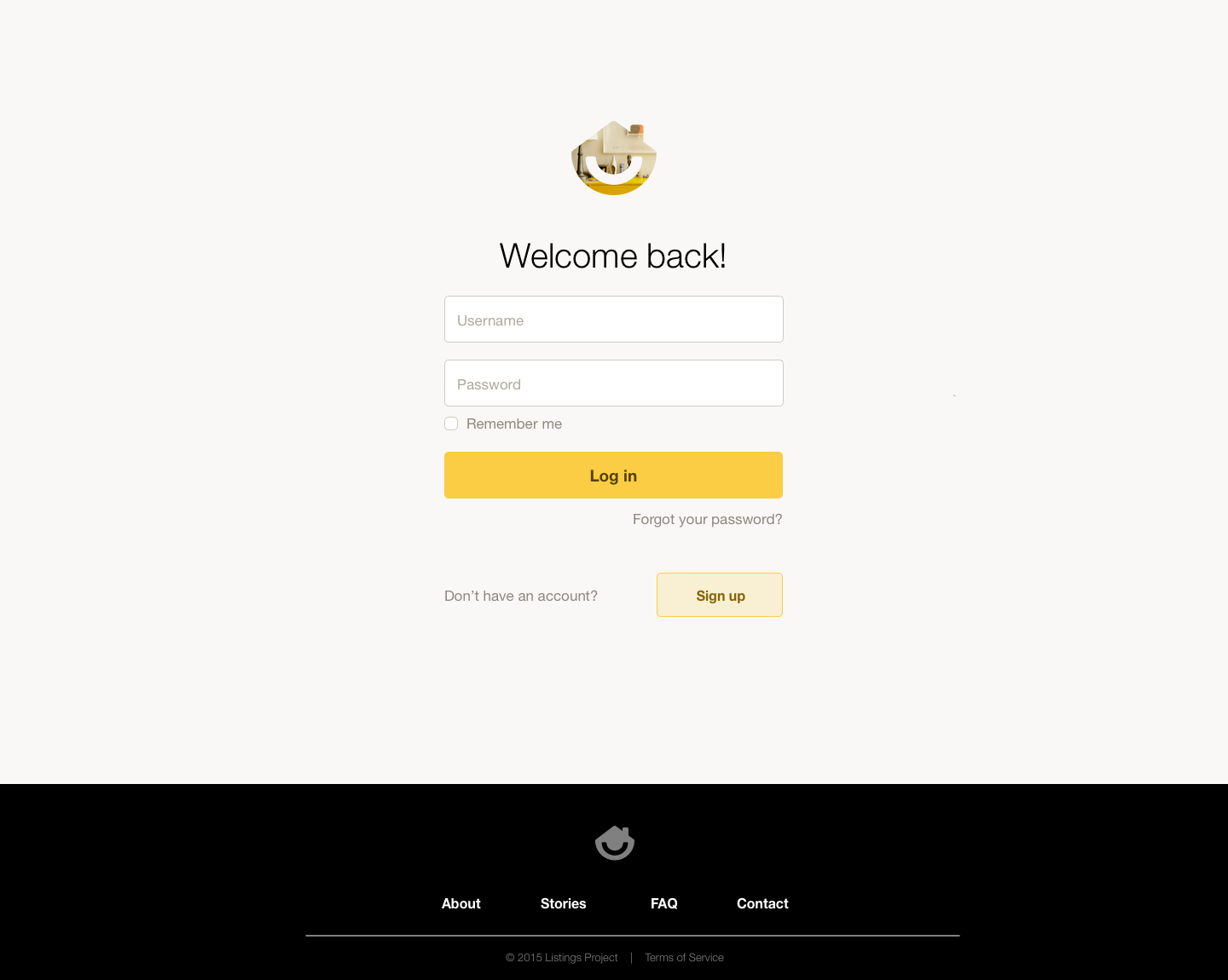
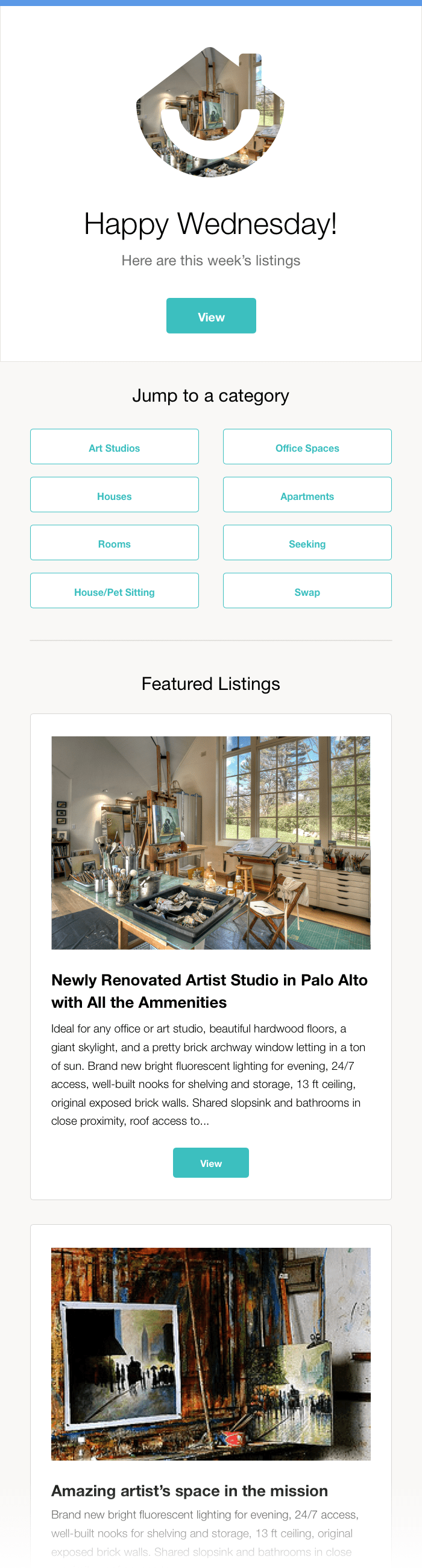
For the emails, we needed something simple and responsive. It was actually the limitation of the email that led to the branding being so heavily Helvetica Neue - so that the experience held it's integrity down through to the emails.
The Outcome
I can't wait to get through the next version of Listings Project with Stephanie. This is just a springboard for the type of potential it has. Maybe her list will become the next big thing in real estate!
© Jon Kerwin 2020