This content is outdated. I'll be making updates to non-current work soon. Check back later!
Monette
Print Design
Overview
My friend Monette came to me wanting some work done for her wedding. The inspiration was that she wanted something "modern, with a little rustic vineyard." She had a great example of typography used on an invitation, and I knew exactly where this needed to go. She also wanted something like a logo, which eventually turned into the intricate placard you see below.
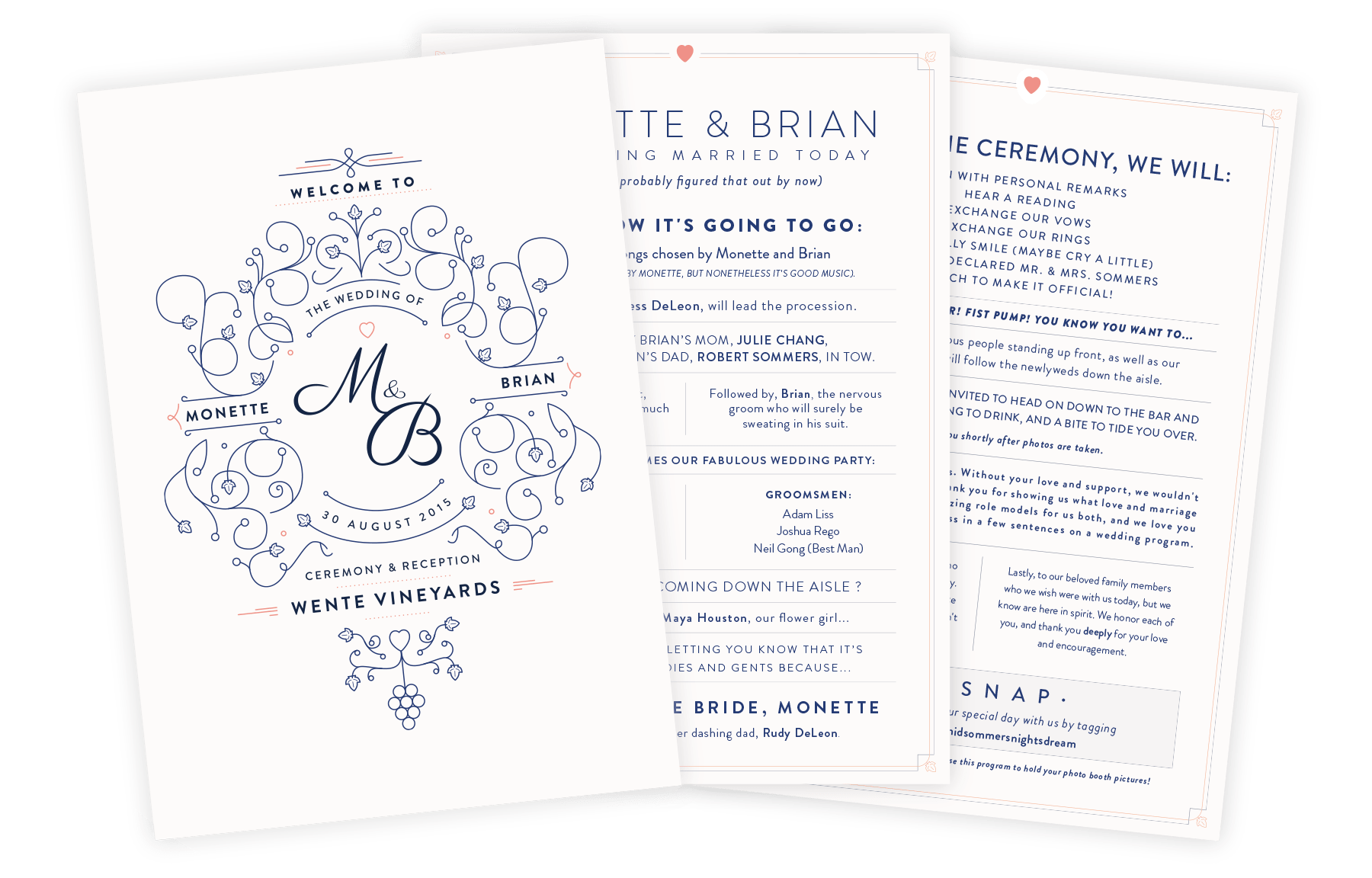
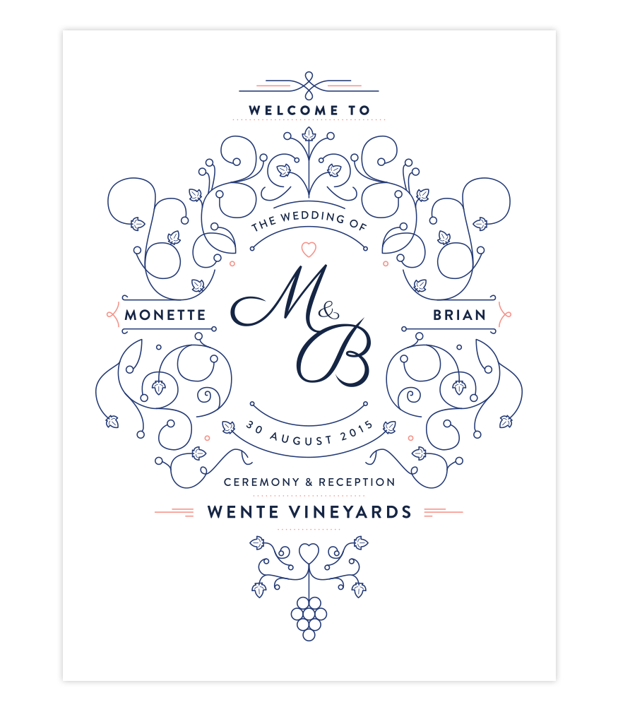
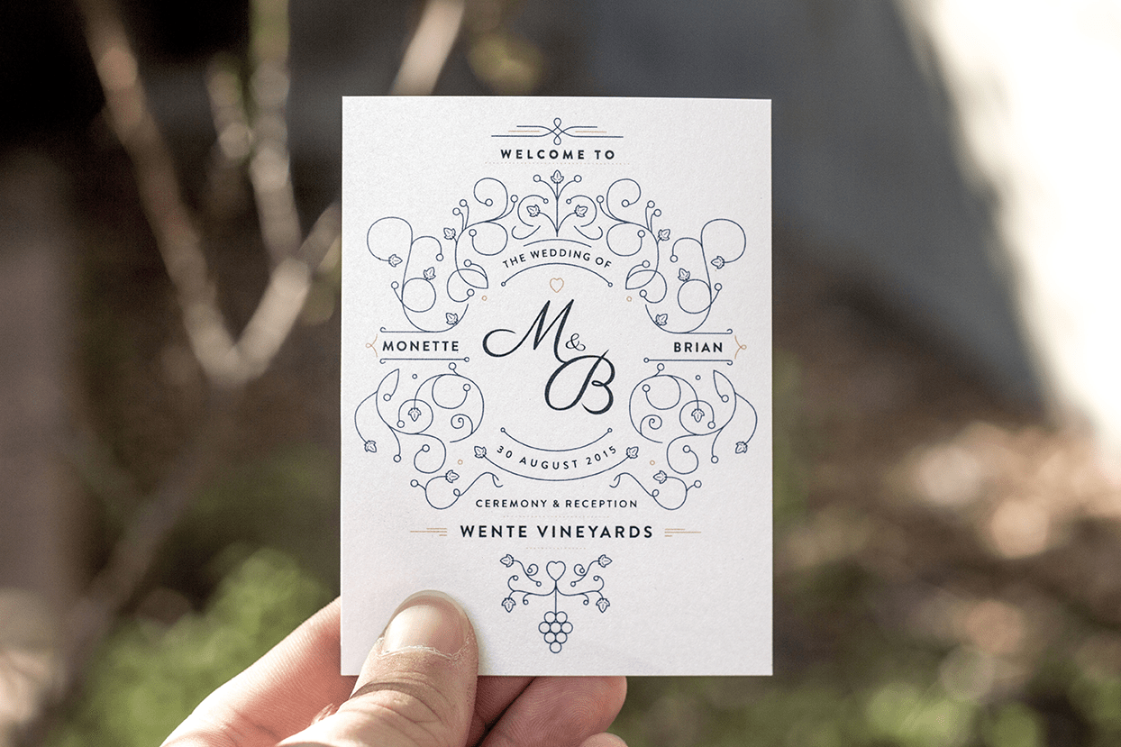
The Placard
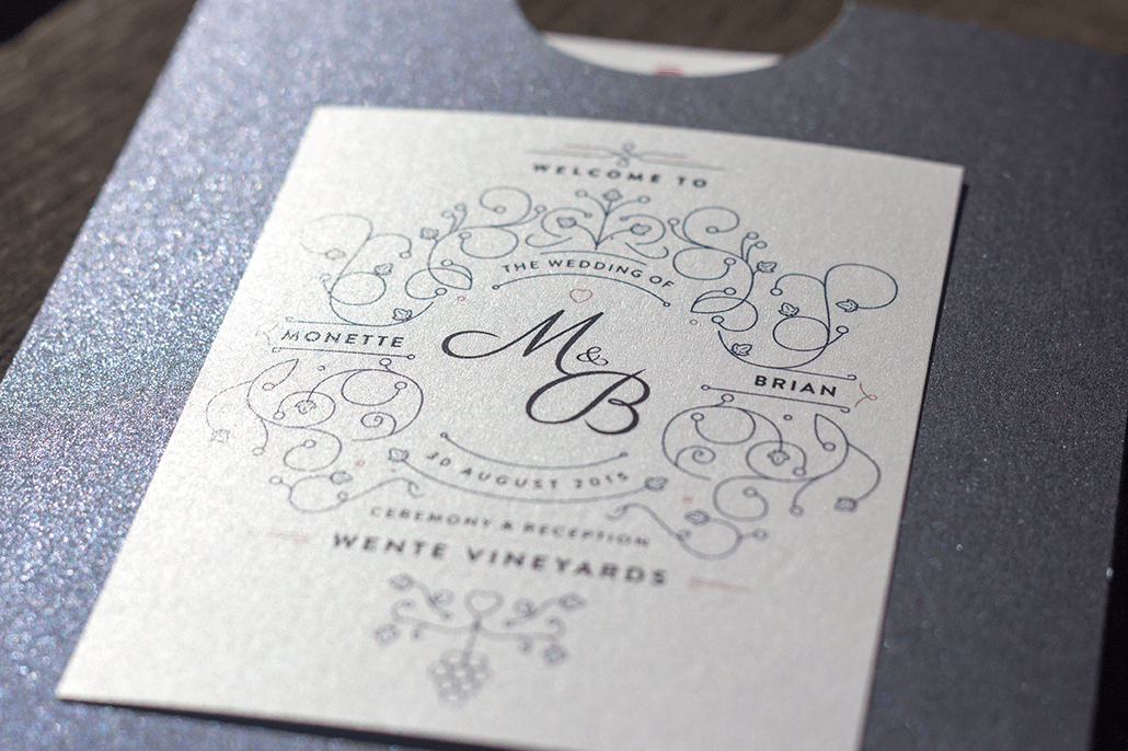
Instead of making a monogram that was going to be blown up large, I decided to float the idea of a more ornate take on a monogram that could do double duty. The "M&B" was able to be separated out to be incorporated into the photo booth printouts, while the larger graphic could be used on the front of the programs, as well as printed large to be hung around the vineyard to welcome guests.
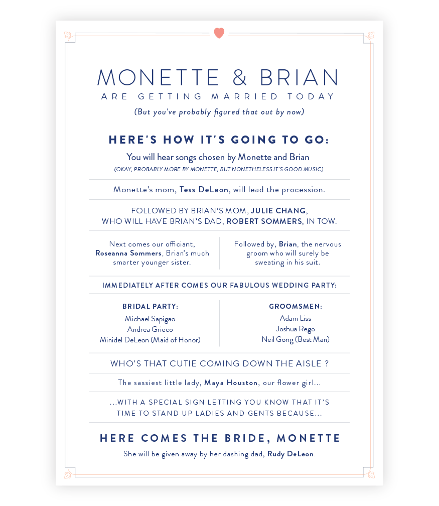
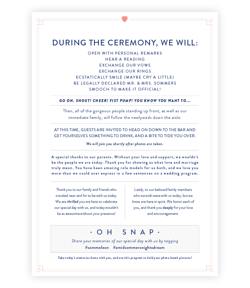
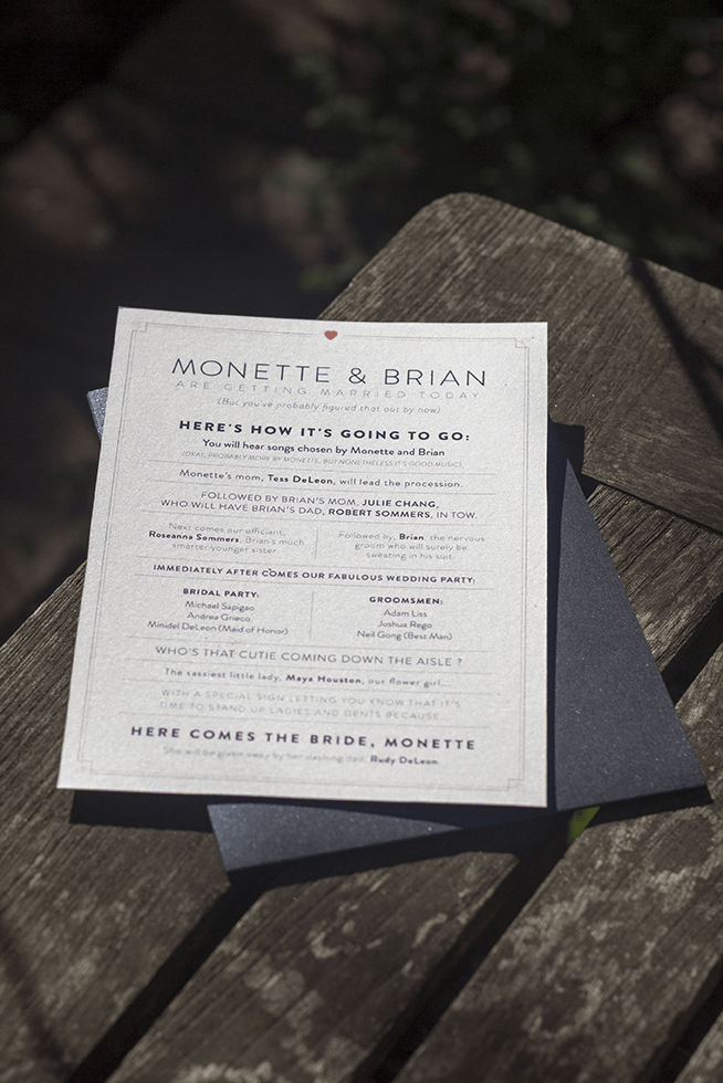
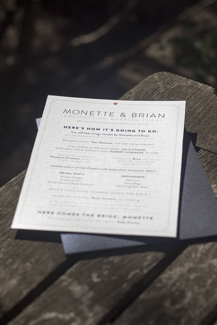
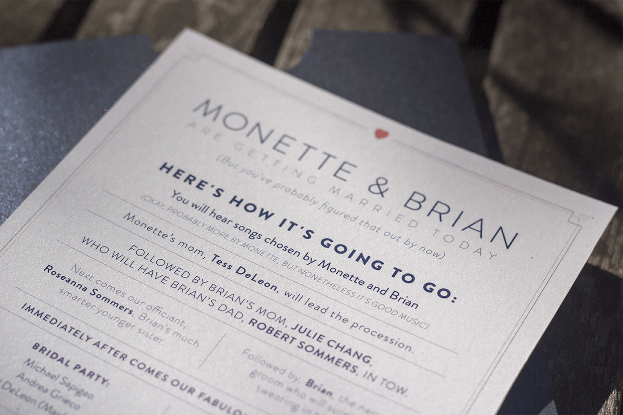
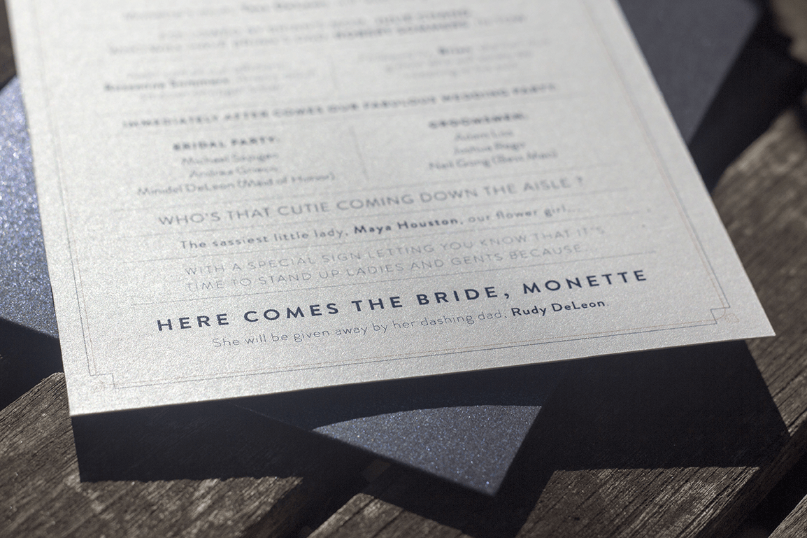
The Program
I absolutely love setting type - it's like molding clay: you start with a block and give it shape and structure, slowly.
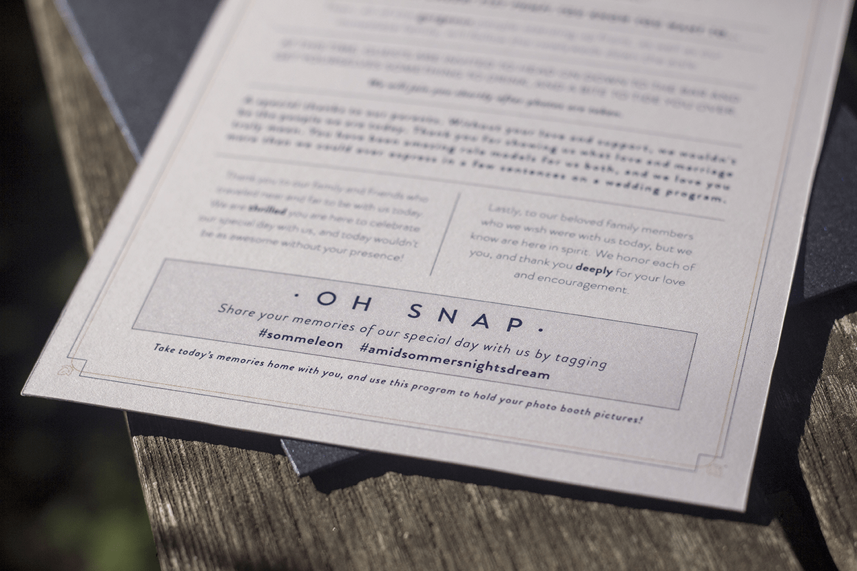
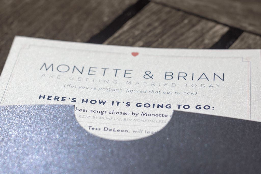
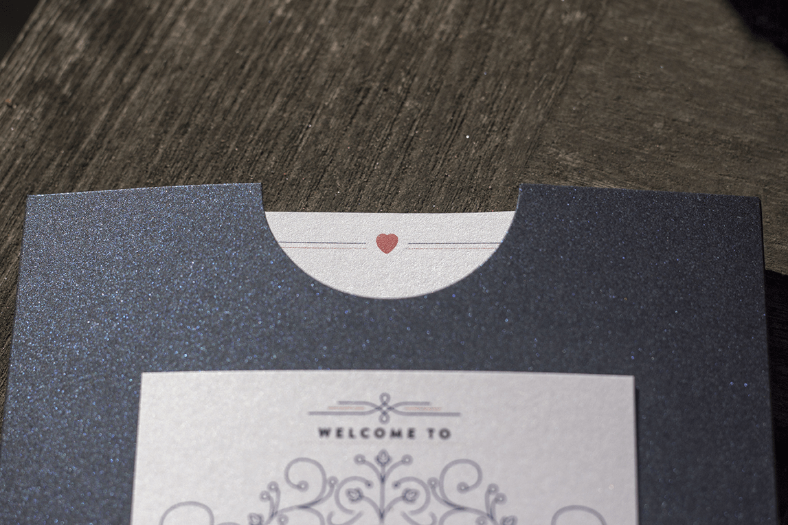
The original idea was to have the program fold into a envelope to hold photo booth printouts, but on the budget we had I suggested we go with a pocket to hold a single 5 x 7. I found a beautiful shimmering dark blue pocket, with a shimmery thick stock for the program itself. I took the heart from the placard and made it peek out from the die-cut in the pocket.
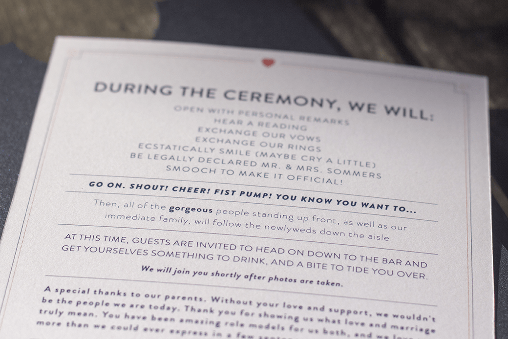
The result was a program that read line-by-line in a fun fashion exactly what was happening during the ceremony.
The Outcome
© Jon Kerwin 2020